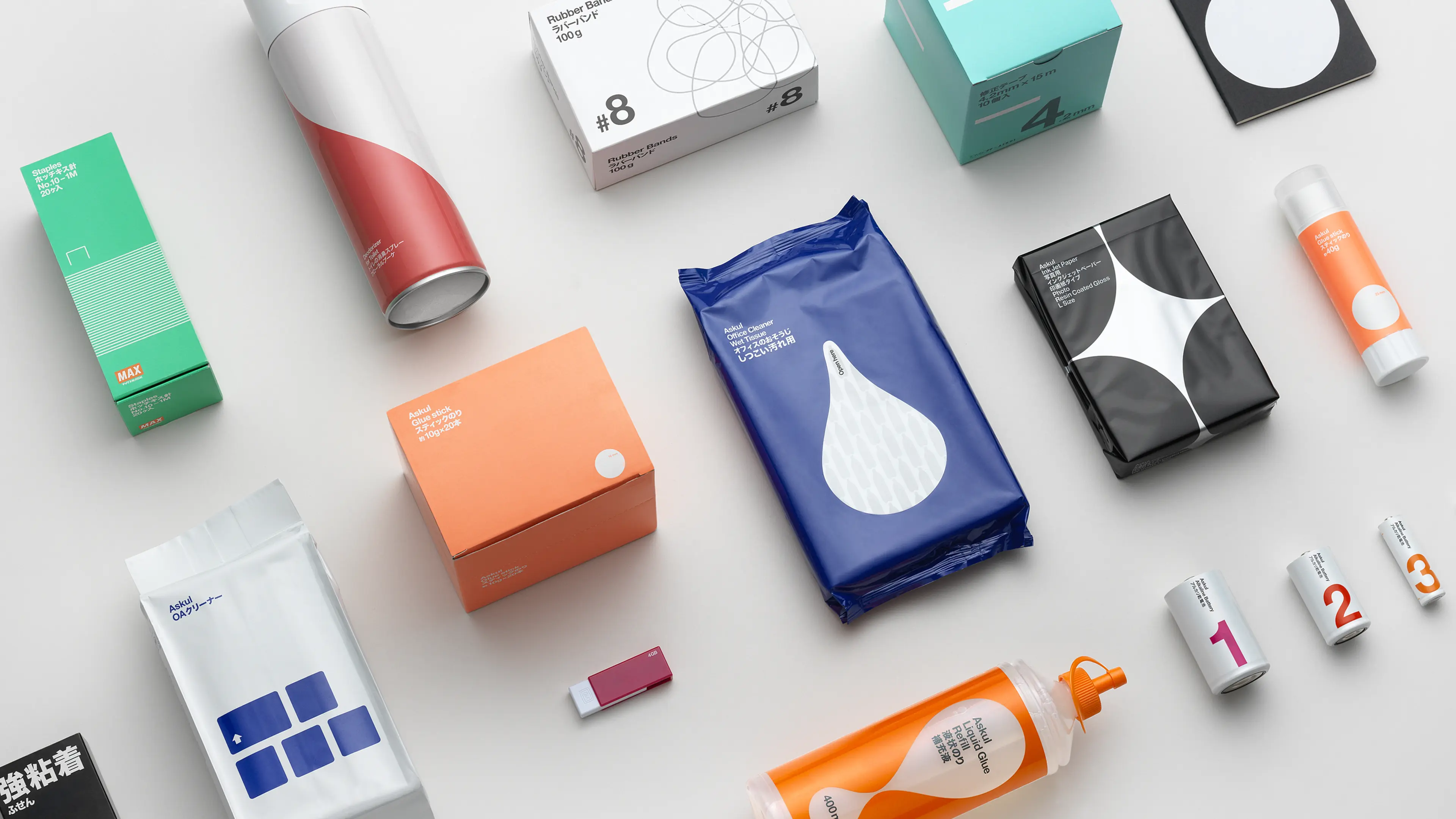
Askul keeps Japan stocked with everything it needs to work, from paper, pens and batteries to bags, chairs, tools, coffee and noodles. Founded in 1963, it sells more than 40,000 products through its website and catalogue, and delivers any of them, anywhere in Japan, within 24 hours. Askul has everything. But in 2005, it was looking for something new.
Askul wanted to establish a clear, compelling visual identity for its own-brand products. With the shared Japanese and Swedish design values of simplicity, clarity and economy in mind, and the benefit of a fresh set of eyes from outside Japan, Askul asked SDL to take a holistic approach to redesigning its brand identity.
Askul sells more than 40,000 products through its website and catalogue, and delivers any of them, anywhere in Japan, within 24 hours.
Solution
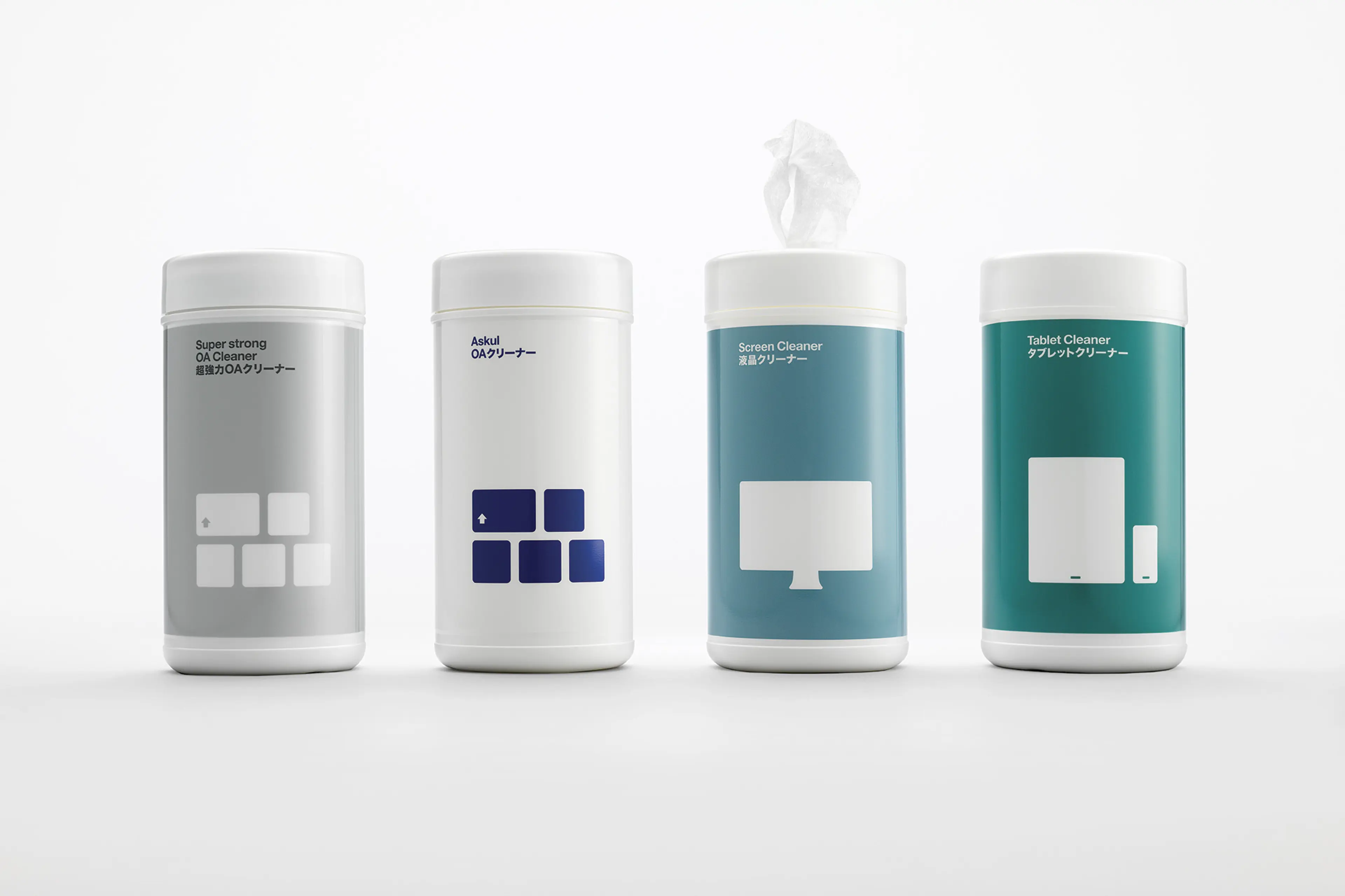
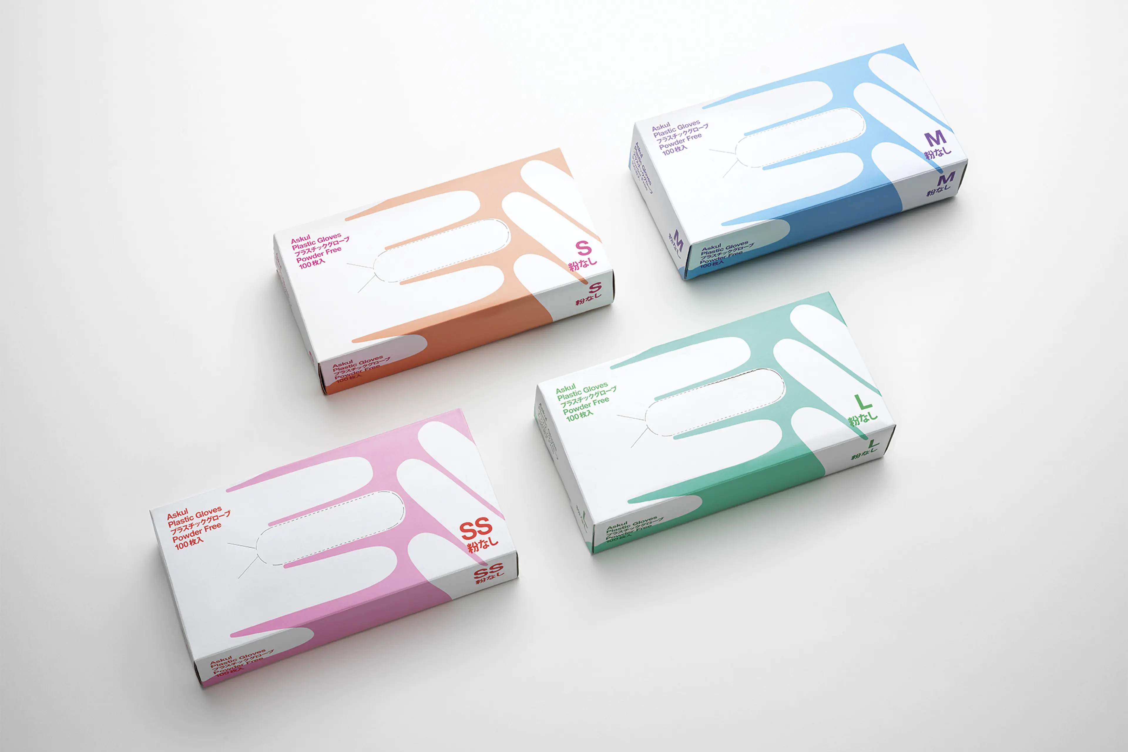
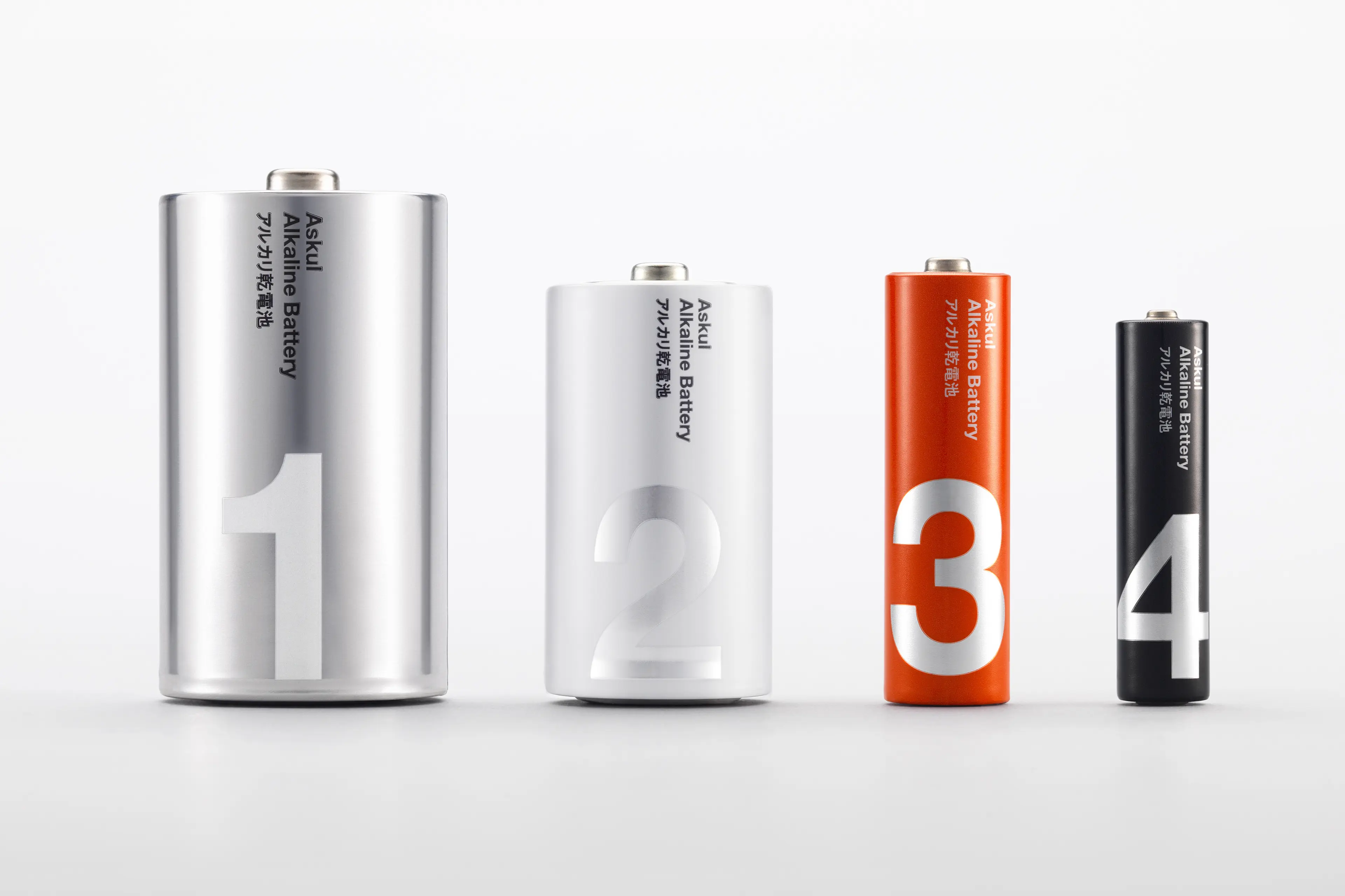
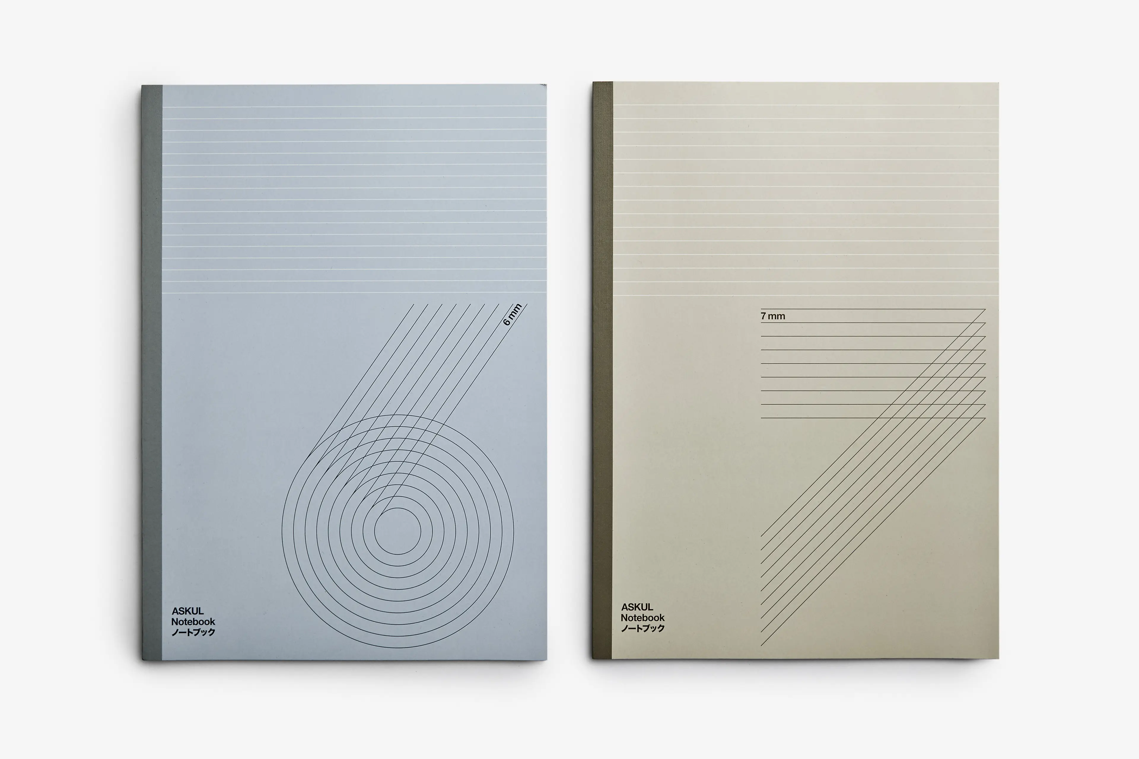
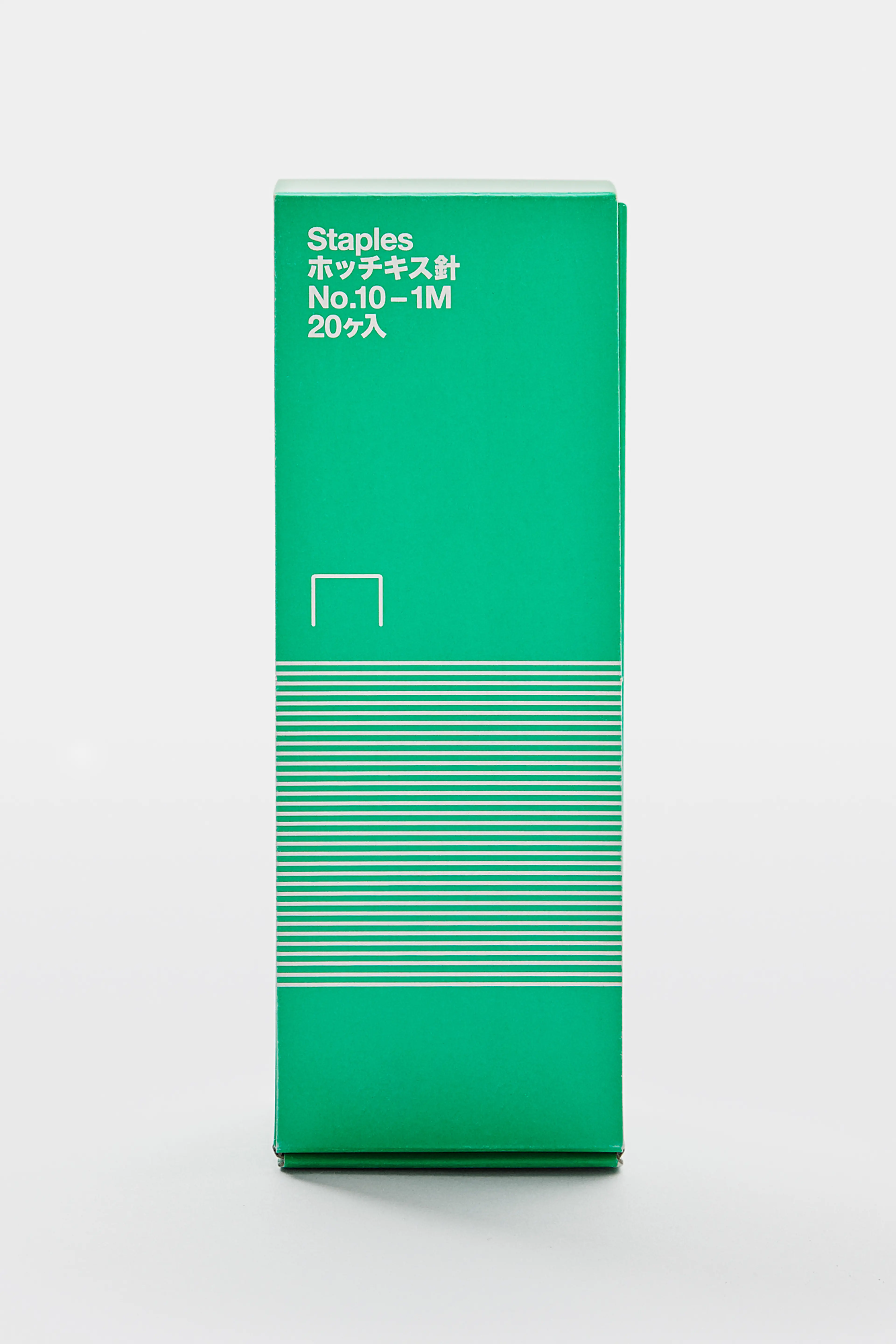
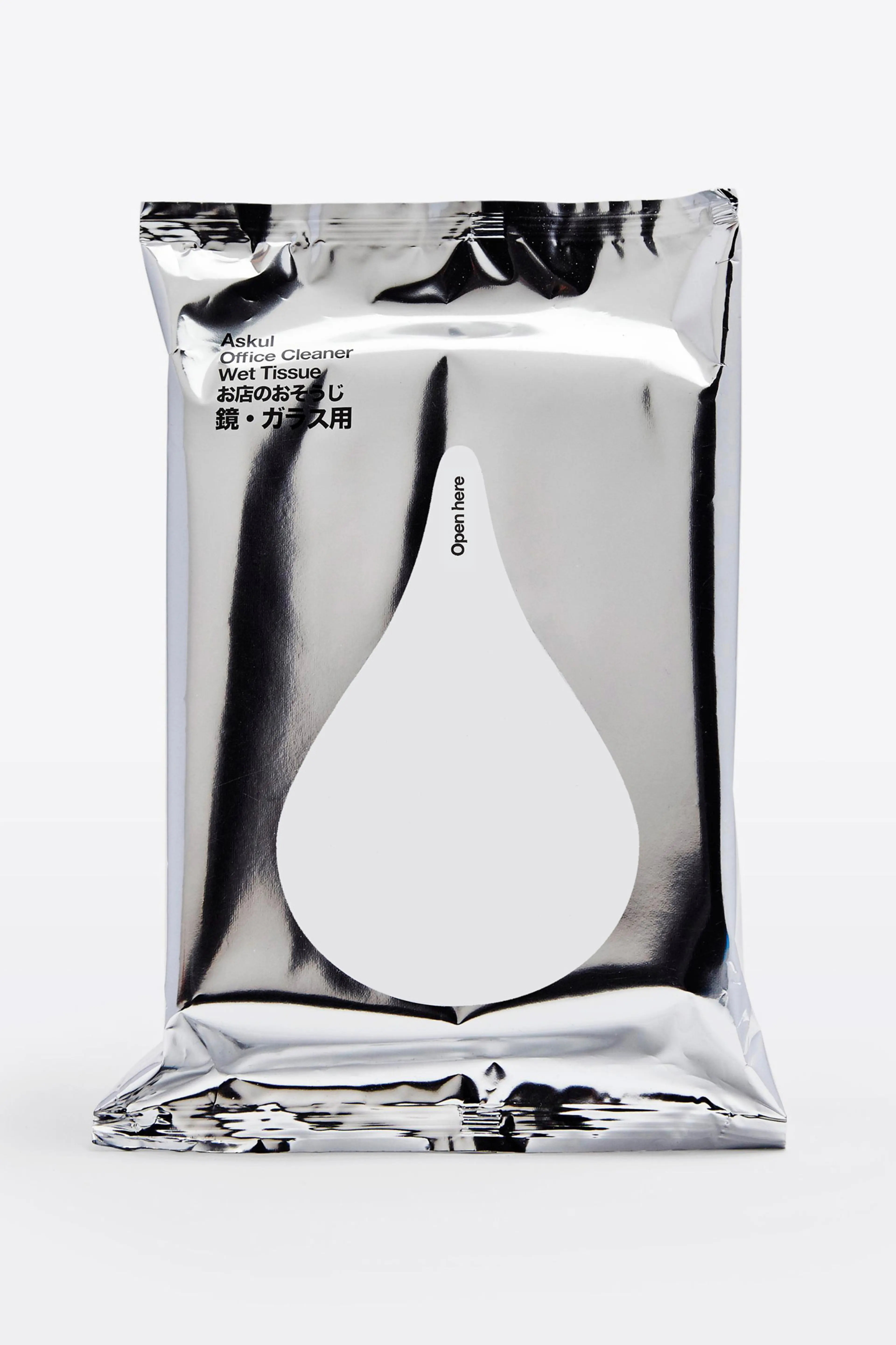
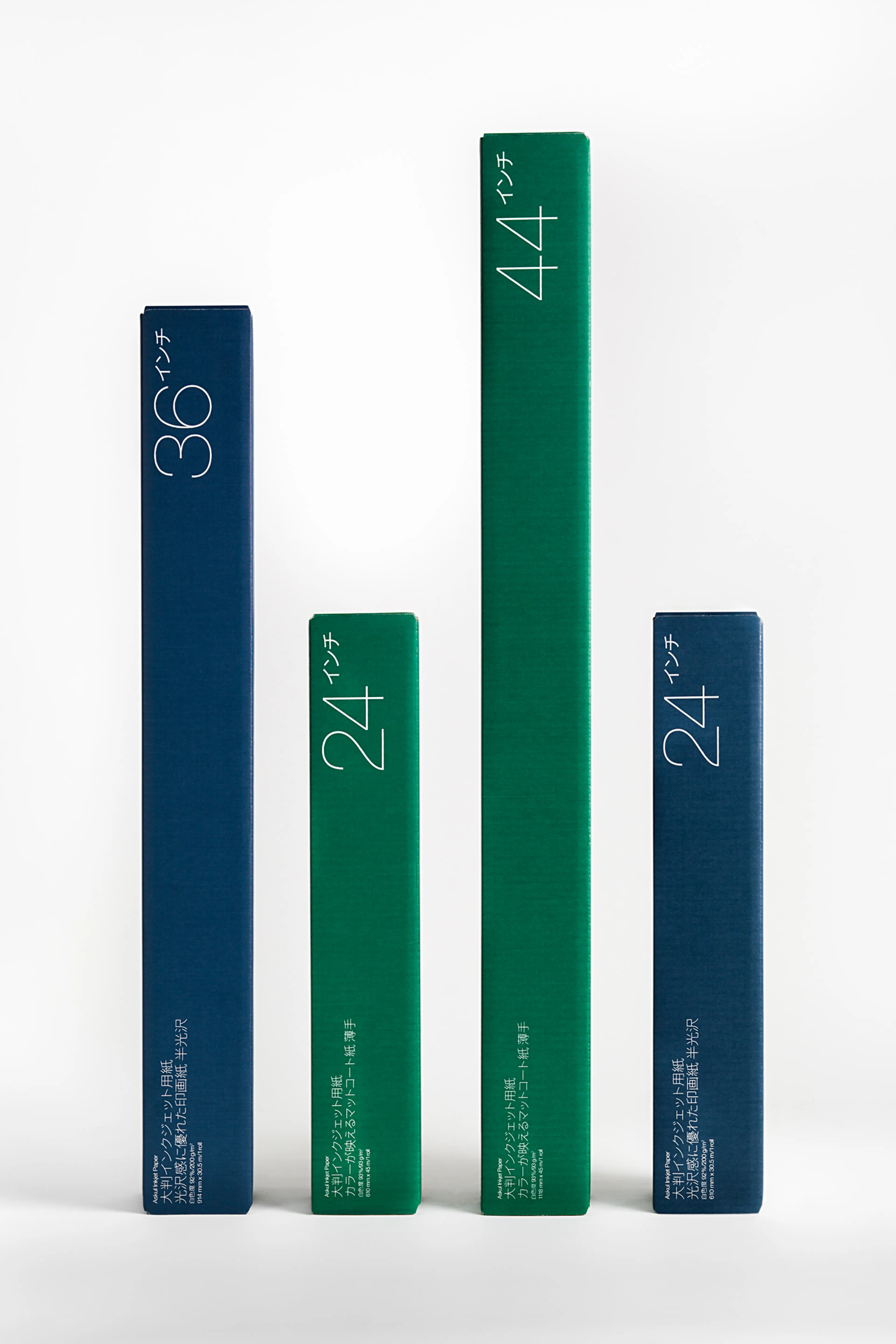
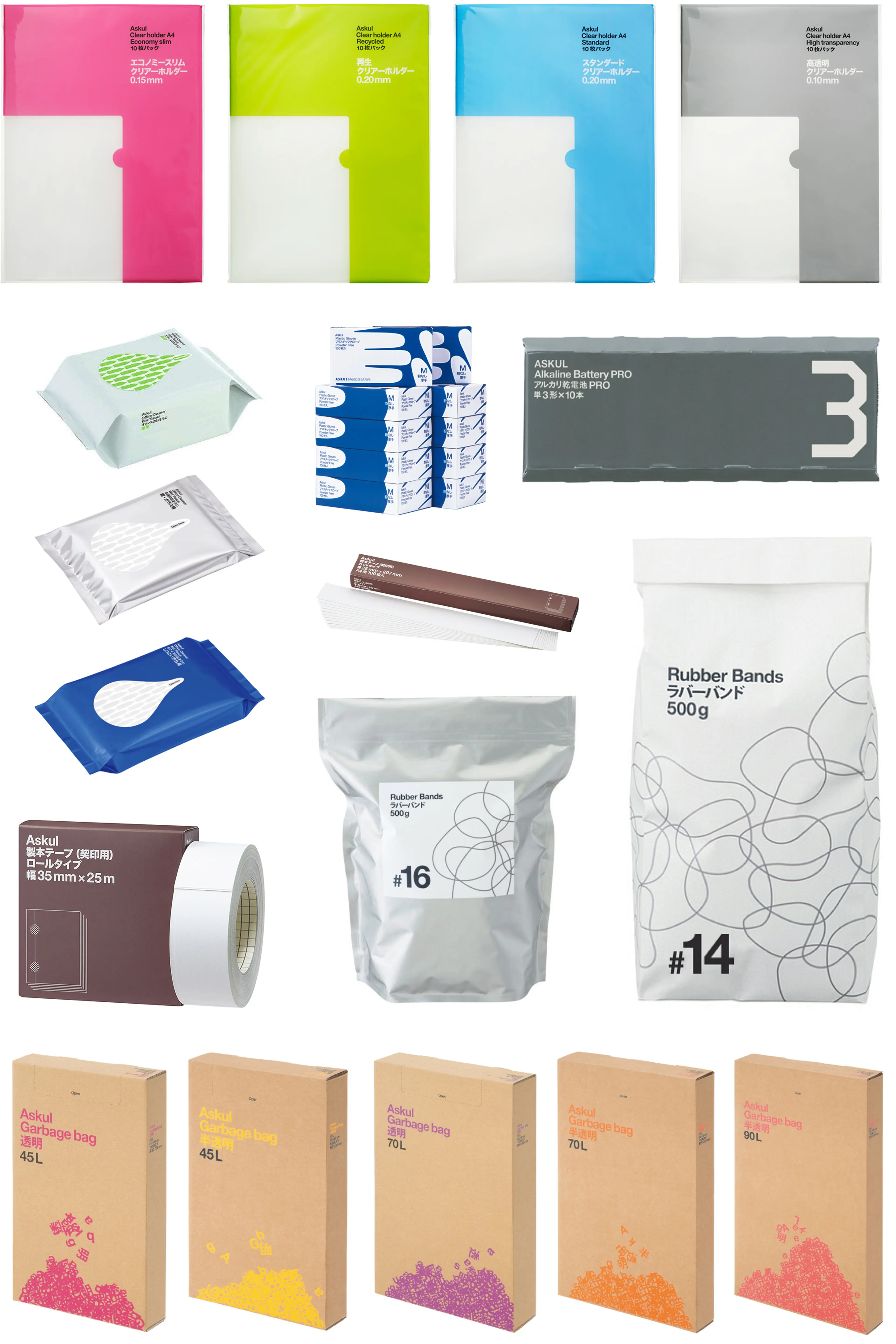
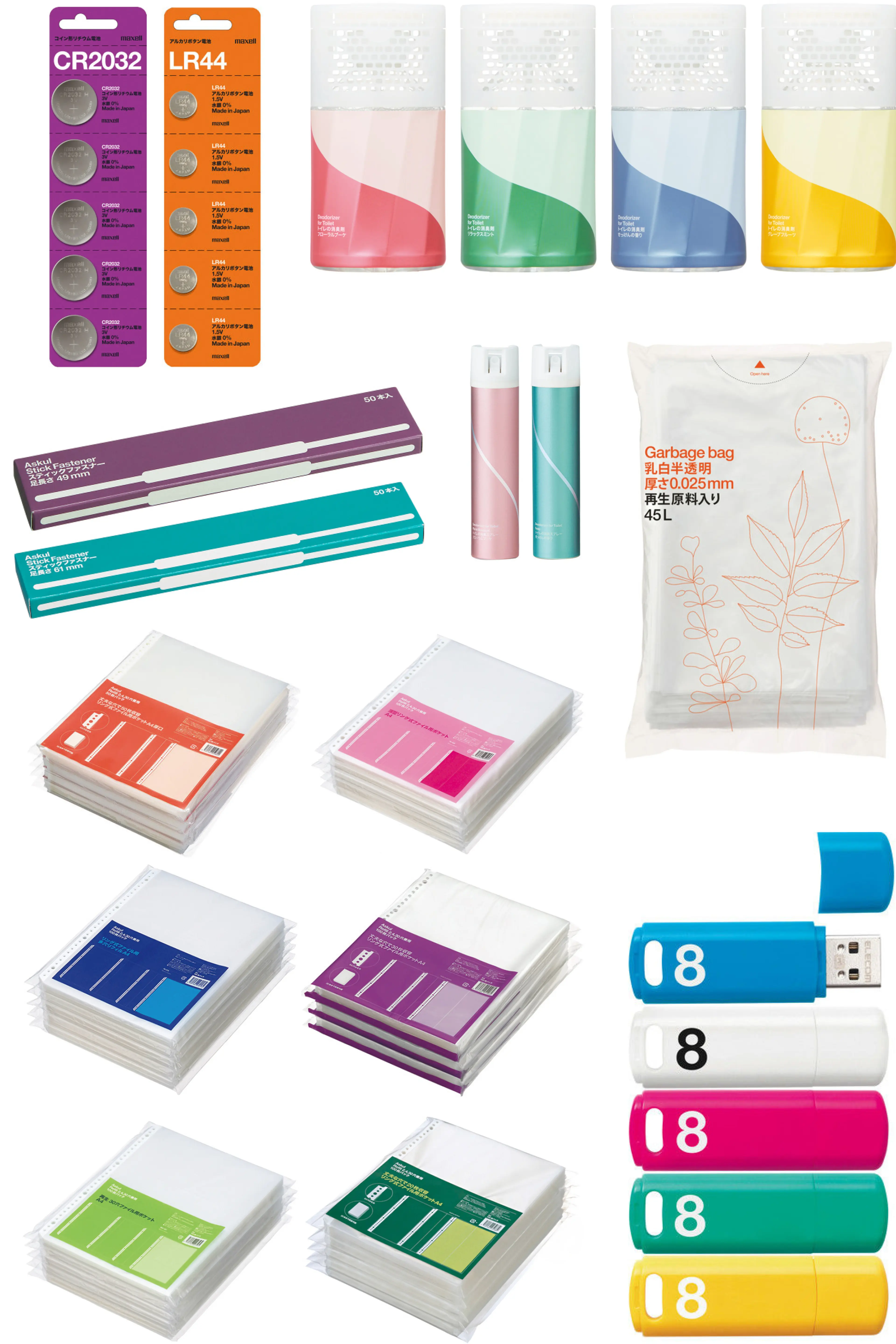
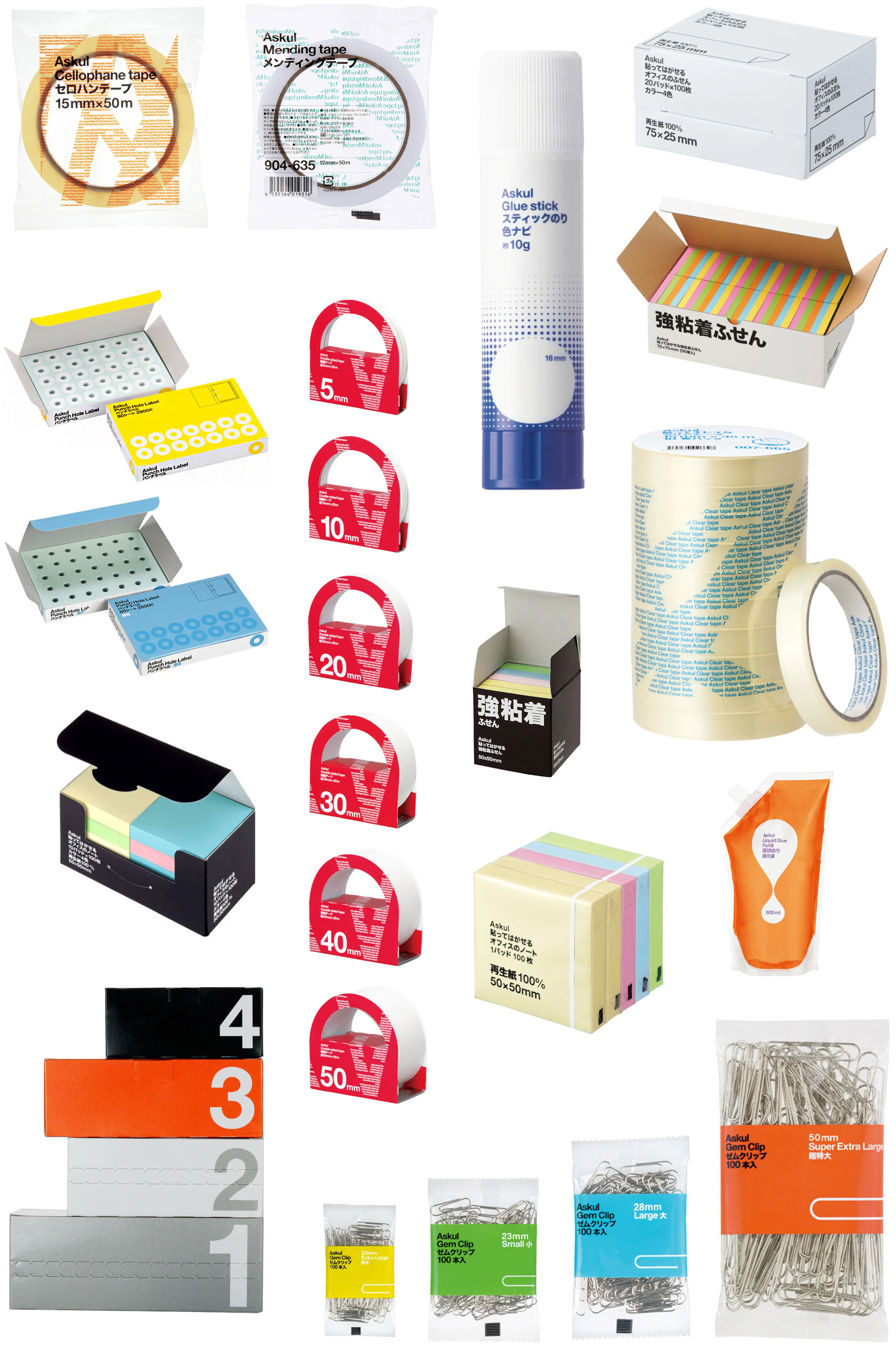
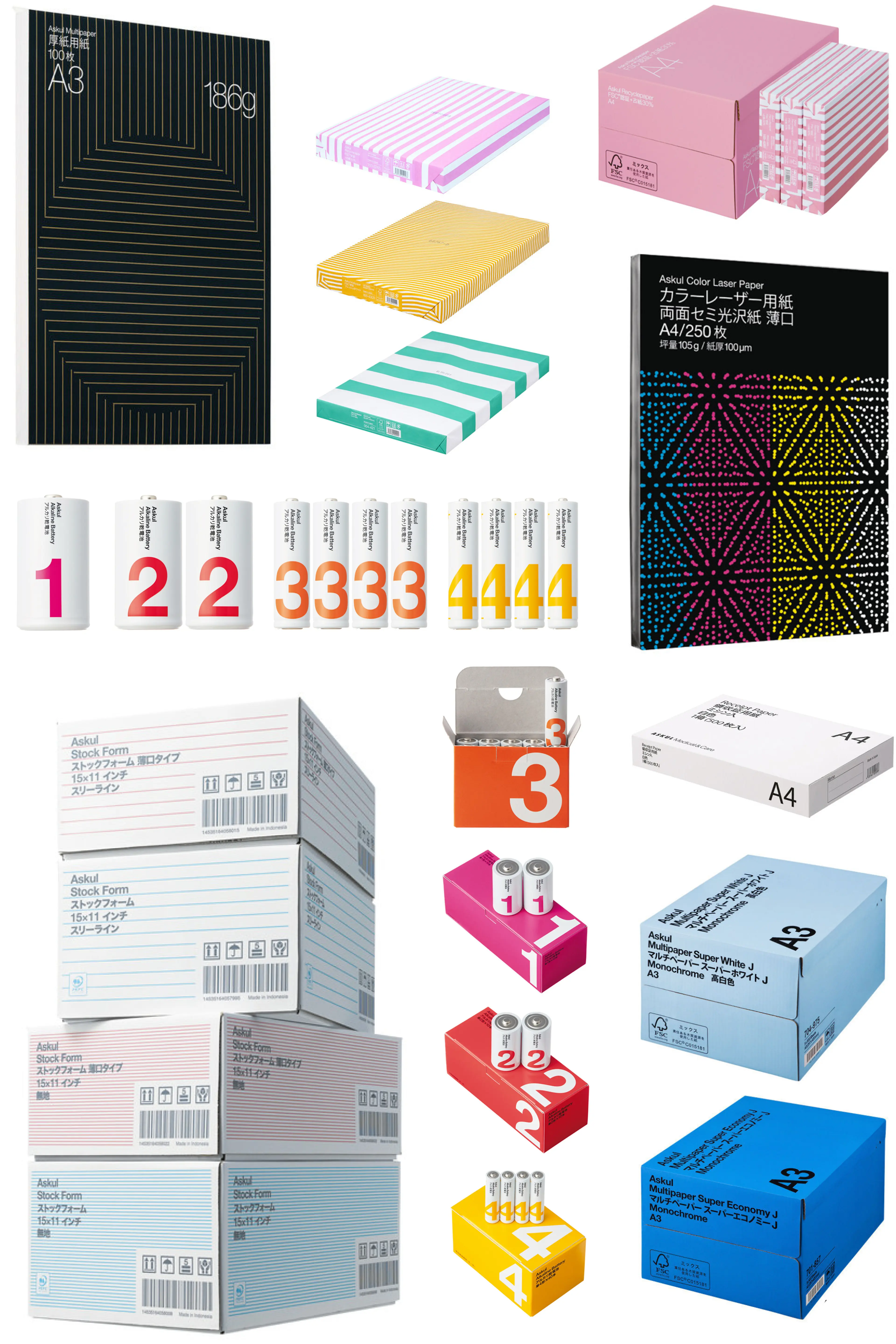
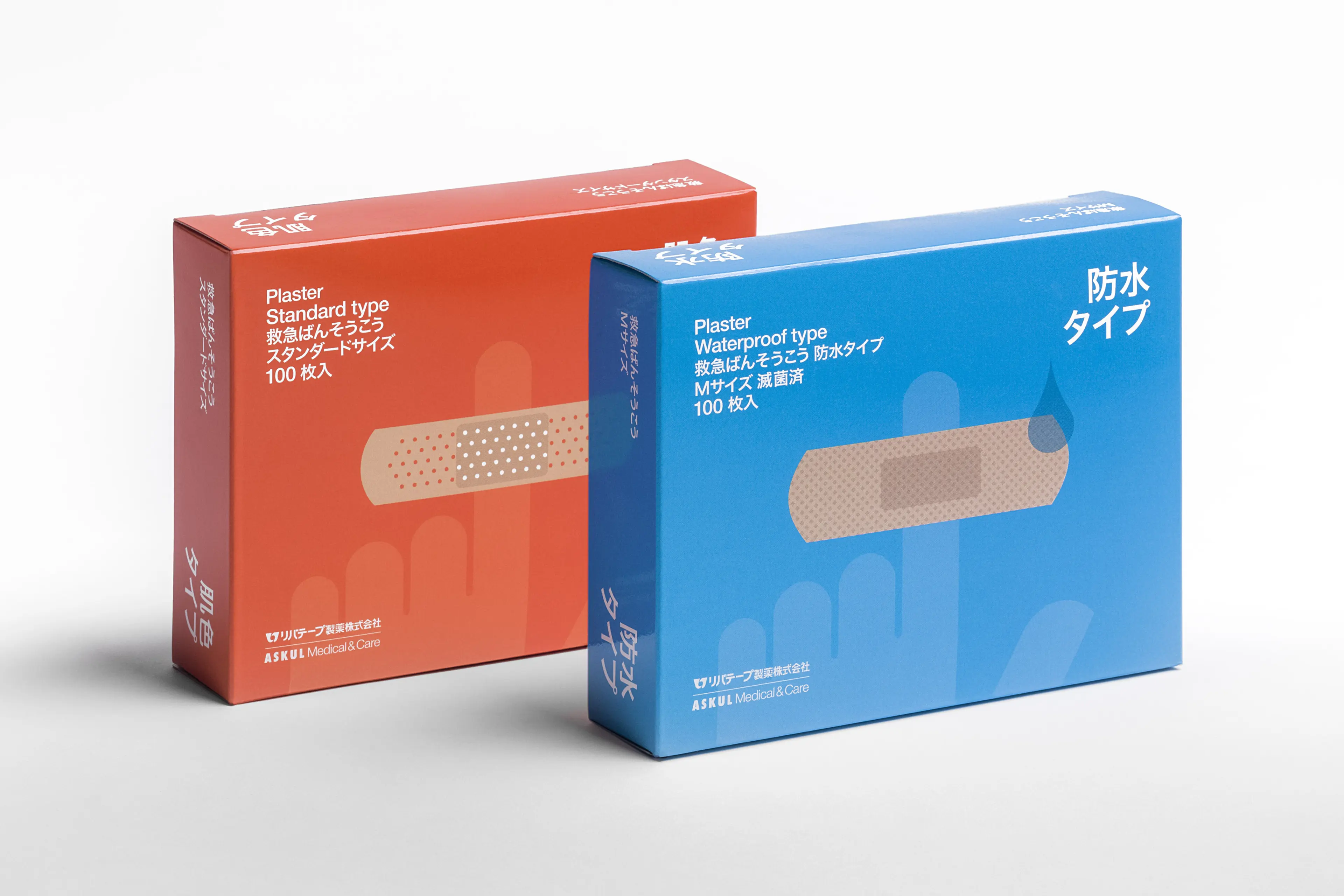
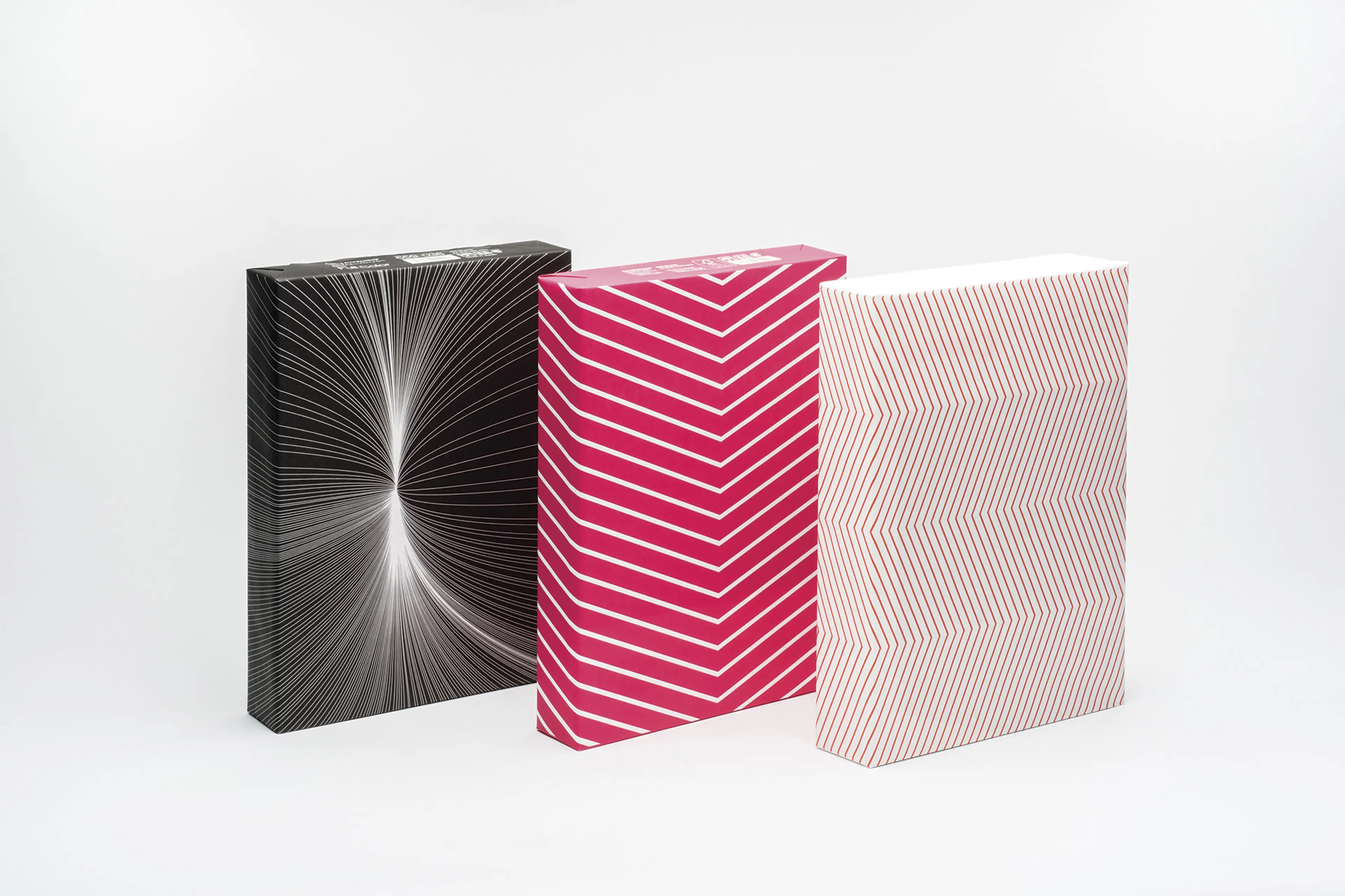
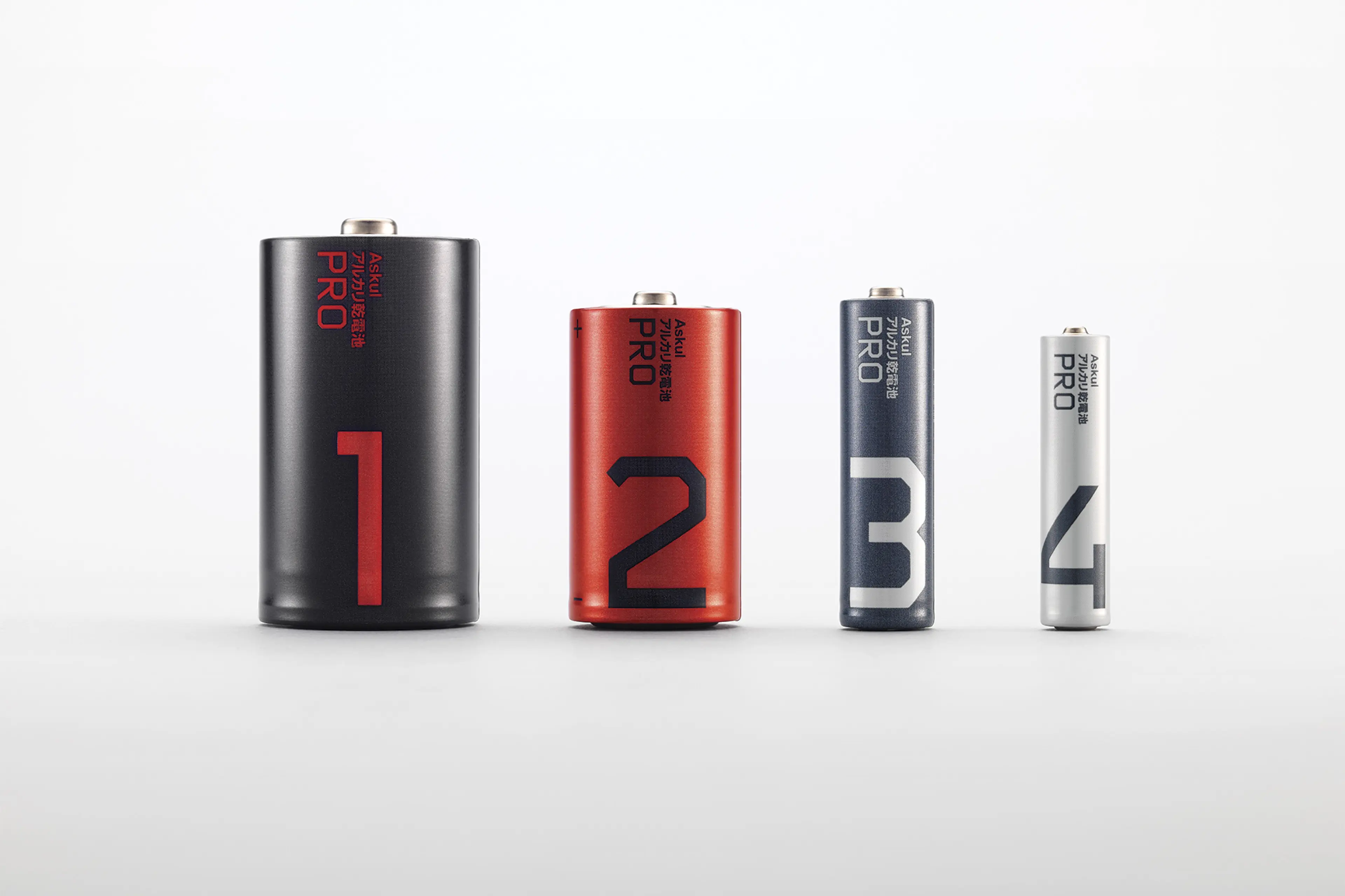
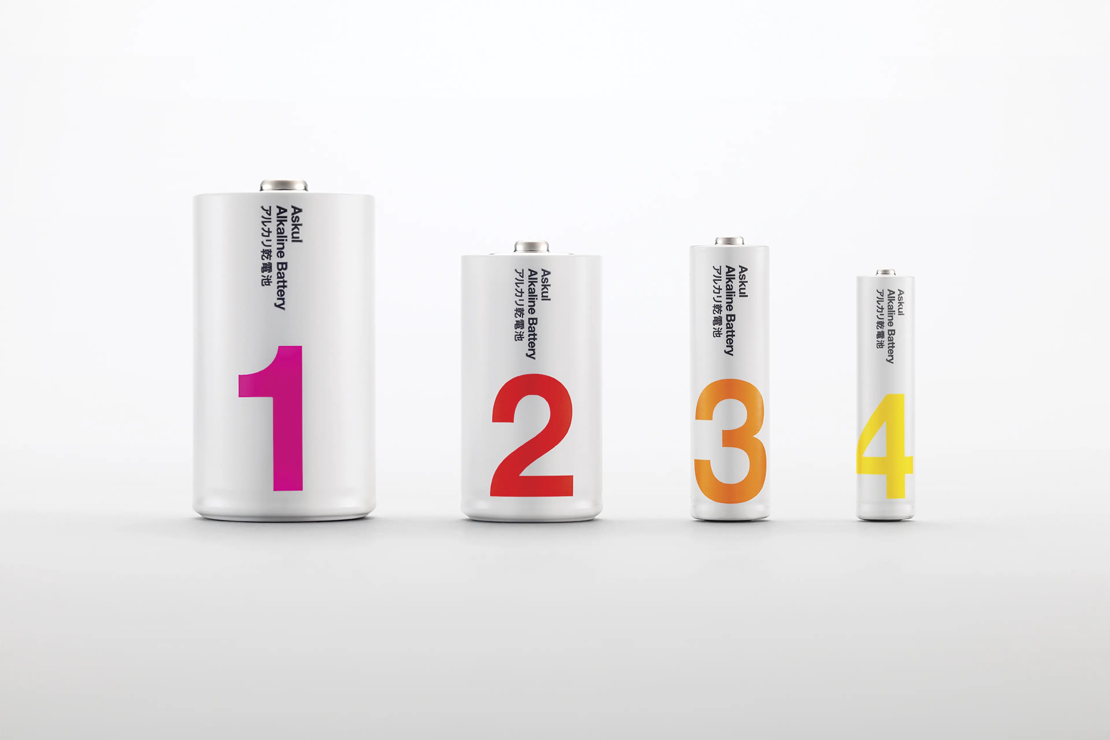
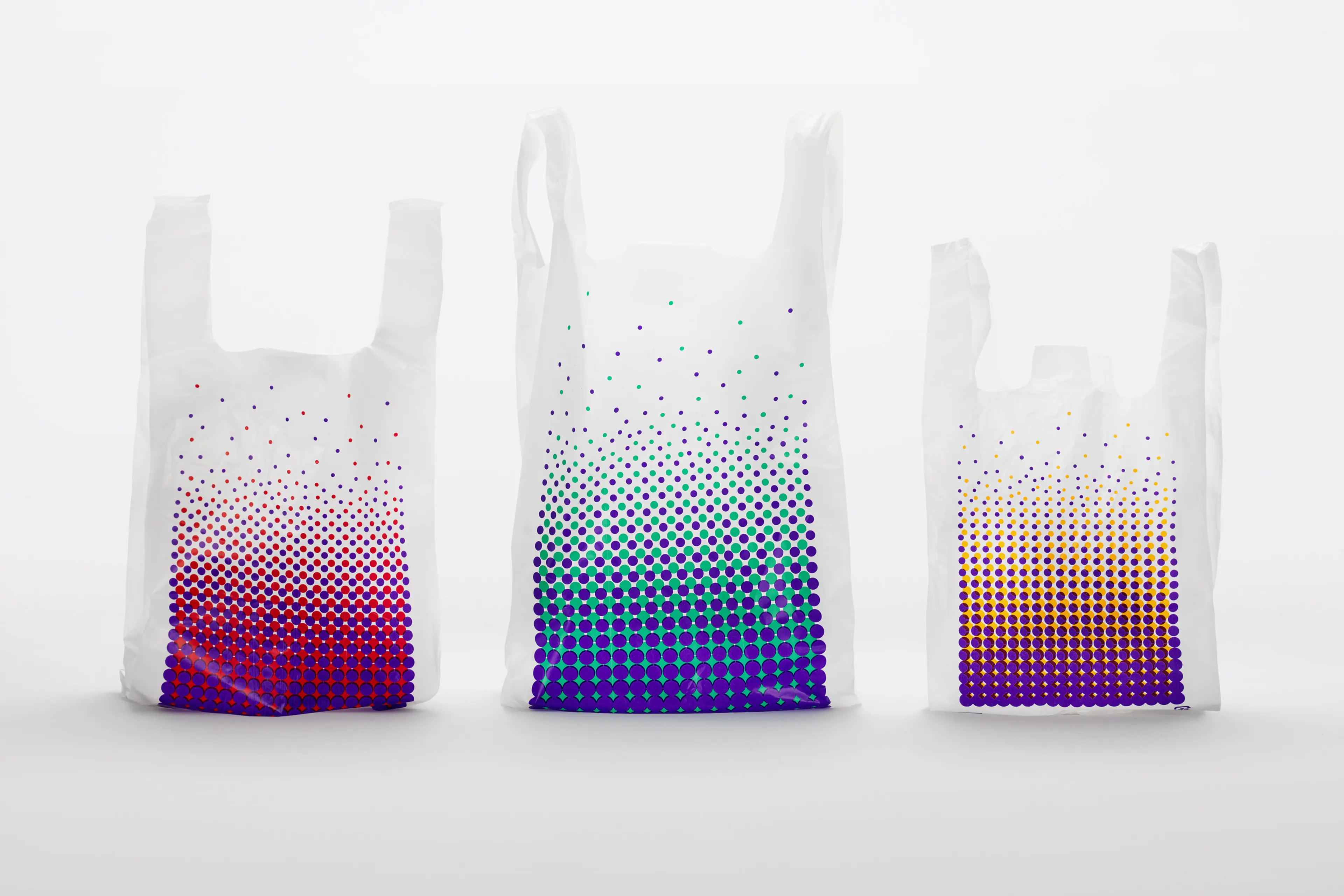
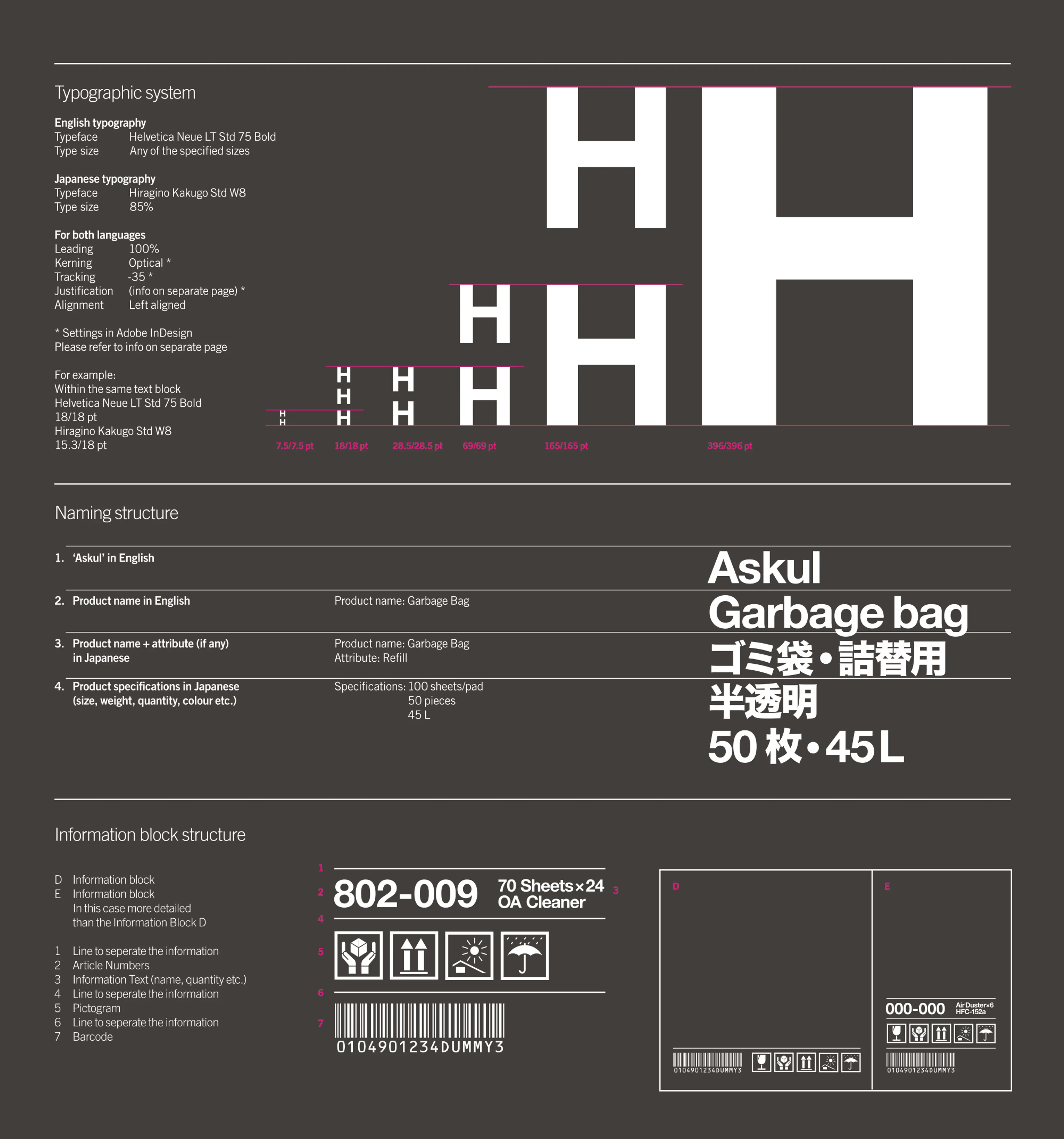
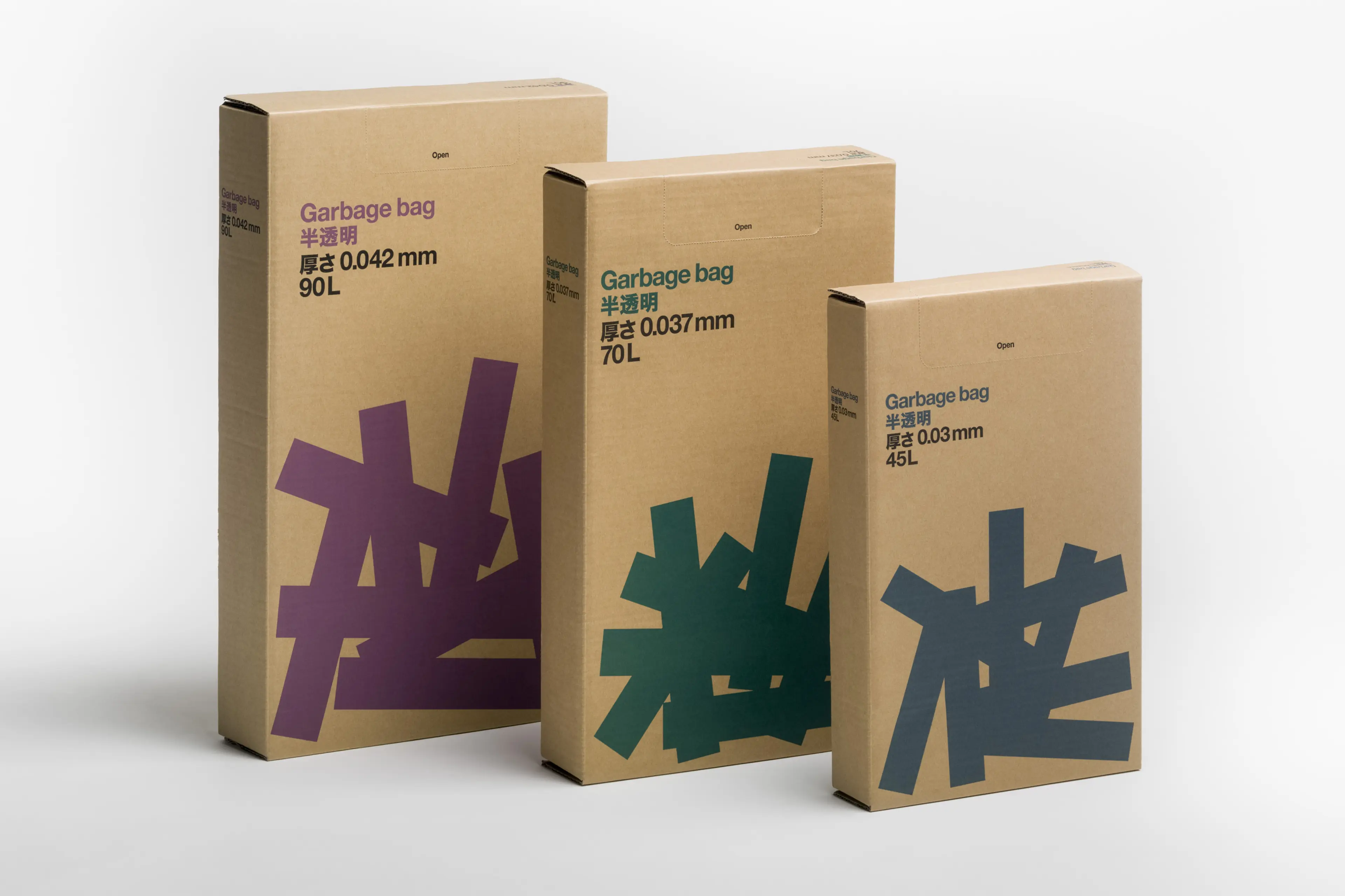
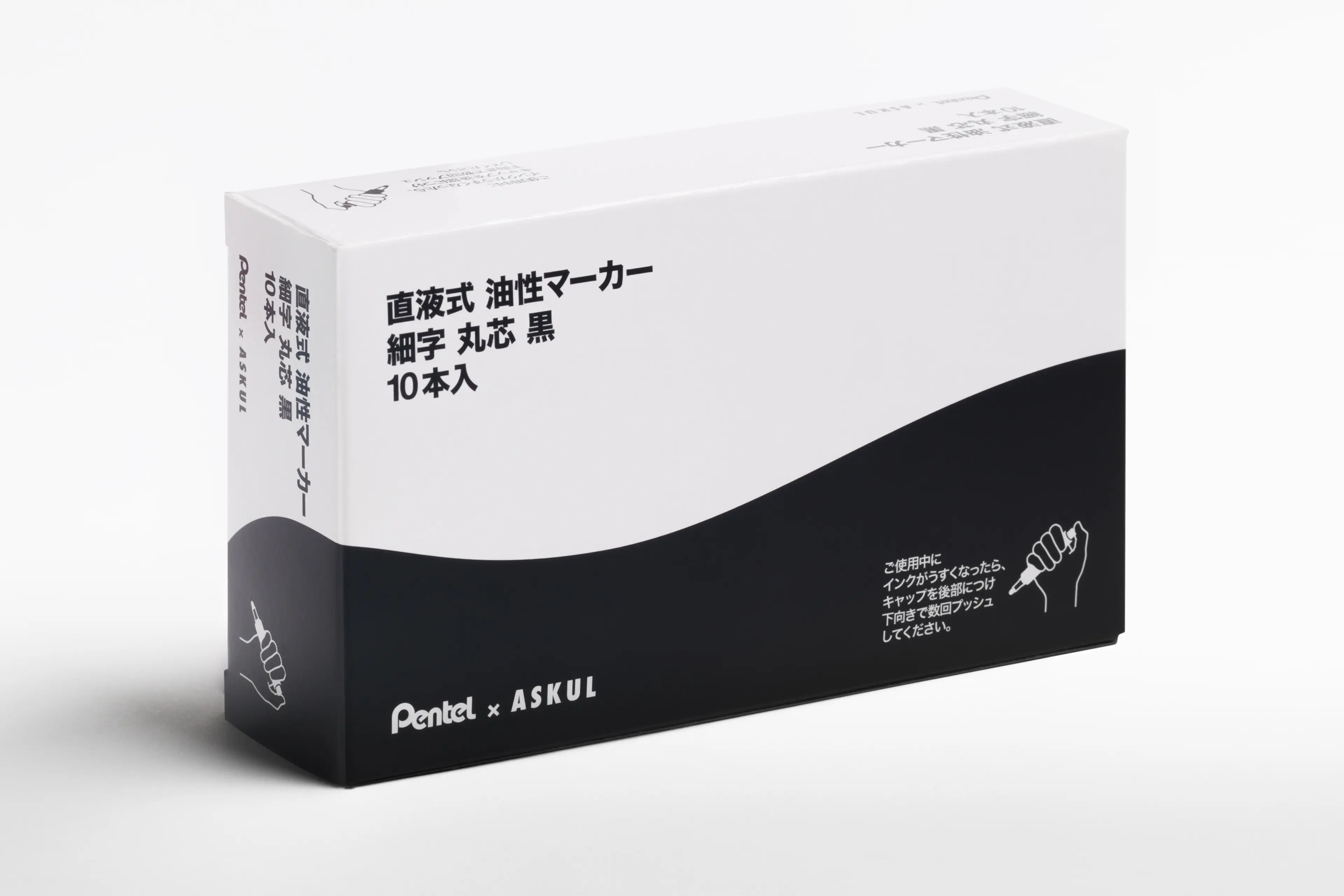
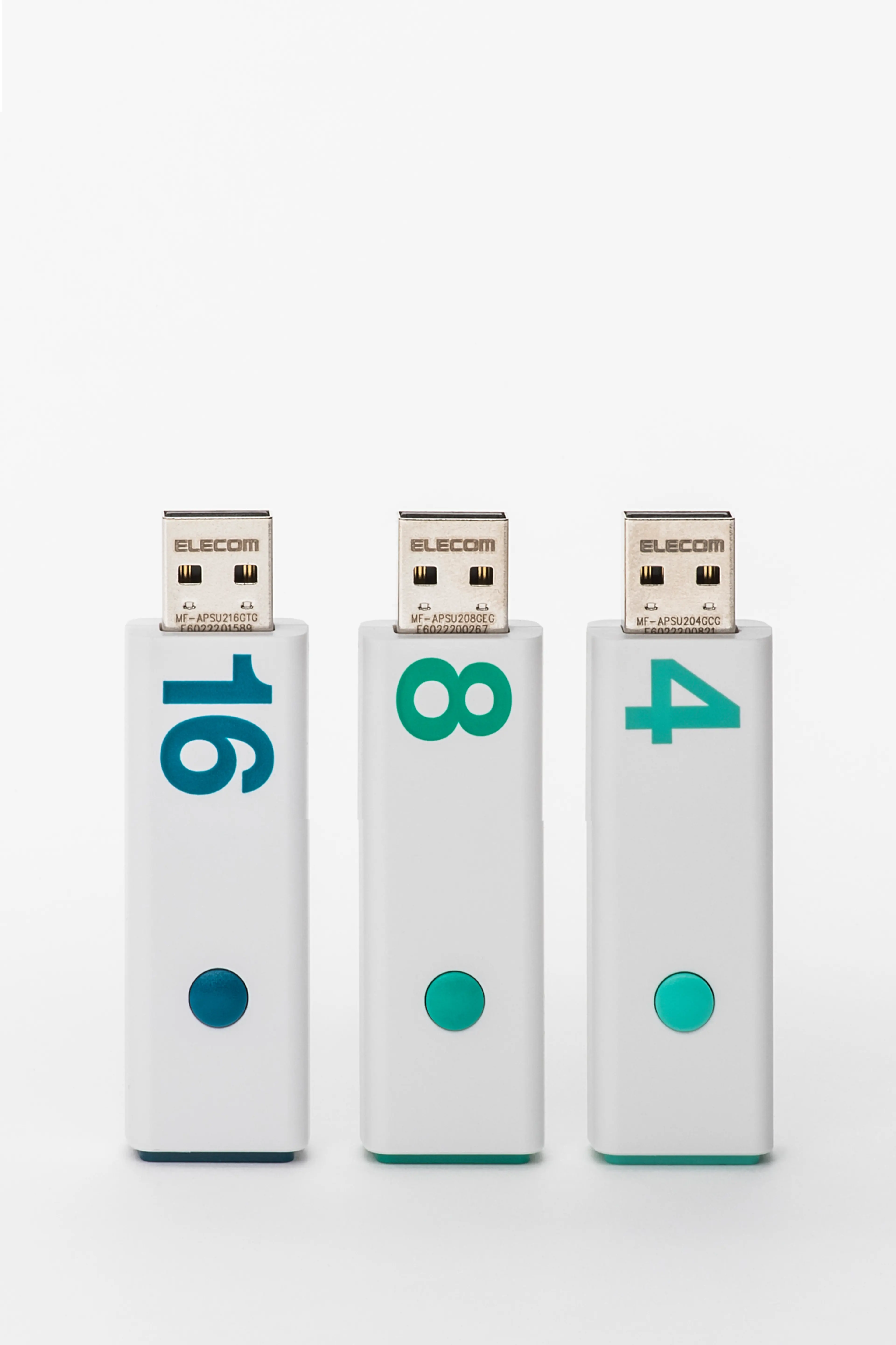
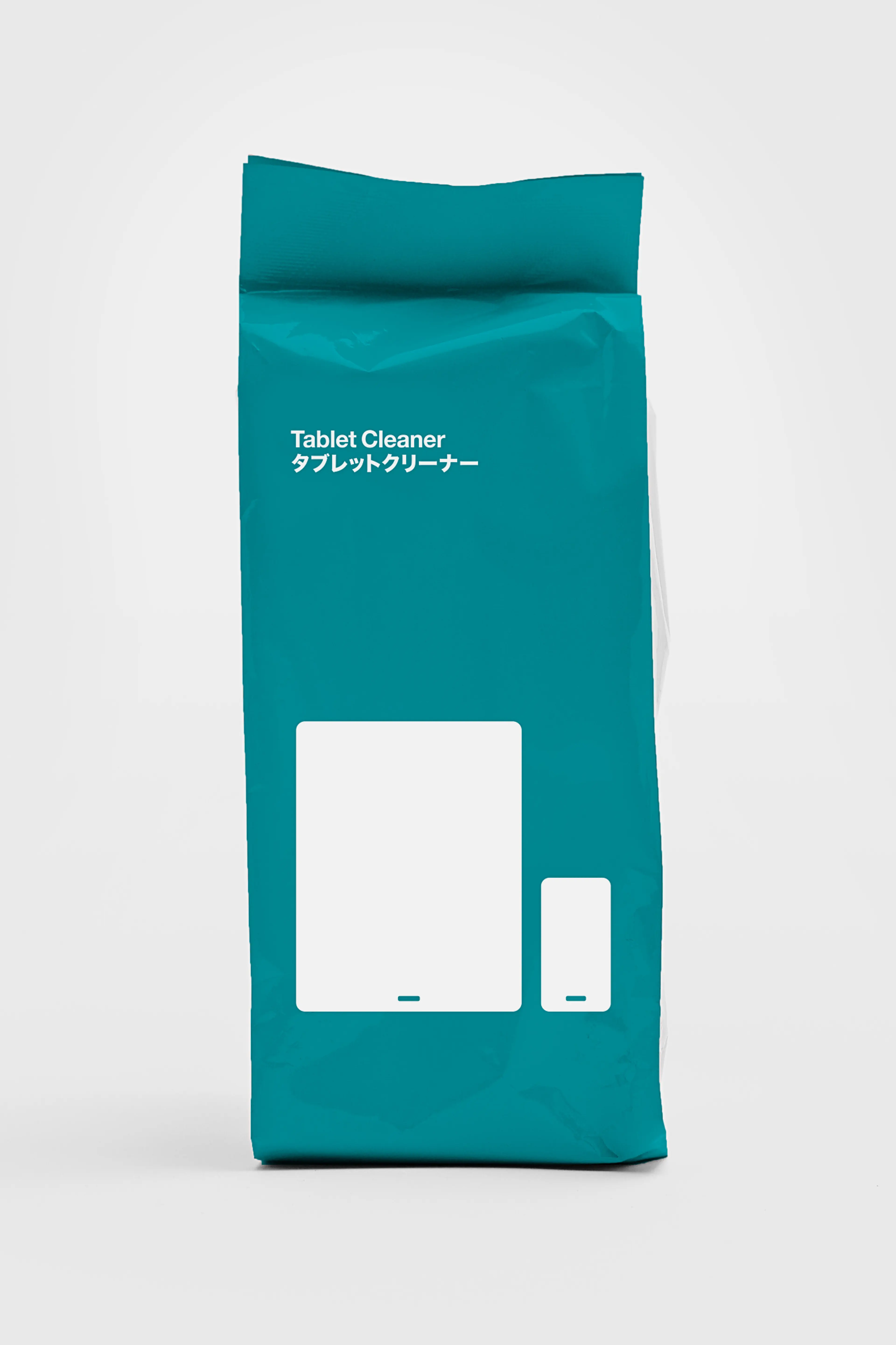
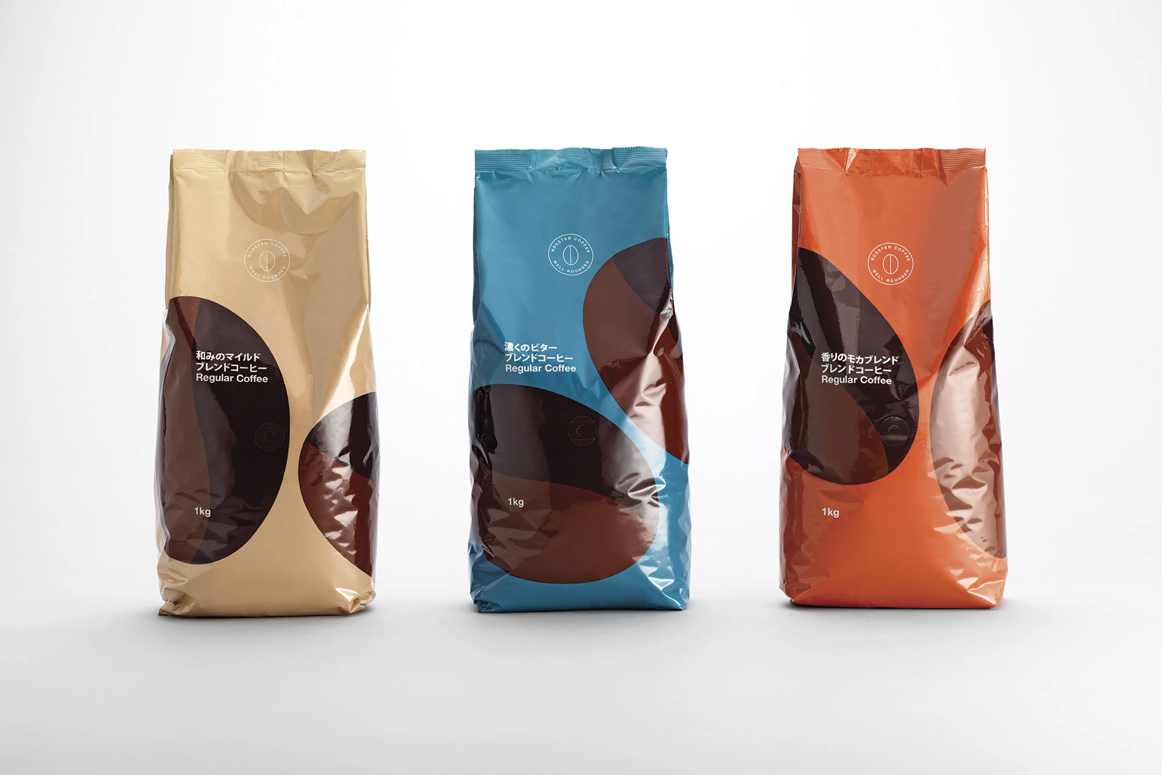
Working to an intense series of deadlines, across timezones and linguistic barriers, we introduced a system of packaging and product design that, in the context of the typical Askul catalogue or website page, was striking in its calm, stylish simplicity. Each item was reduced to its bare essentials: form and essential information. Helvetica type ranged left, solid colours, simple symbols and clear, bilingual labelling made products leap off the page. Silhouetted illustrations and patterns added a touch of quiet wit.
Result
Adding design to more than 1000 commodity products – where people least expect it – has won attention for Askul across the world, boosted brand equity and brightened life in offices across Japan. The most mundane of products has become something new and fun – desirable, even. And we never knew a set of batteries could be blogged-about so much. More than 230 million battery sales since we got involved, the Askul brand going stronger than ever.
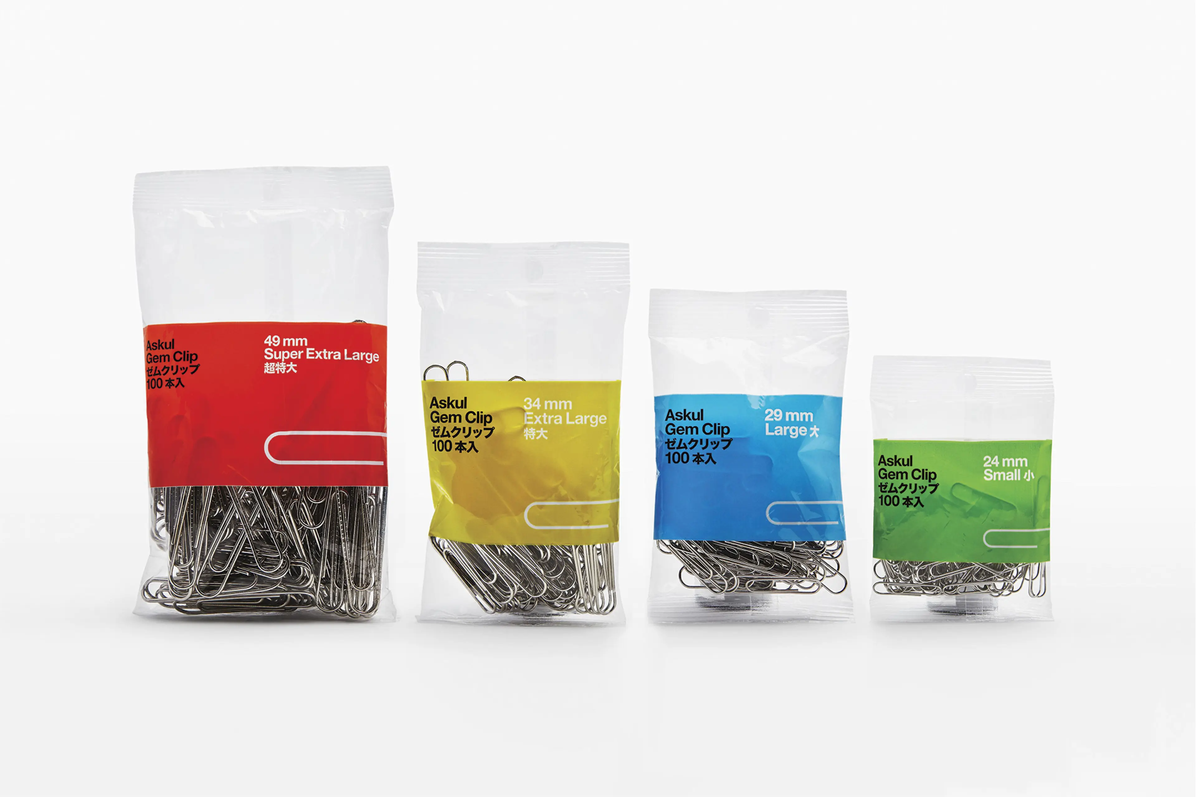
With clarity and elegance, a simplistic visual language makes Askuls own products both visible and desirable in the cluttered contexts where they compete with external brands.


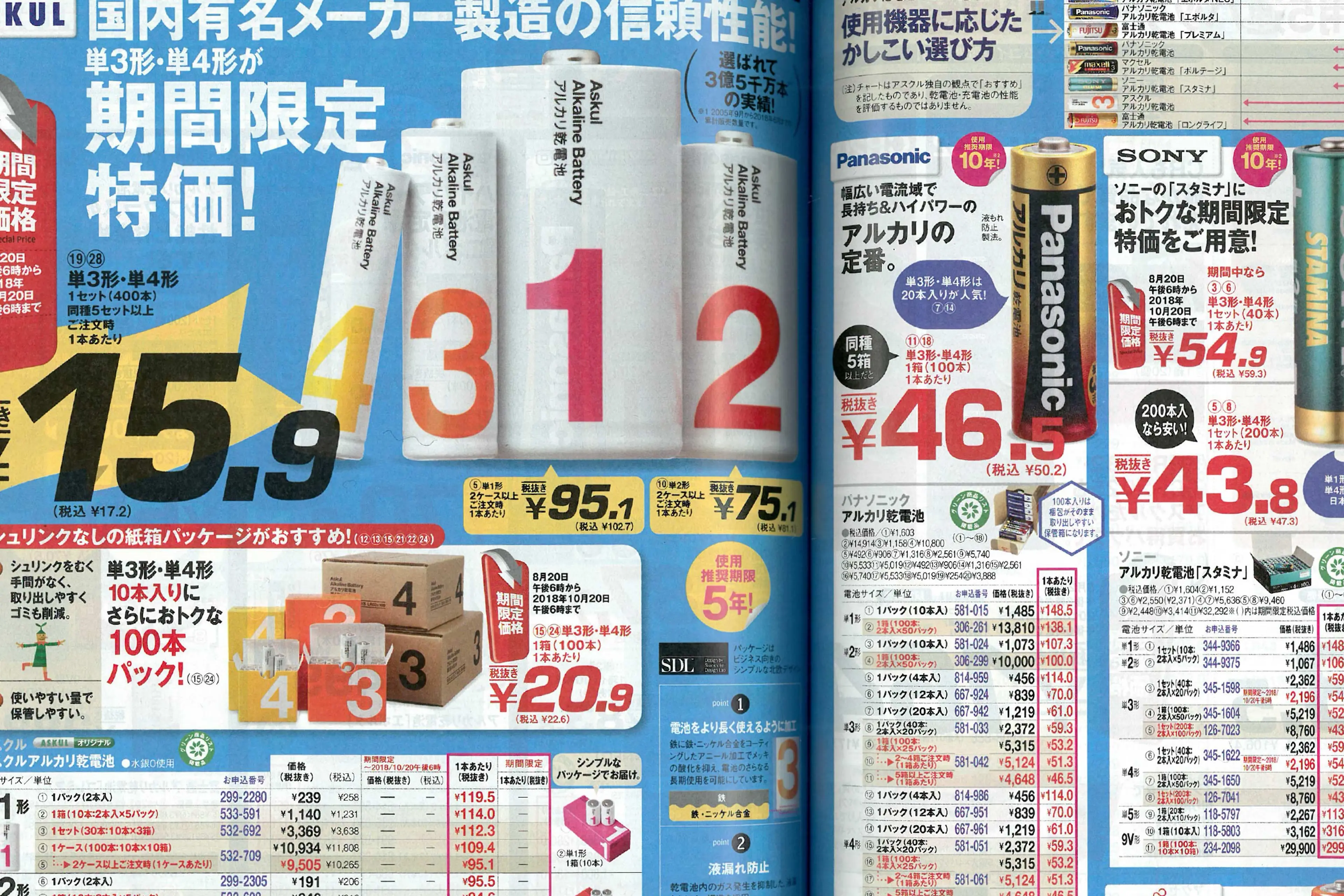
Excerpt from the Askul catalog.
A typographic system ensures coherence throughout the vast range of products and enables quick and easy creation of packaging for new products.
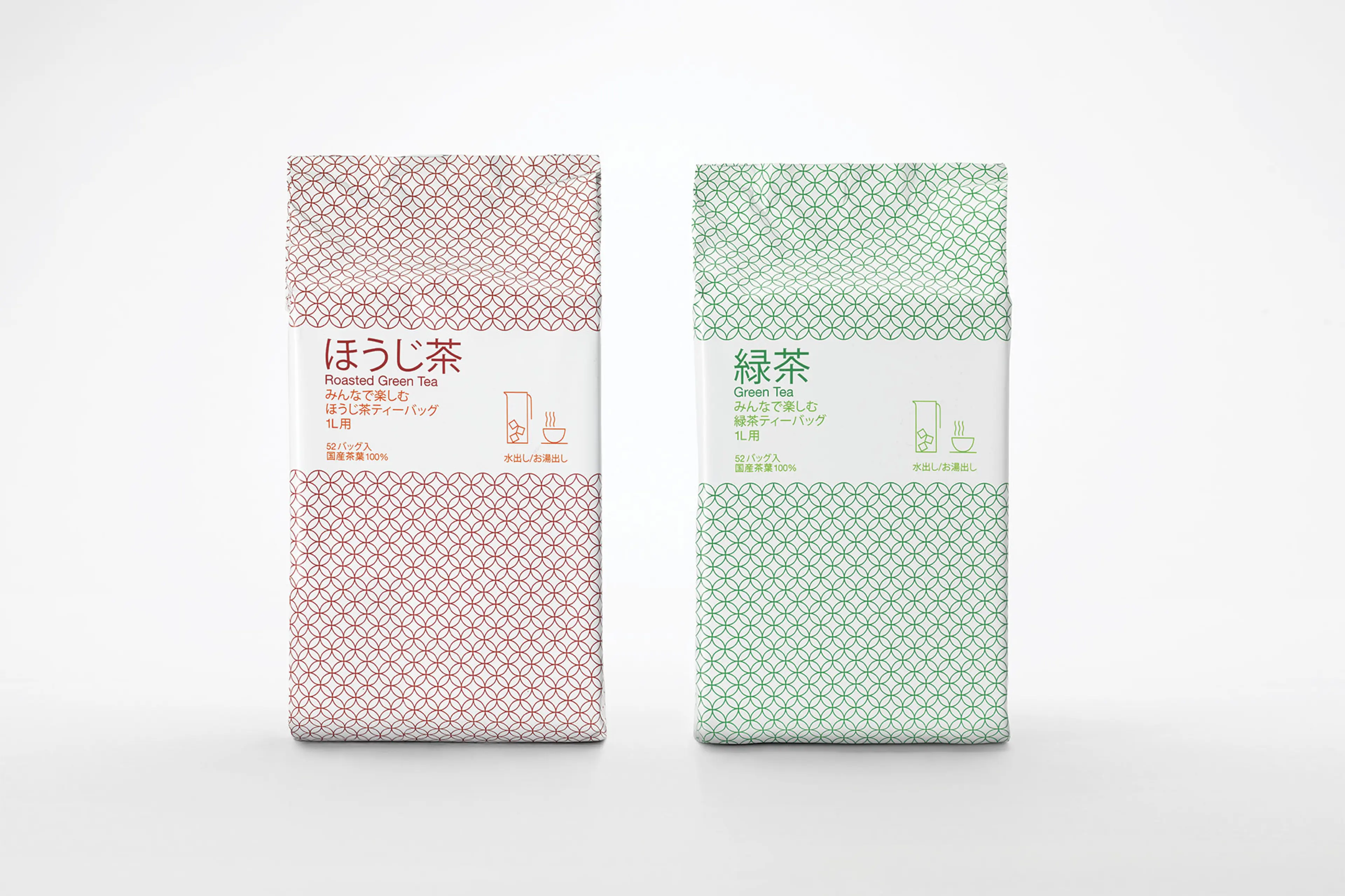
Adding design to more than 200 commodity products – where people least expect it – has won attention for Askul across the world, boosted brand equity and brightened life in offices across Japan.
