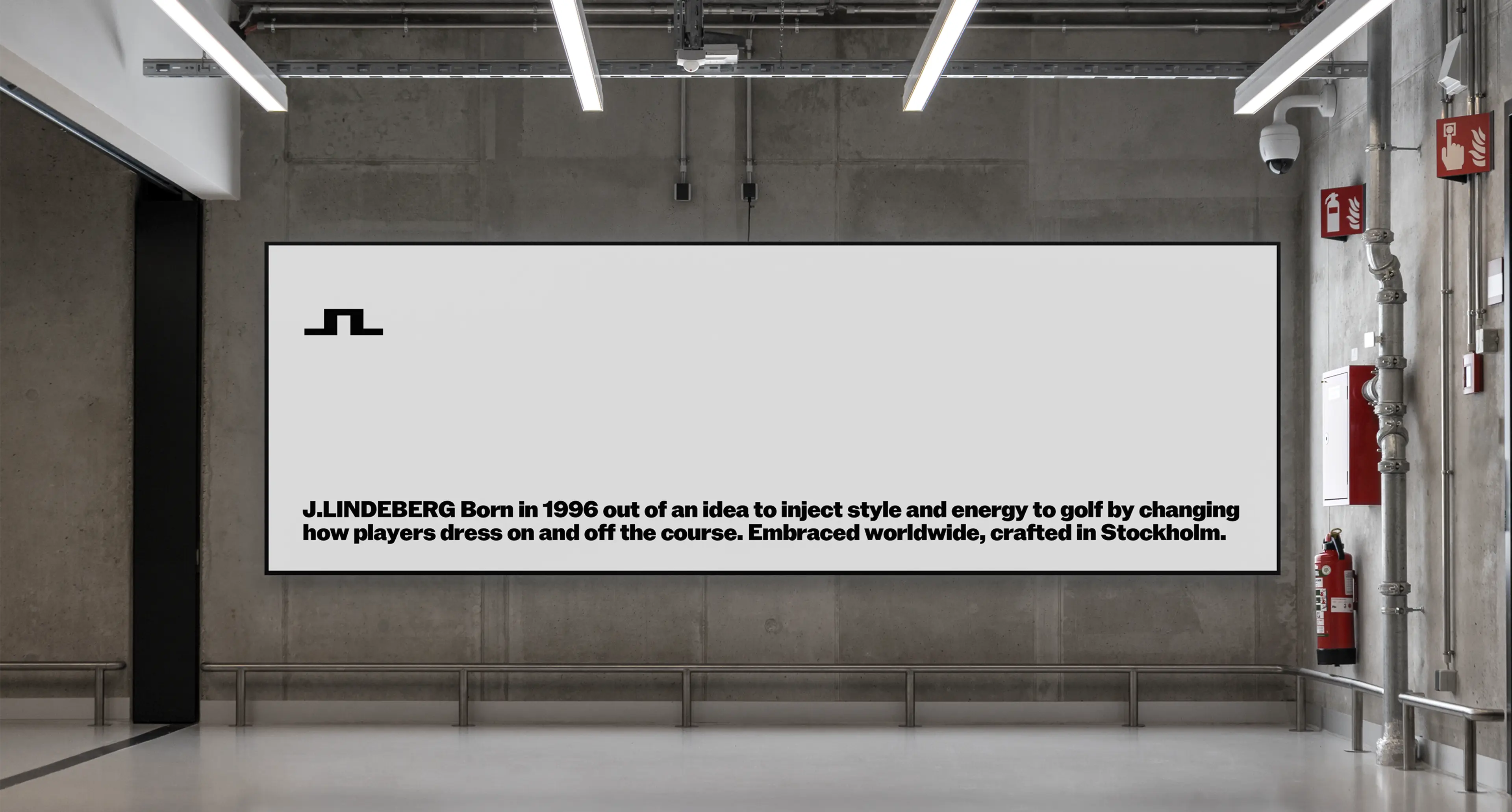
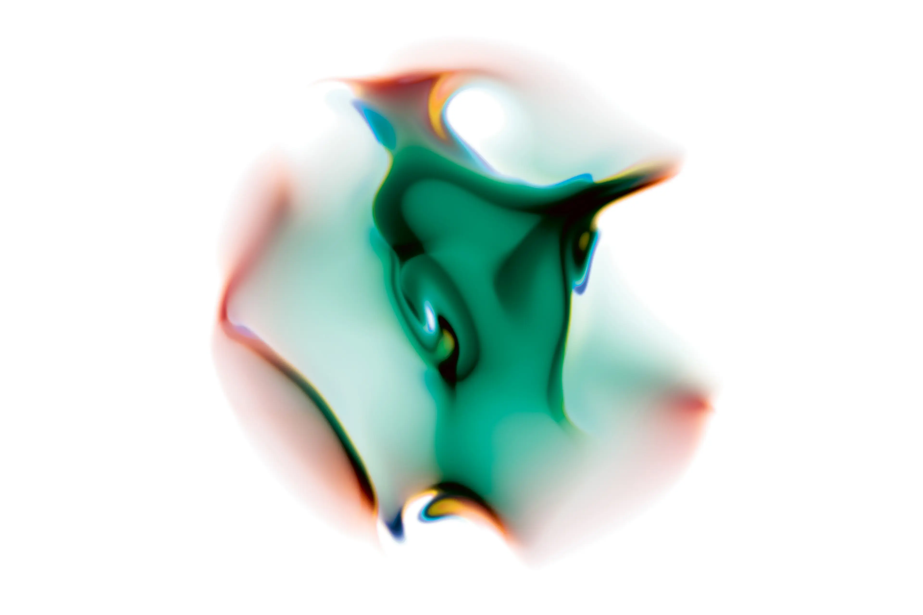
At the heart of J.Lindeberg, founded in 1996, lies a bold contradiction — the refined world of fashion and the raw pulse of sport. These two forces, distinct yet inseparable, carries a tension that allow for something electric to happen.
J.Lindeberg reached out to SDL to shape a new direction for the brand and we set out to explore that in-between space — where structure meets spontaneity, where elegance collides with energy. By embracing contrast and juxtaposition, we unlocked a new kind of expression: one that is fearless, playful, and unapologetically confident in equal measures.
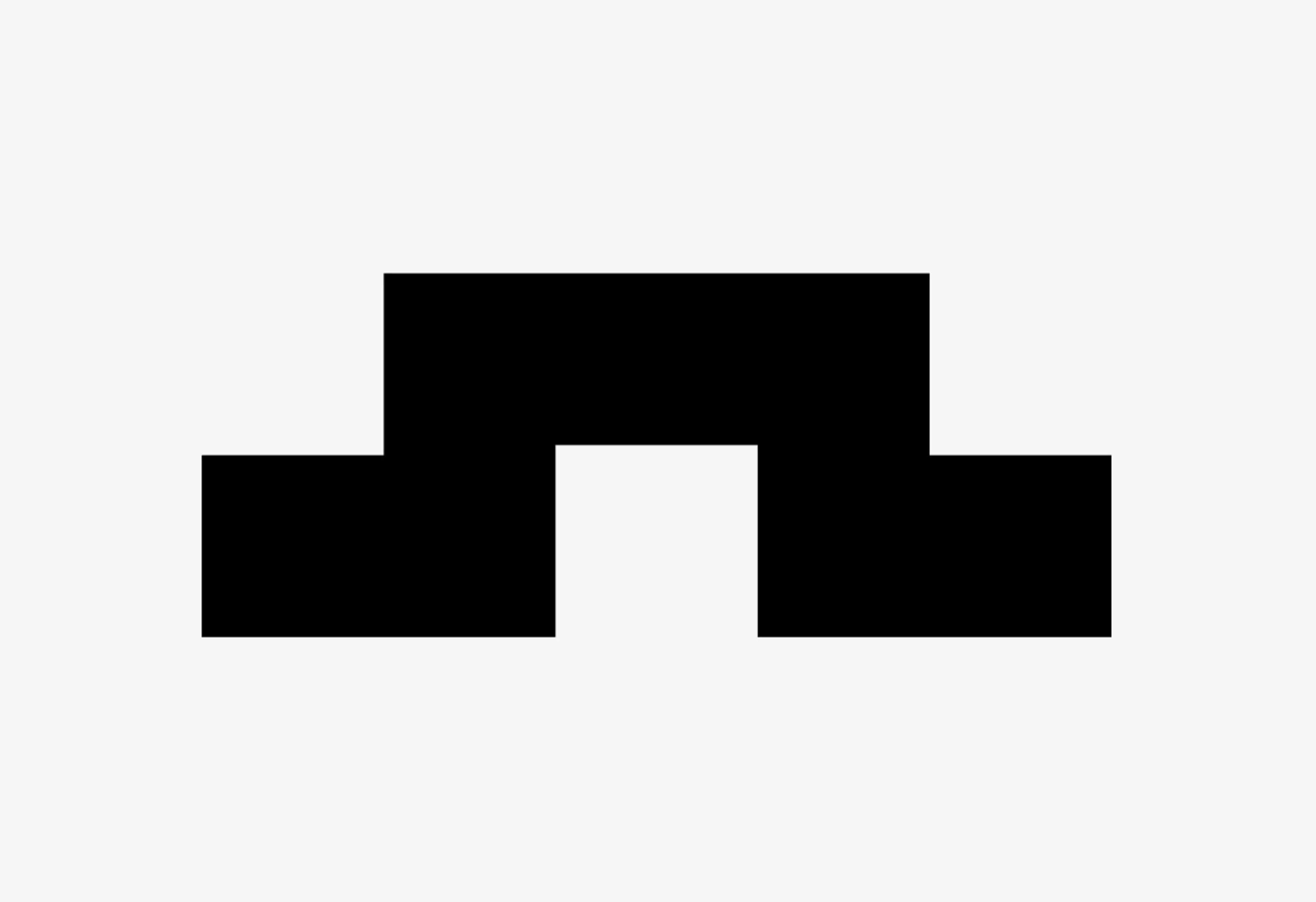
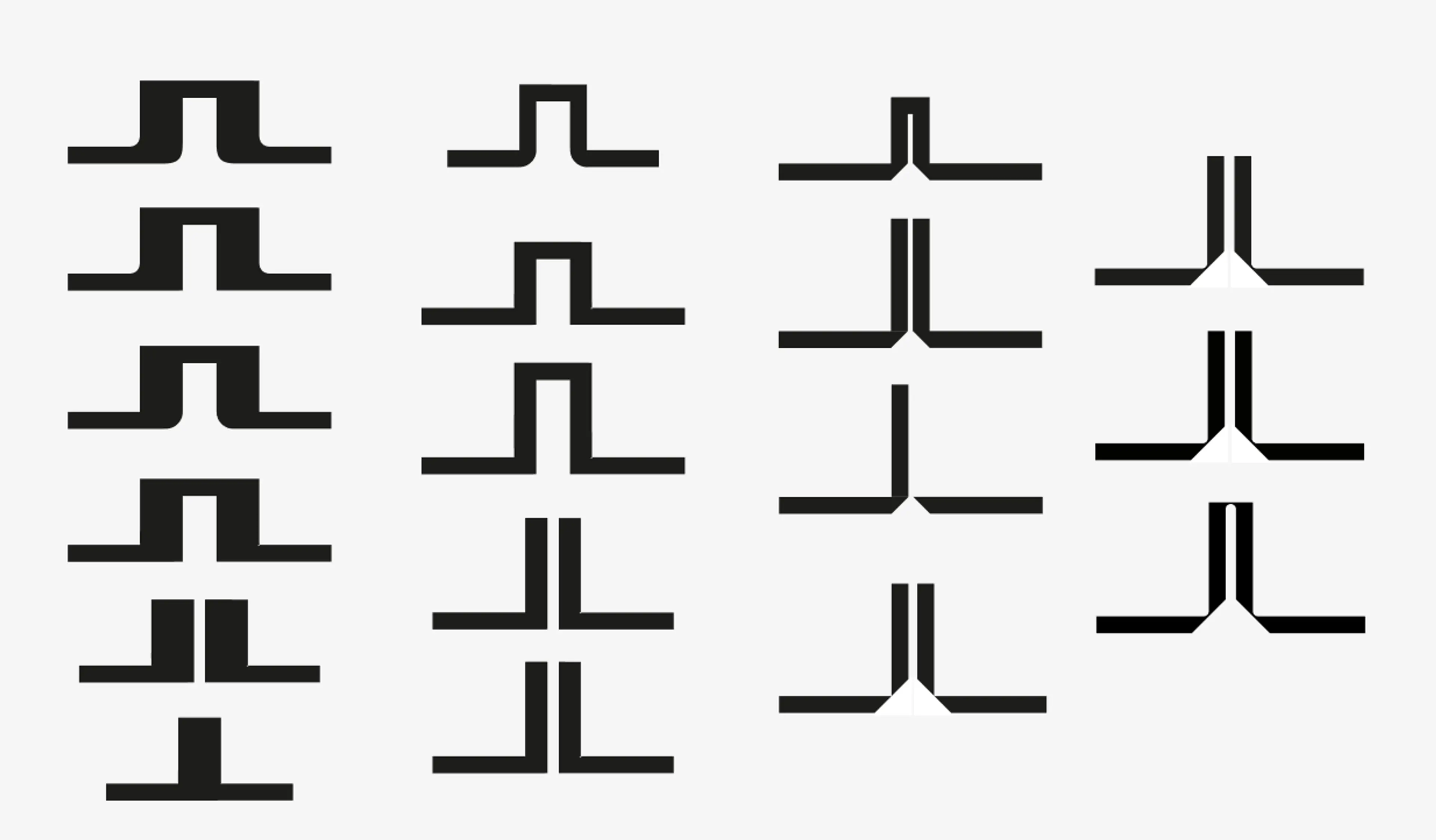
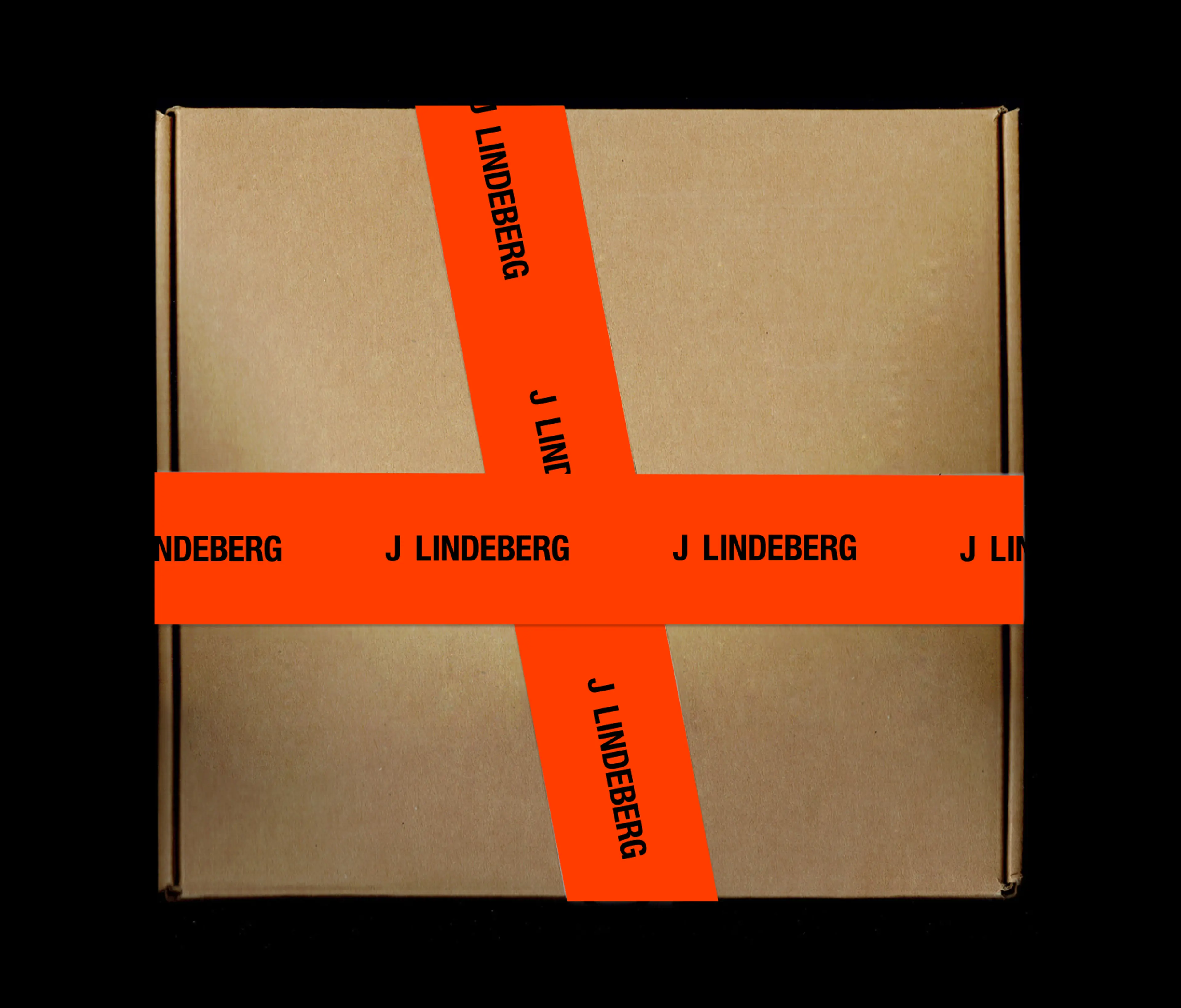
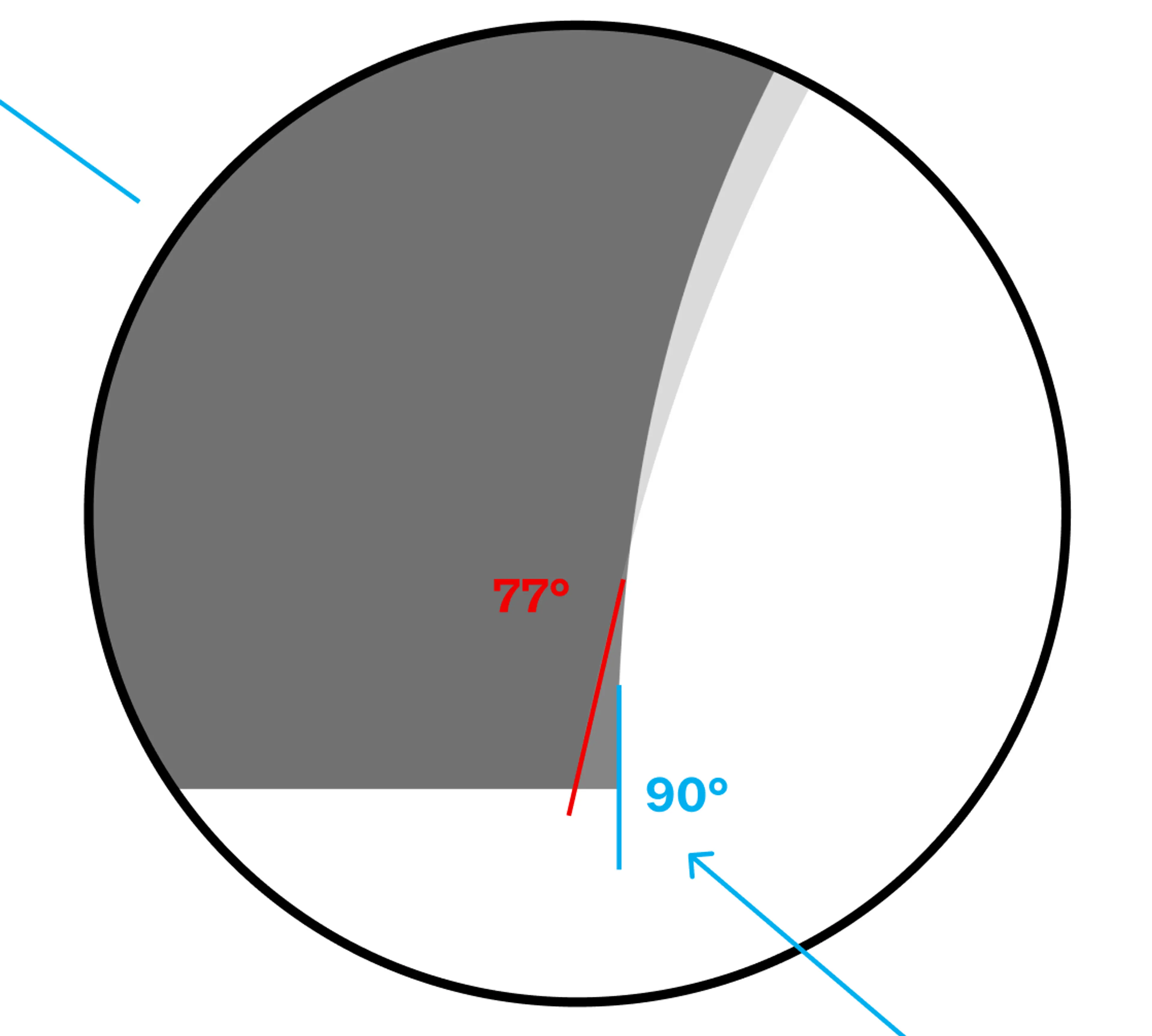
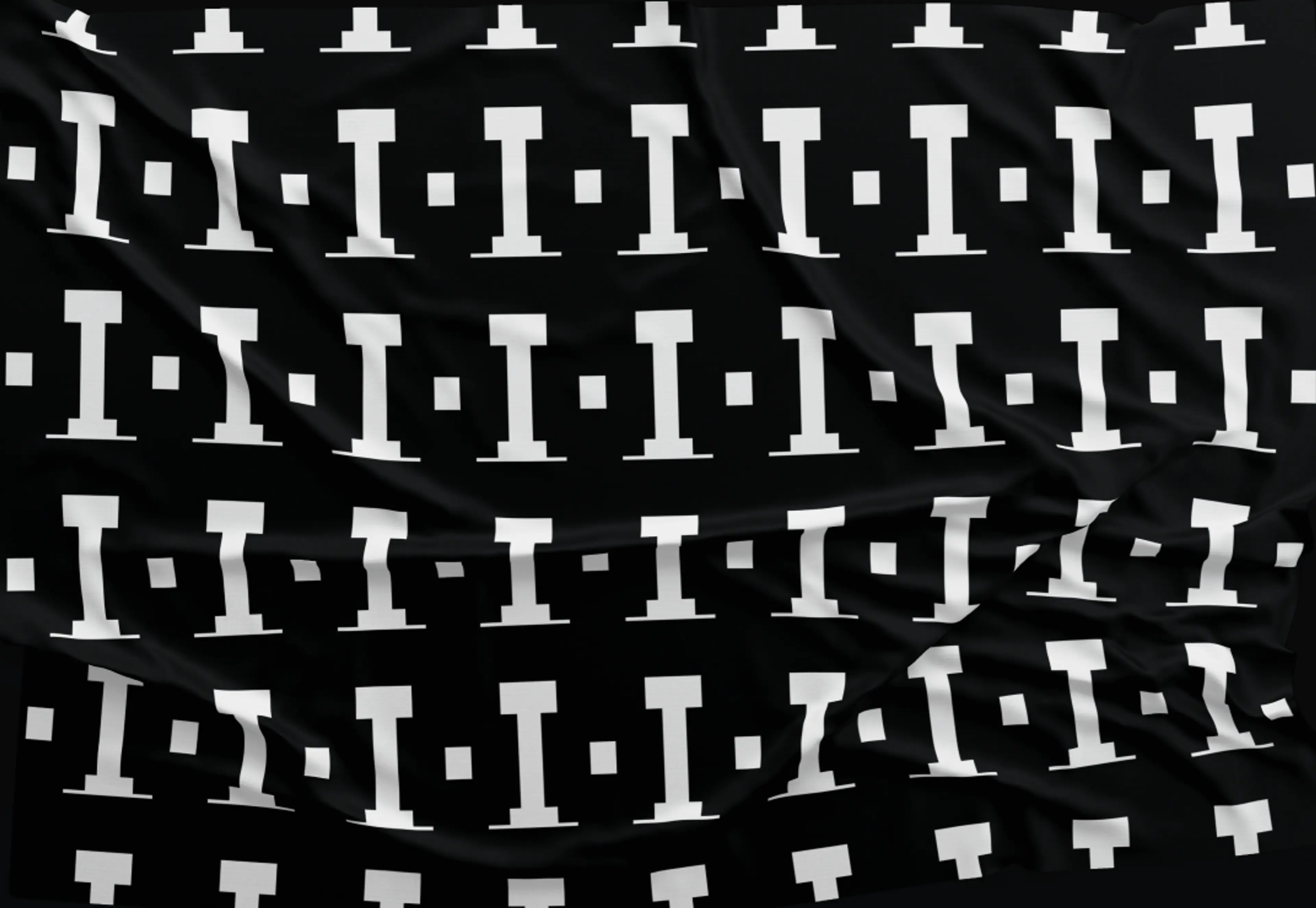
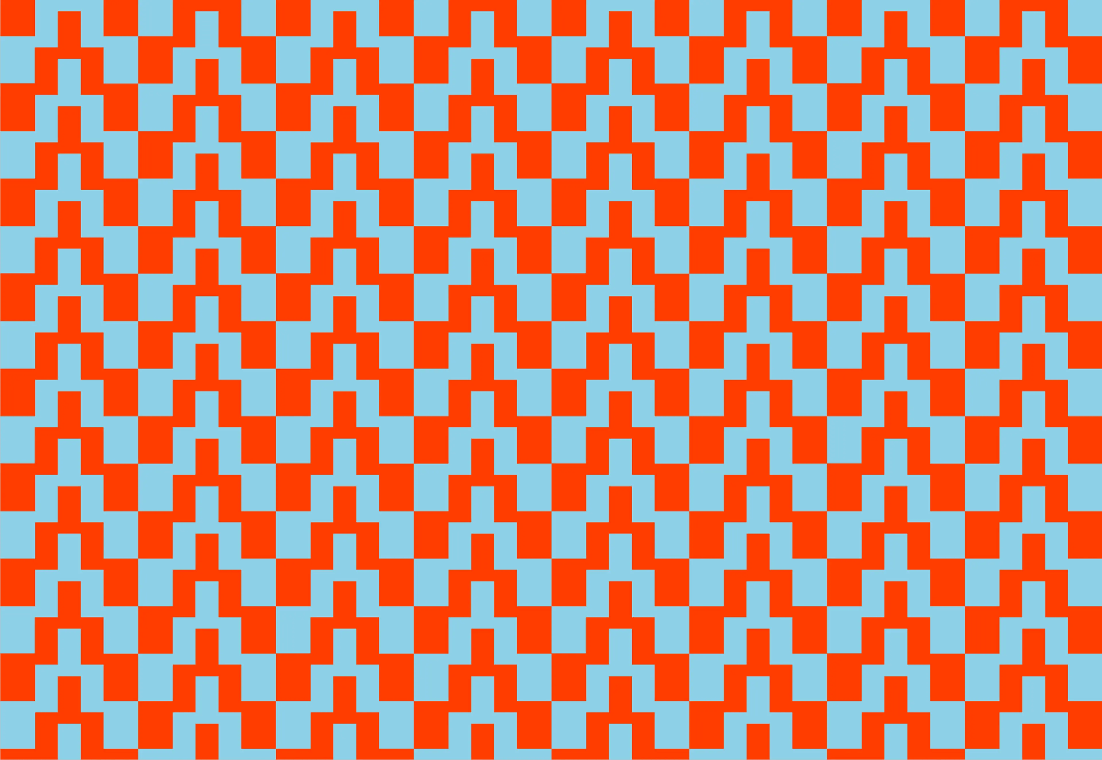
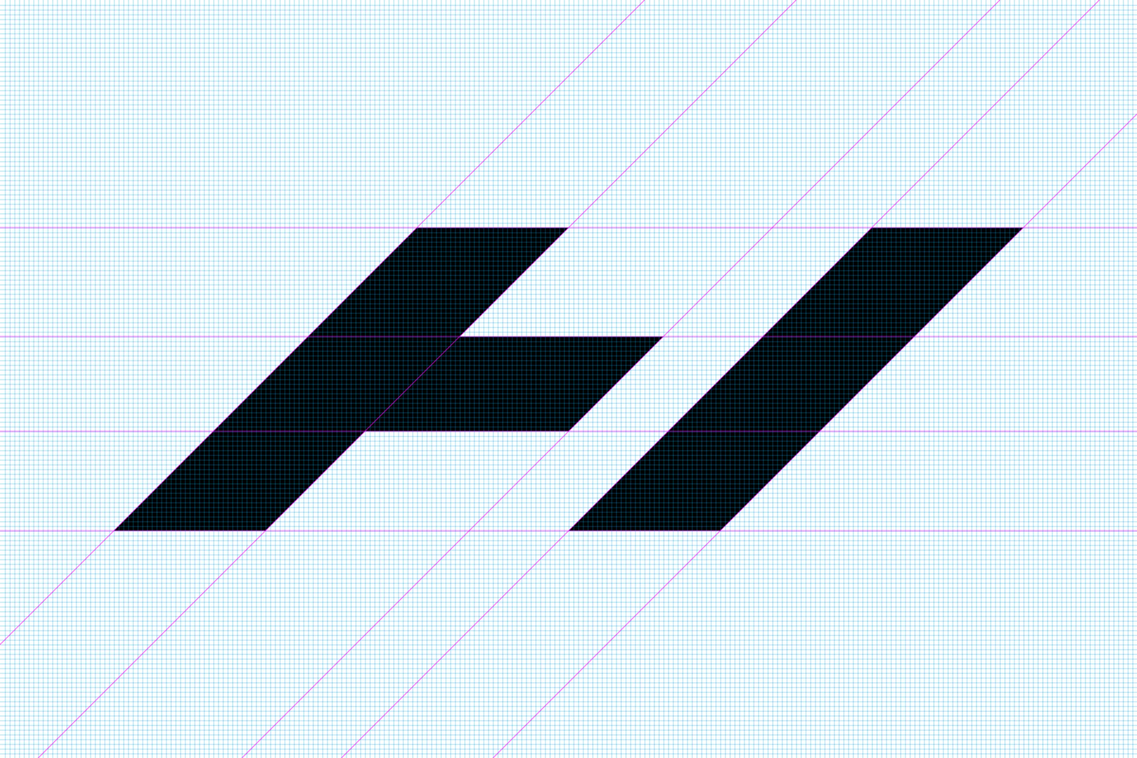
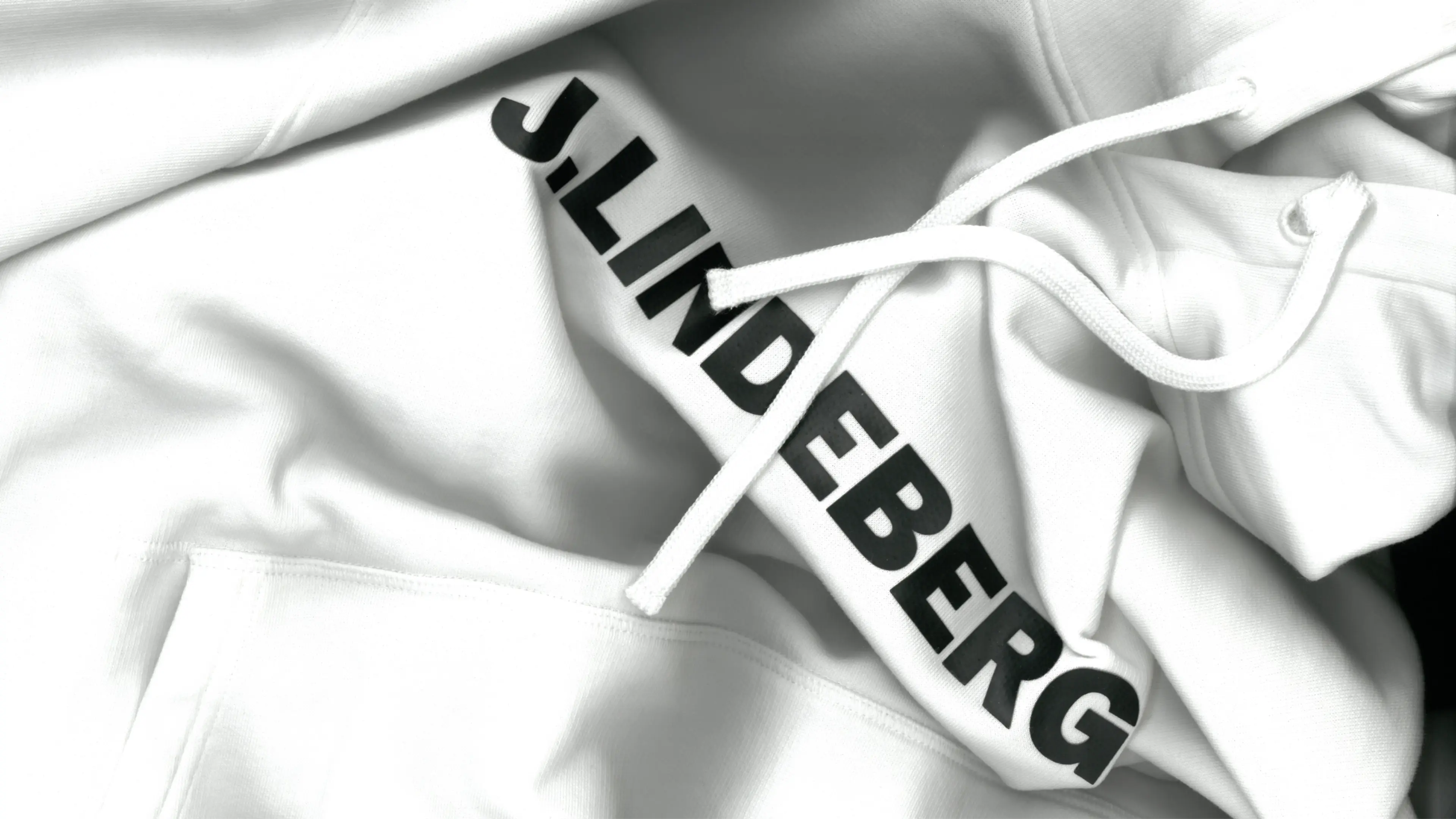
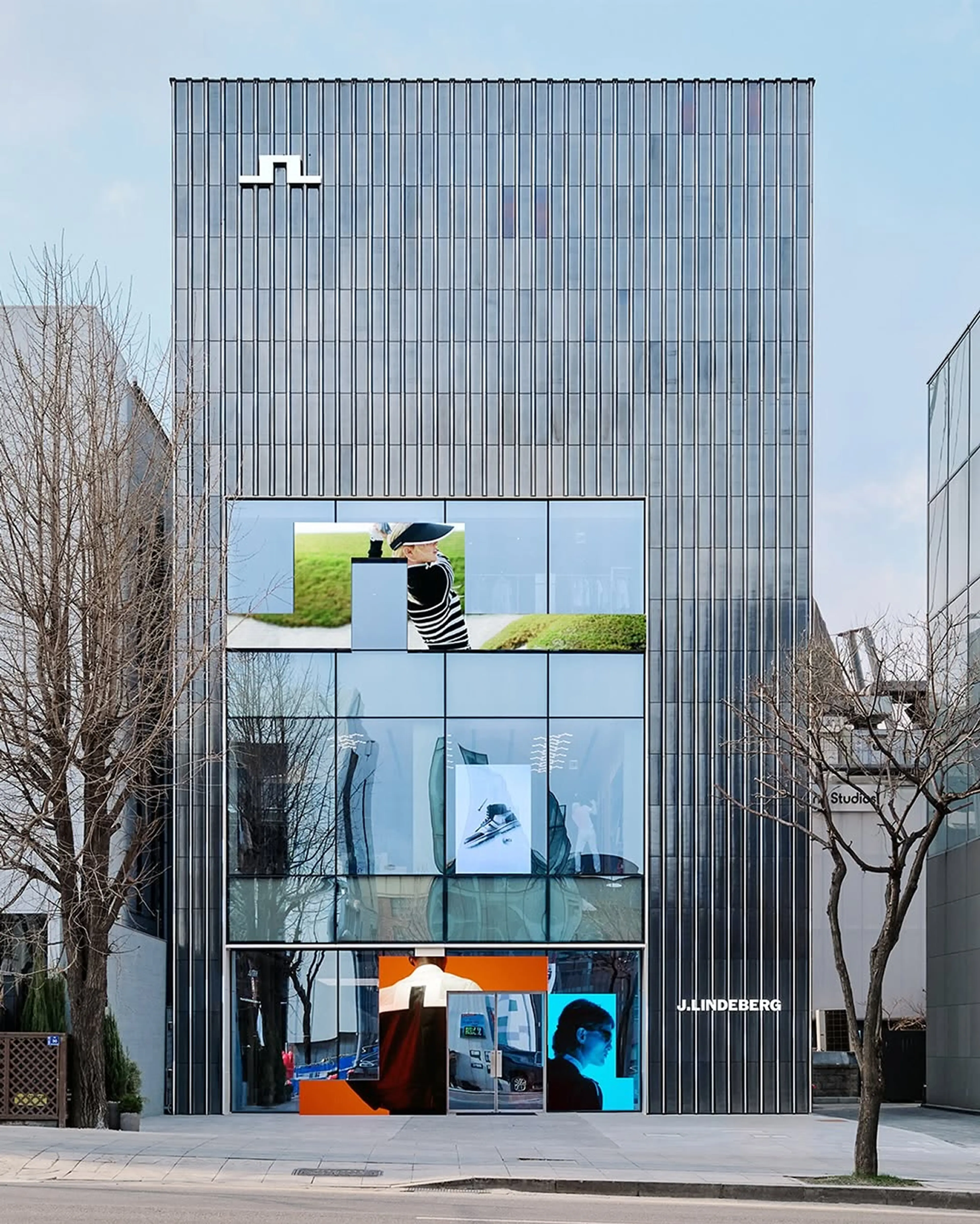
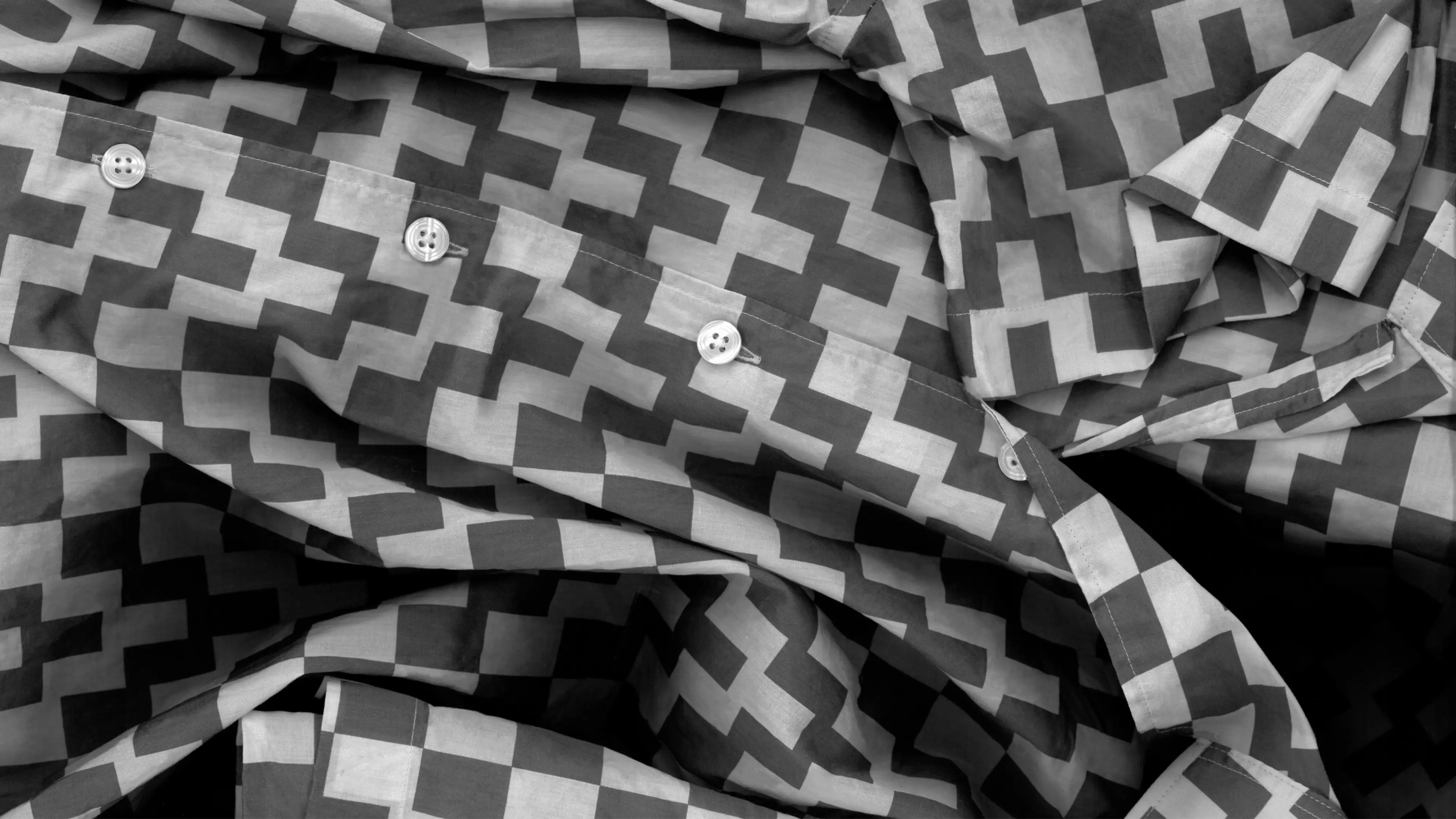
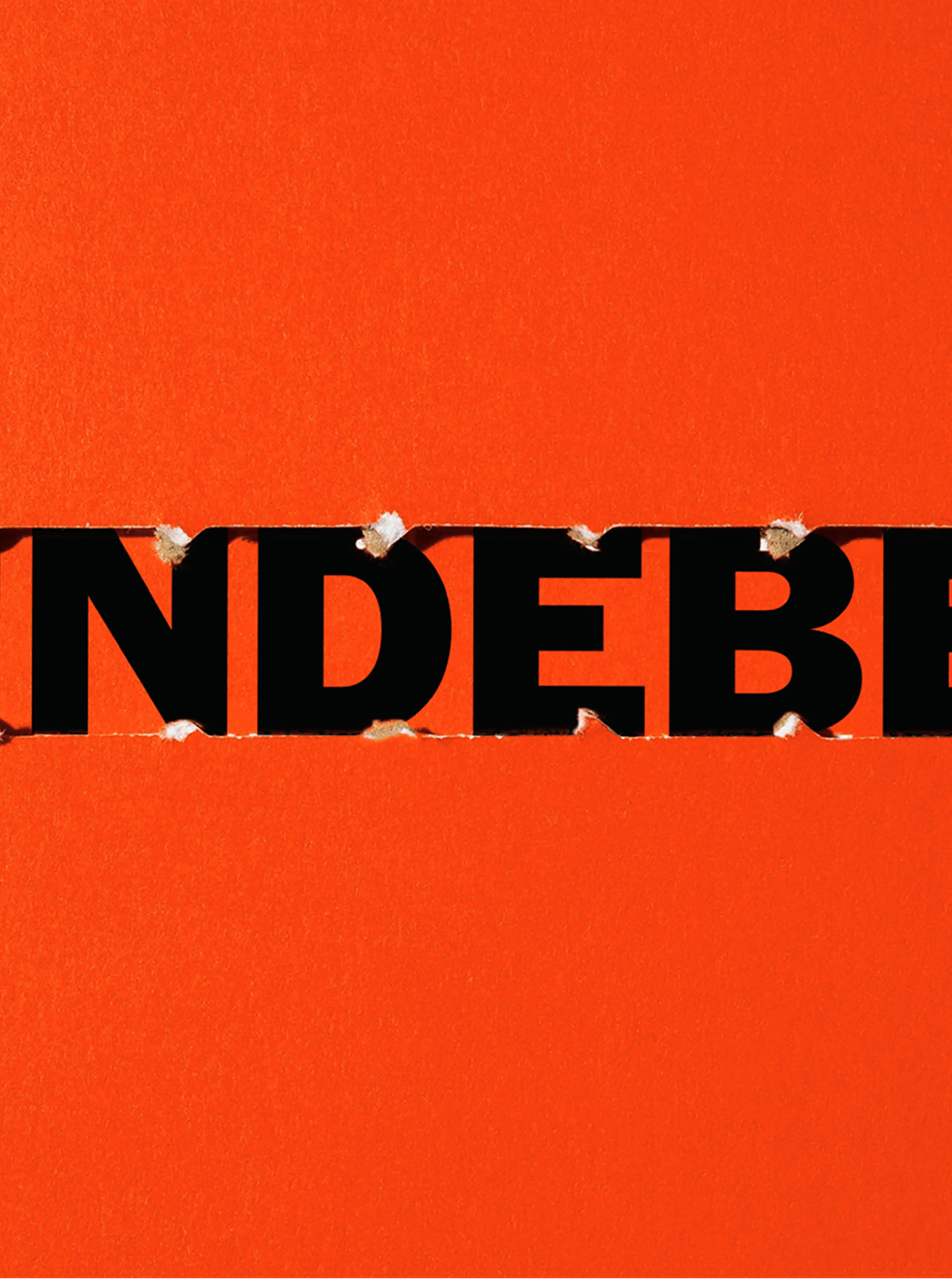
We have updated the iconic bridge symbol, and by doing so created a distinct holistic visual world that supports future growth as well as offering tools for flexibility, improving branding effect in any touch point, be it in retail, on product, packaging, or communication.
This updated brand identity is a celebration of duality — not as division, but as a source of energy. A narrative where opposing elements don’t cancel each other out, but rather, that amplify what makes J.Lindeberg unmistakably itself.
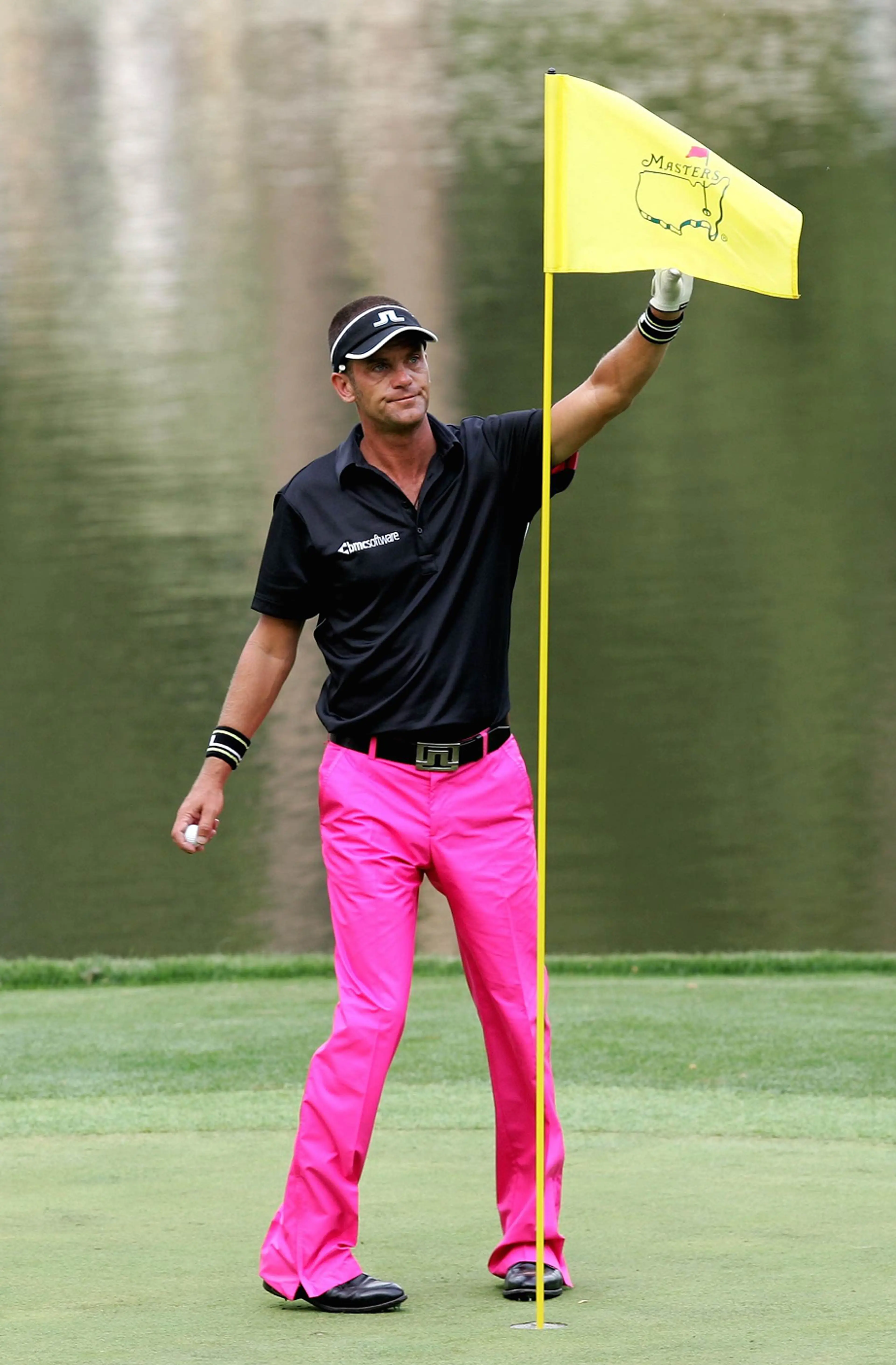
Jesper Parnevik in the iconic pink pant
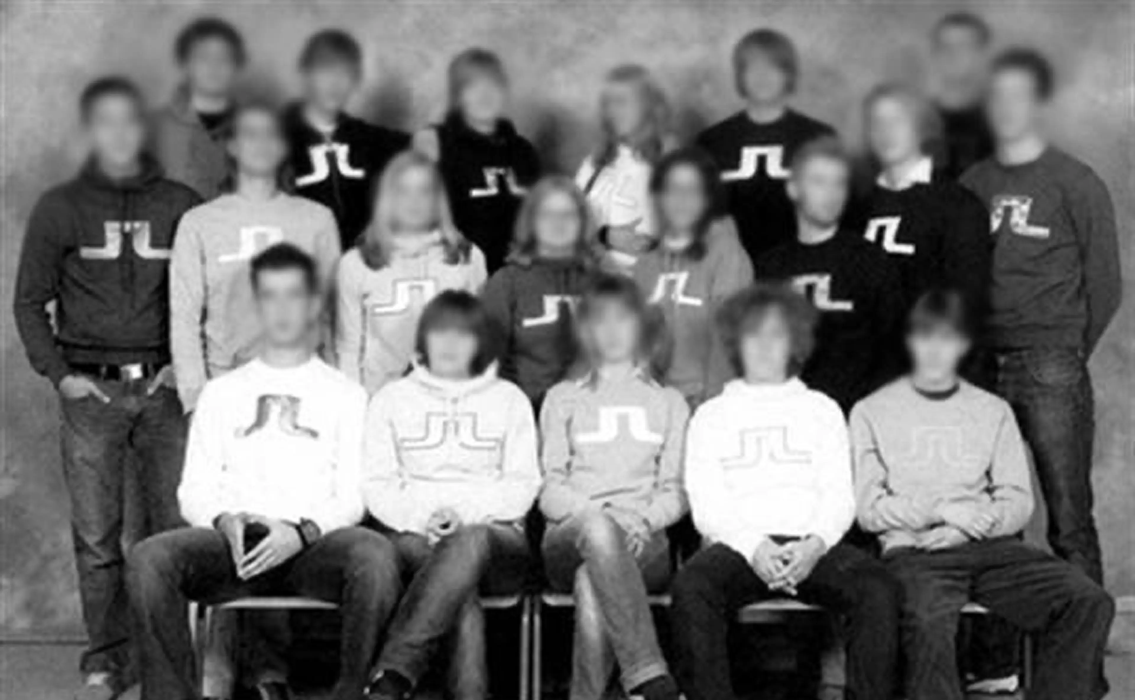
Swedish high school early 2000
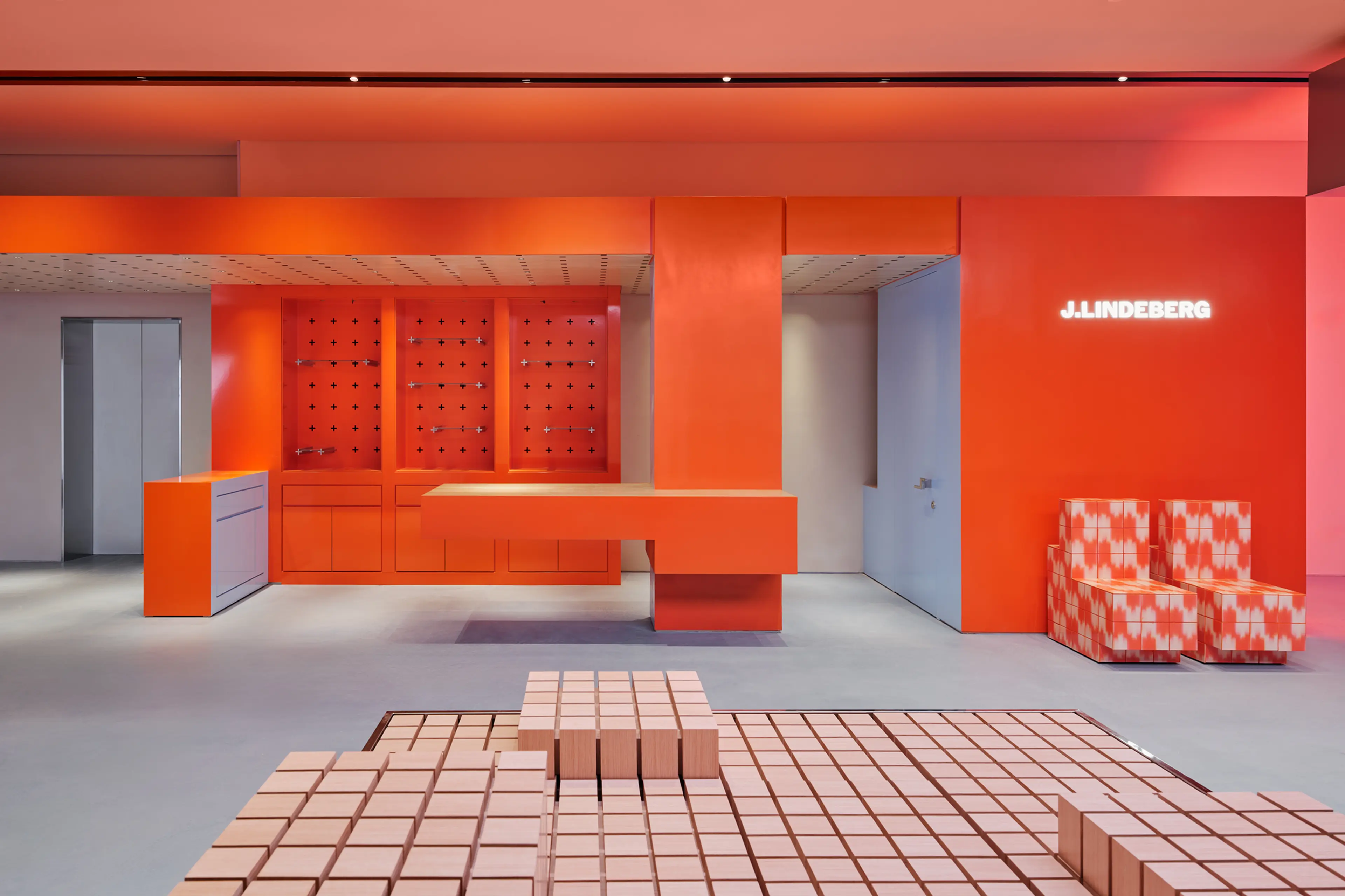
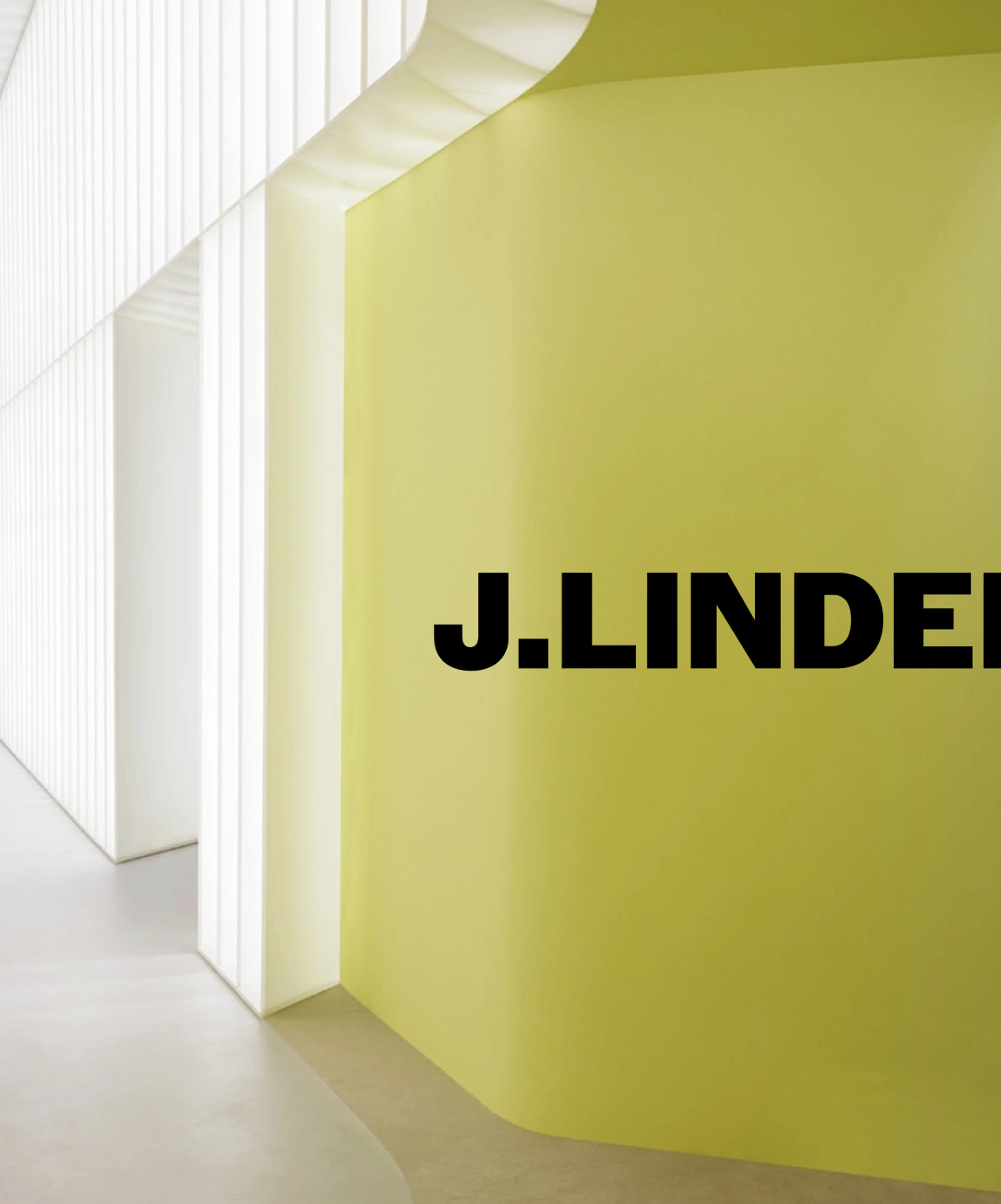
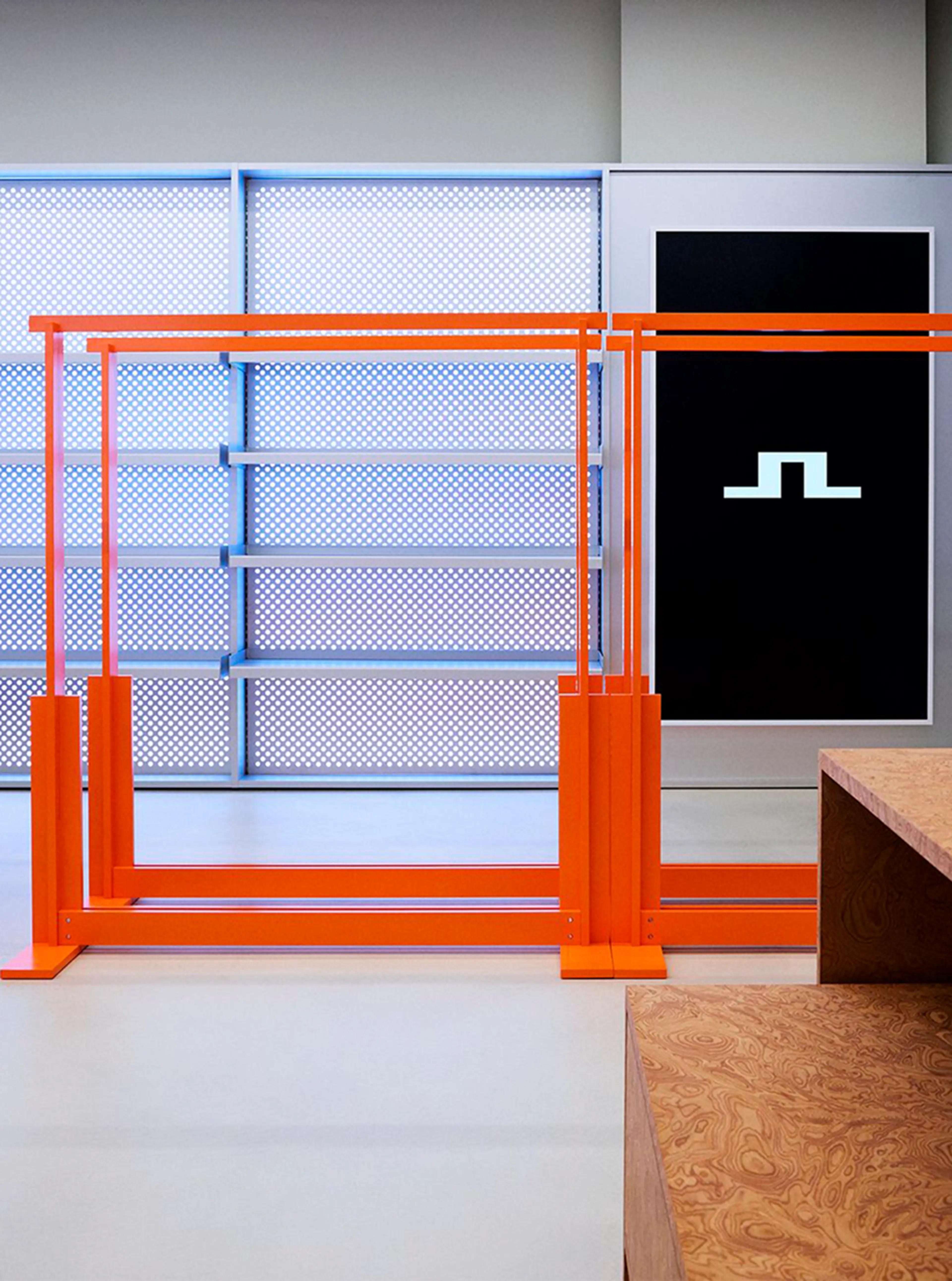
JL Club House, opened in April 2025, designed by J.Lindeberg with interior design firm Showmakers, guided by the new identity concept.
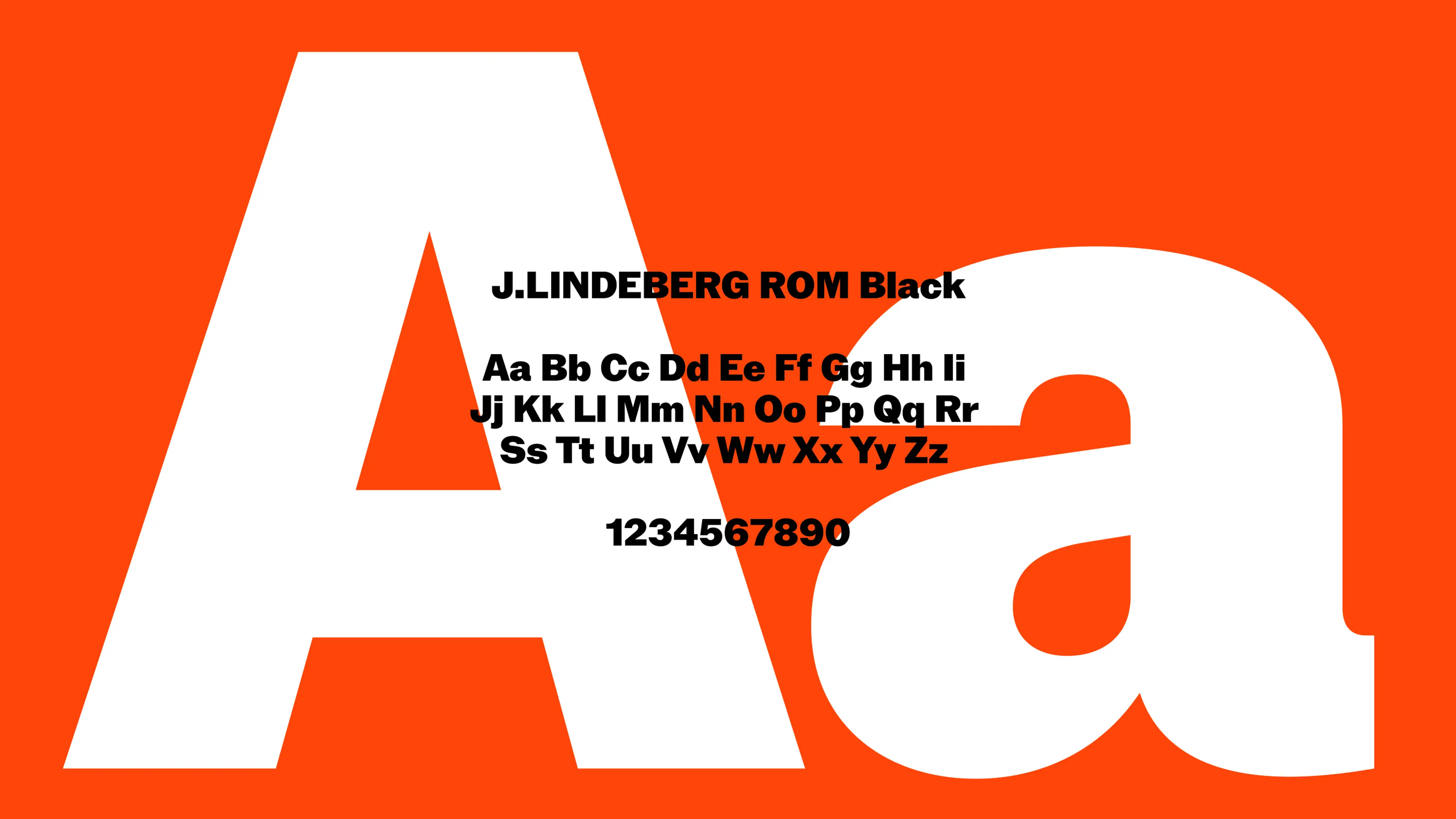
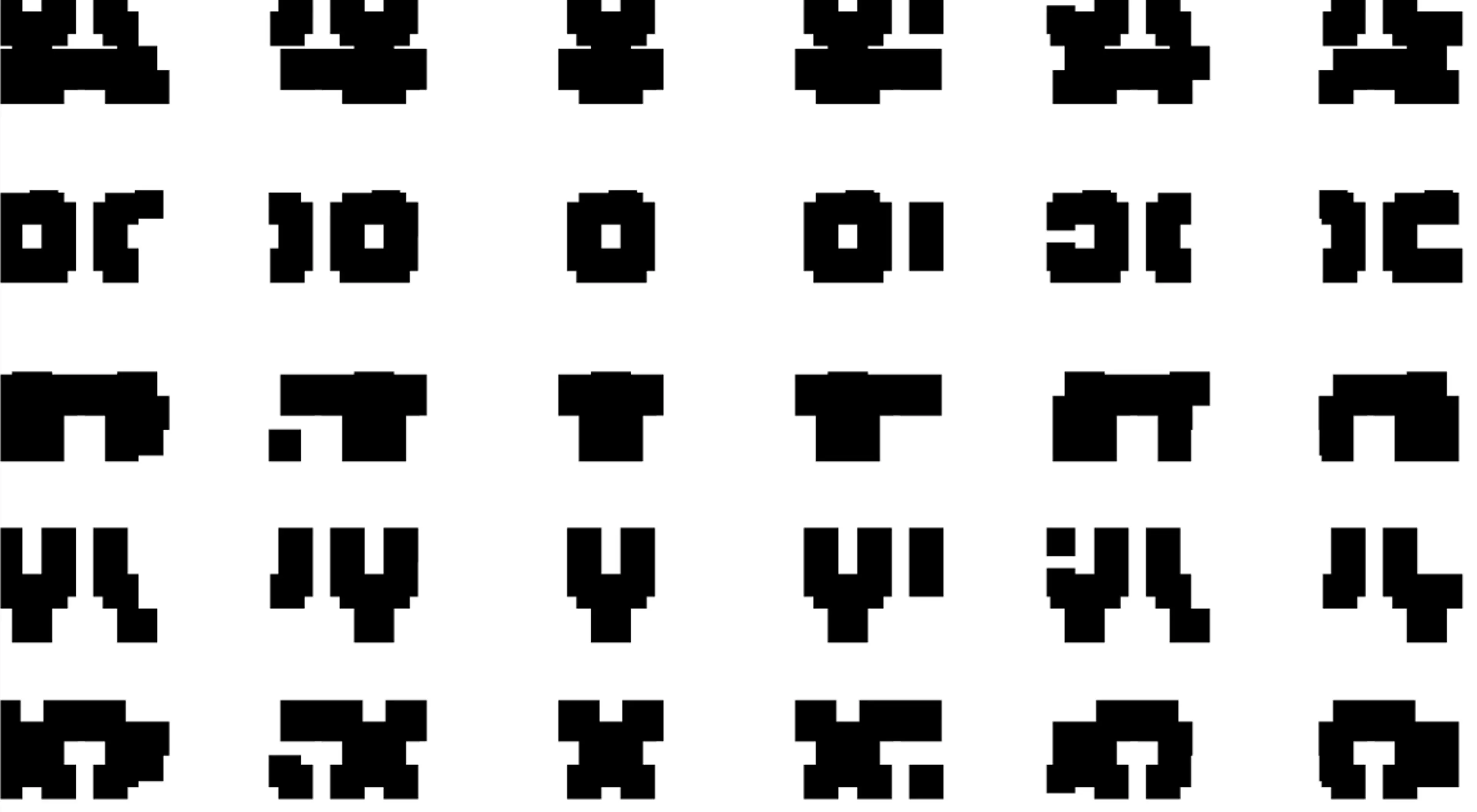
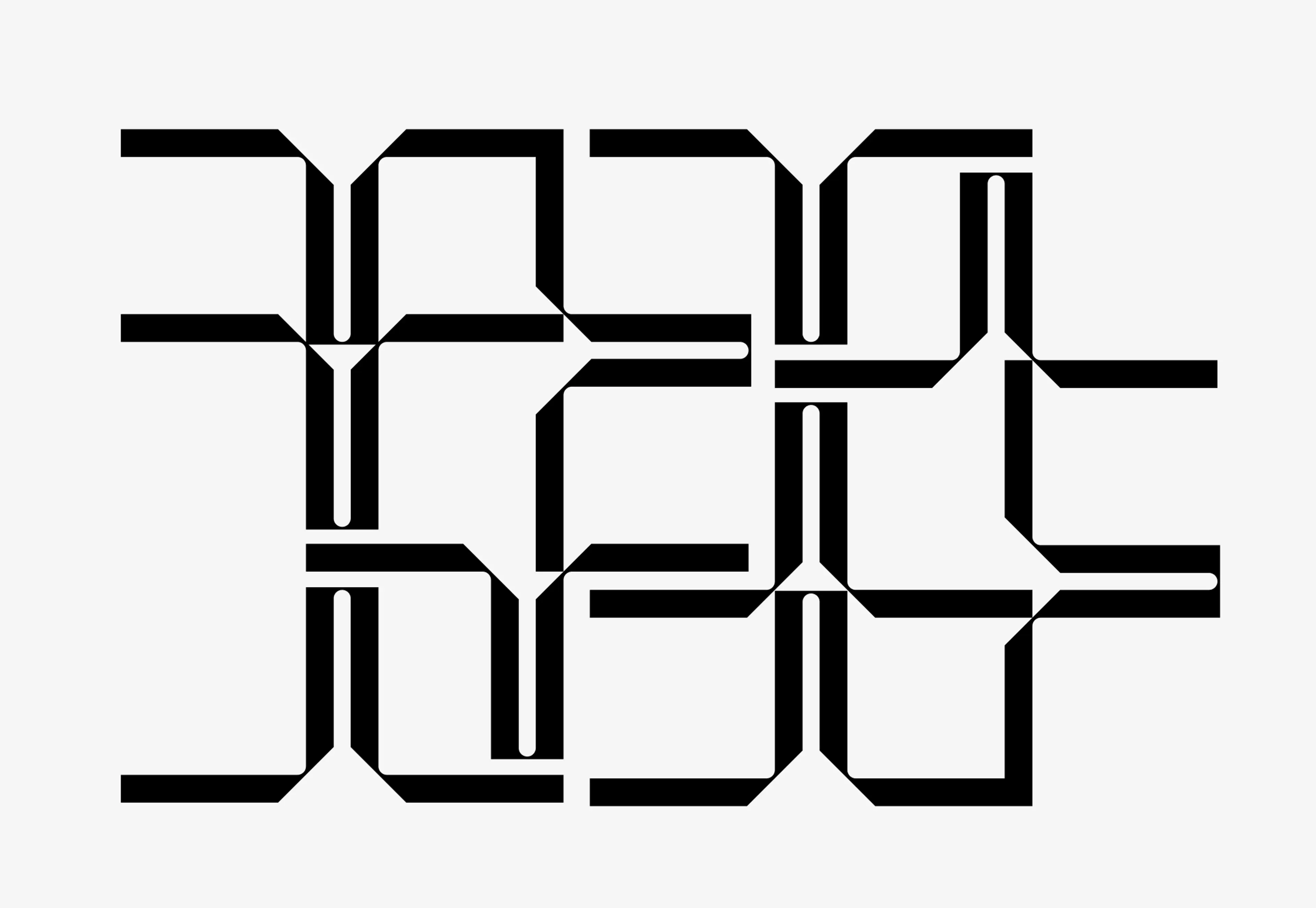
Custom typeface J. Lindeberg ROM
developed with Dinamo Typefaces.
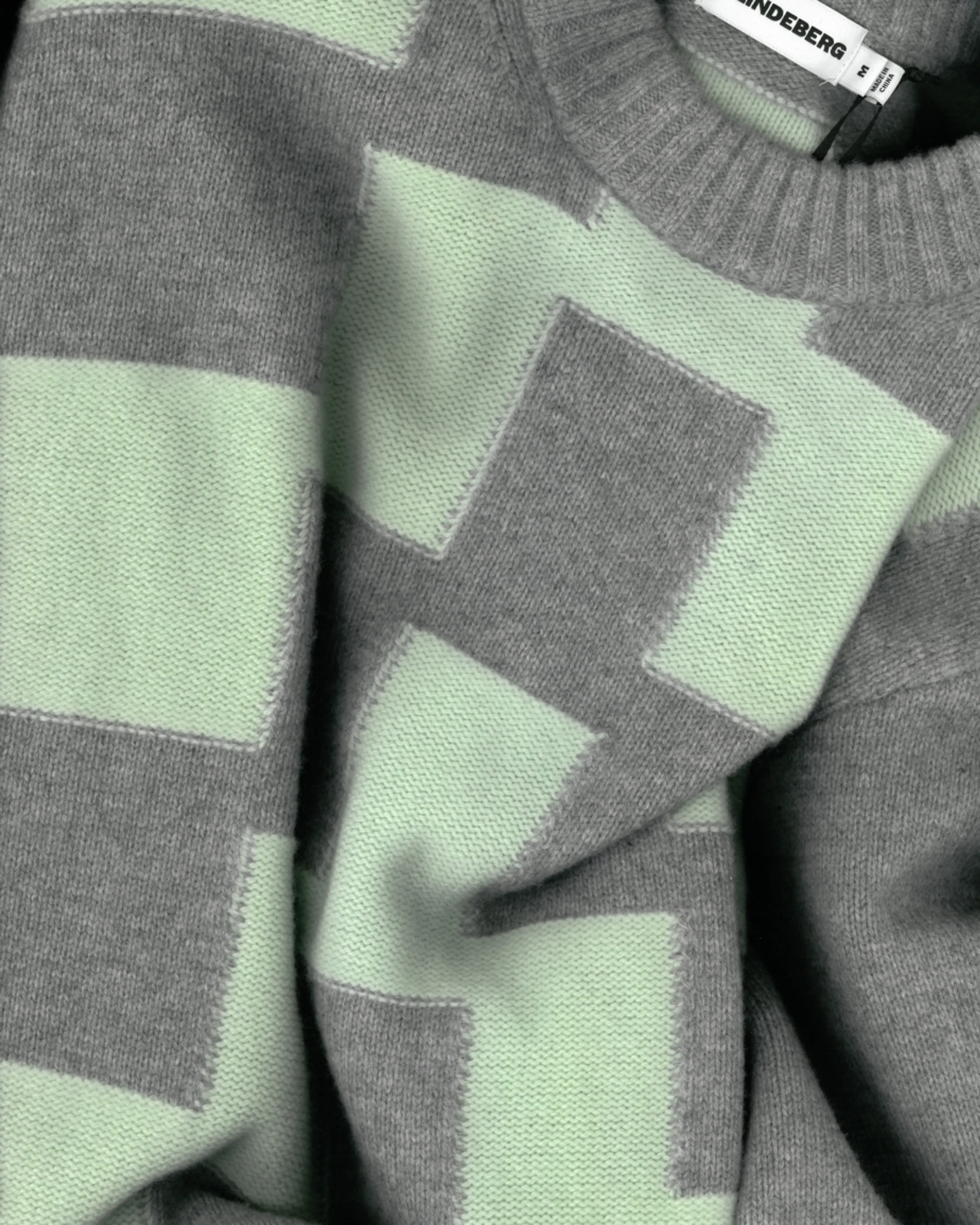
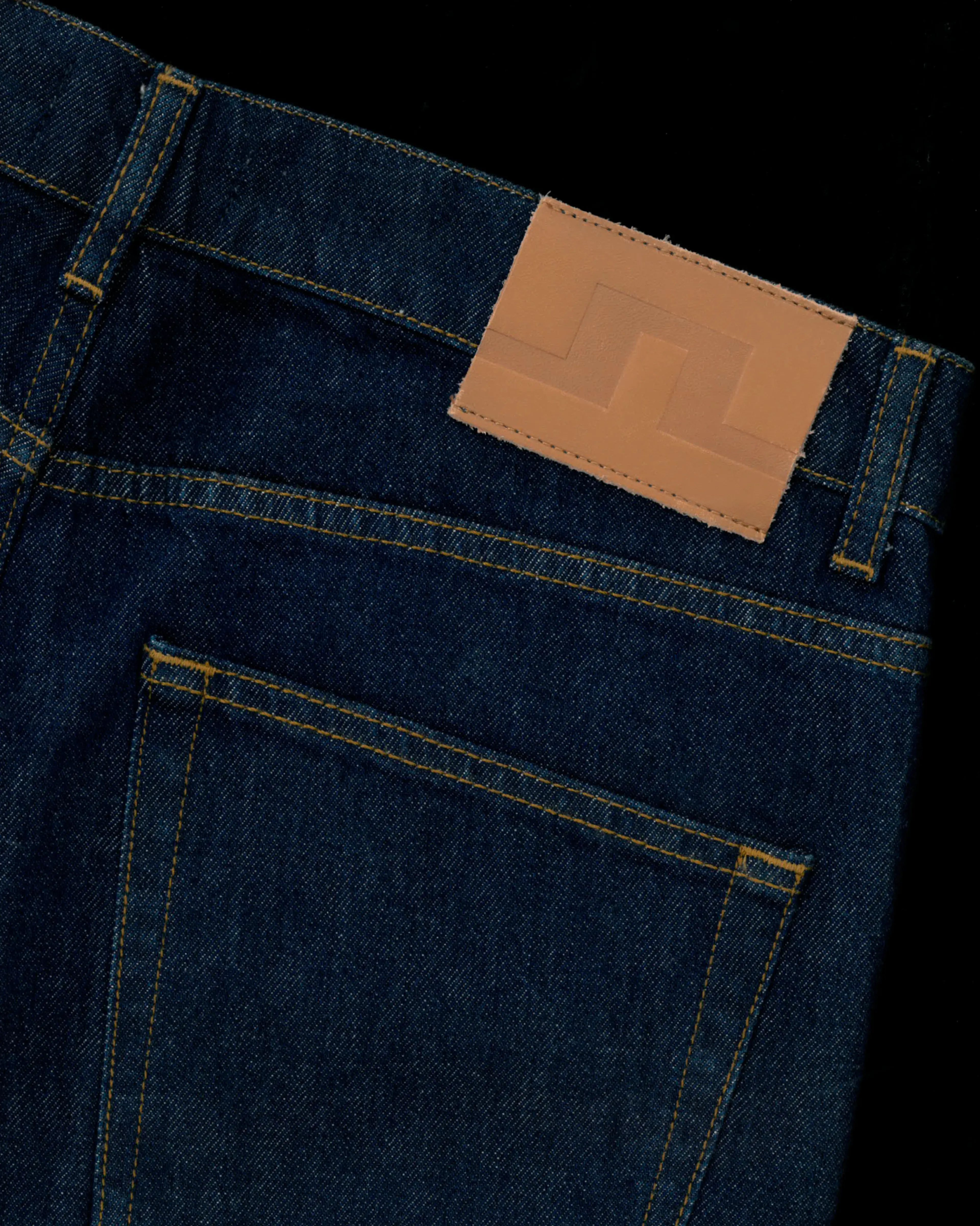
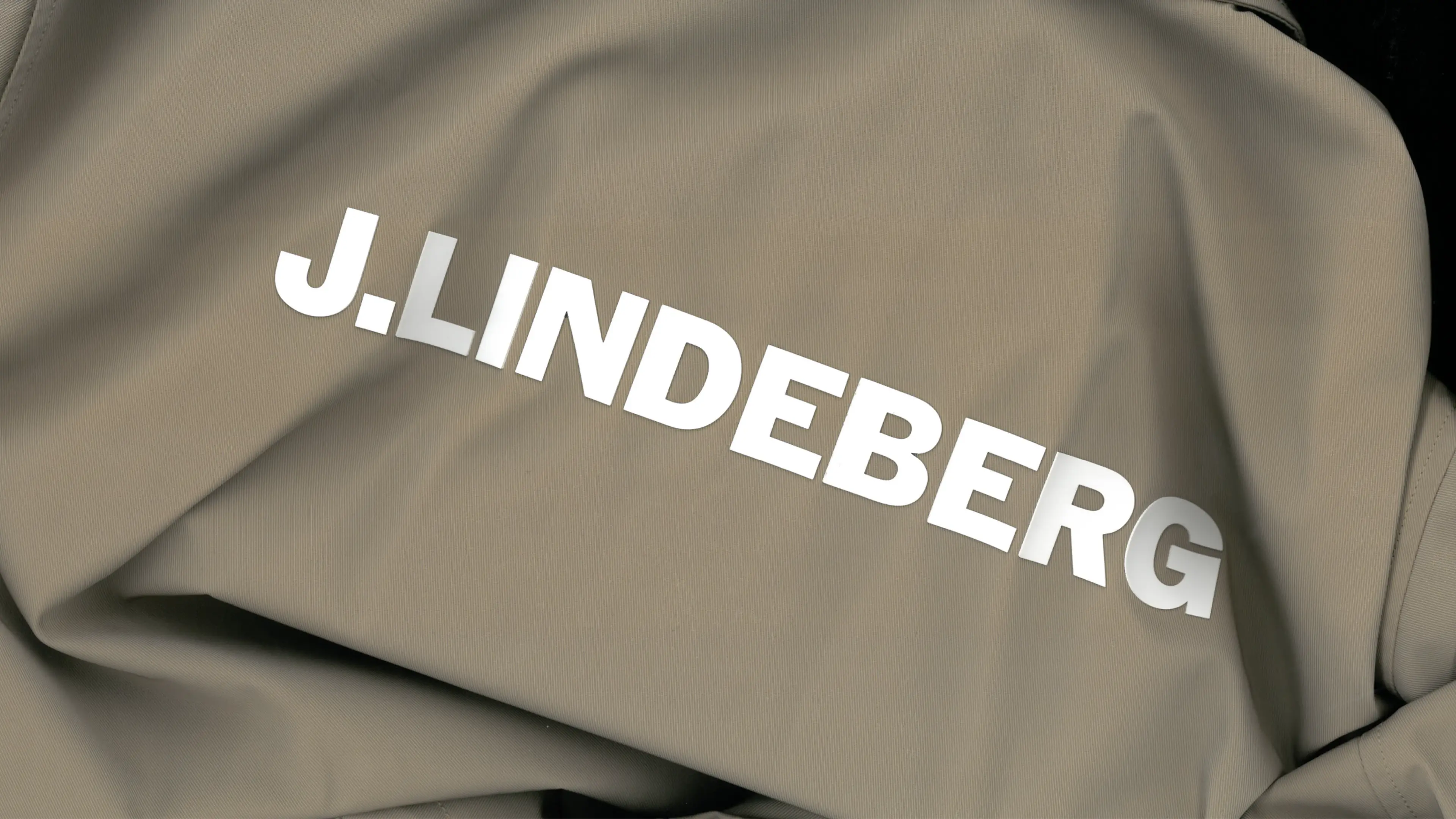
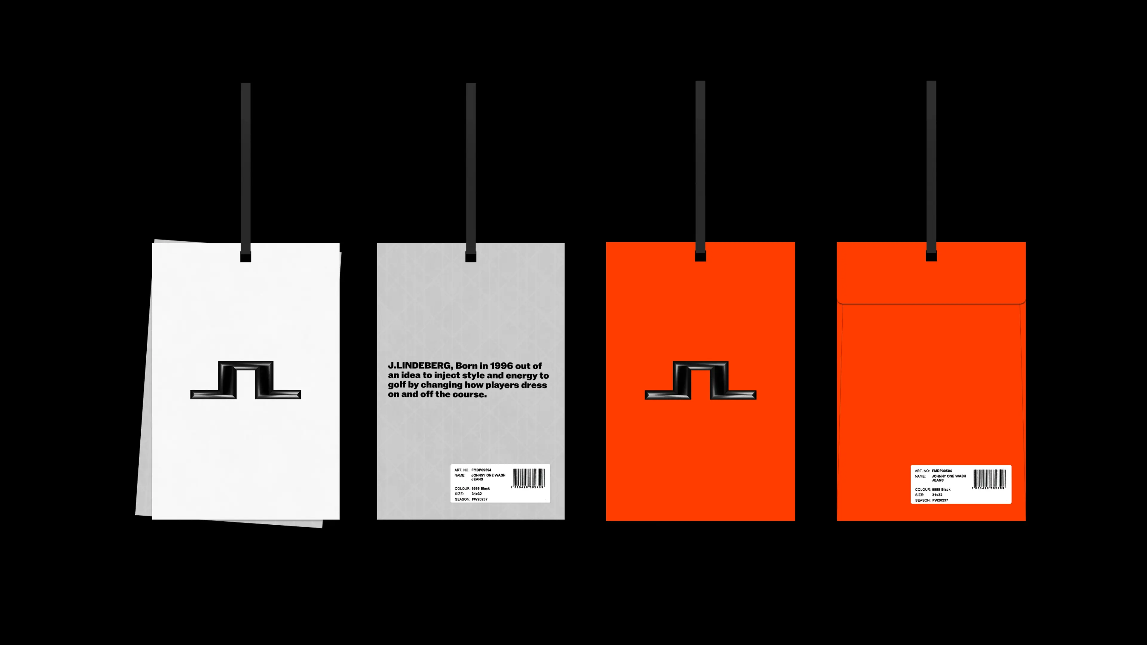
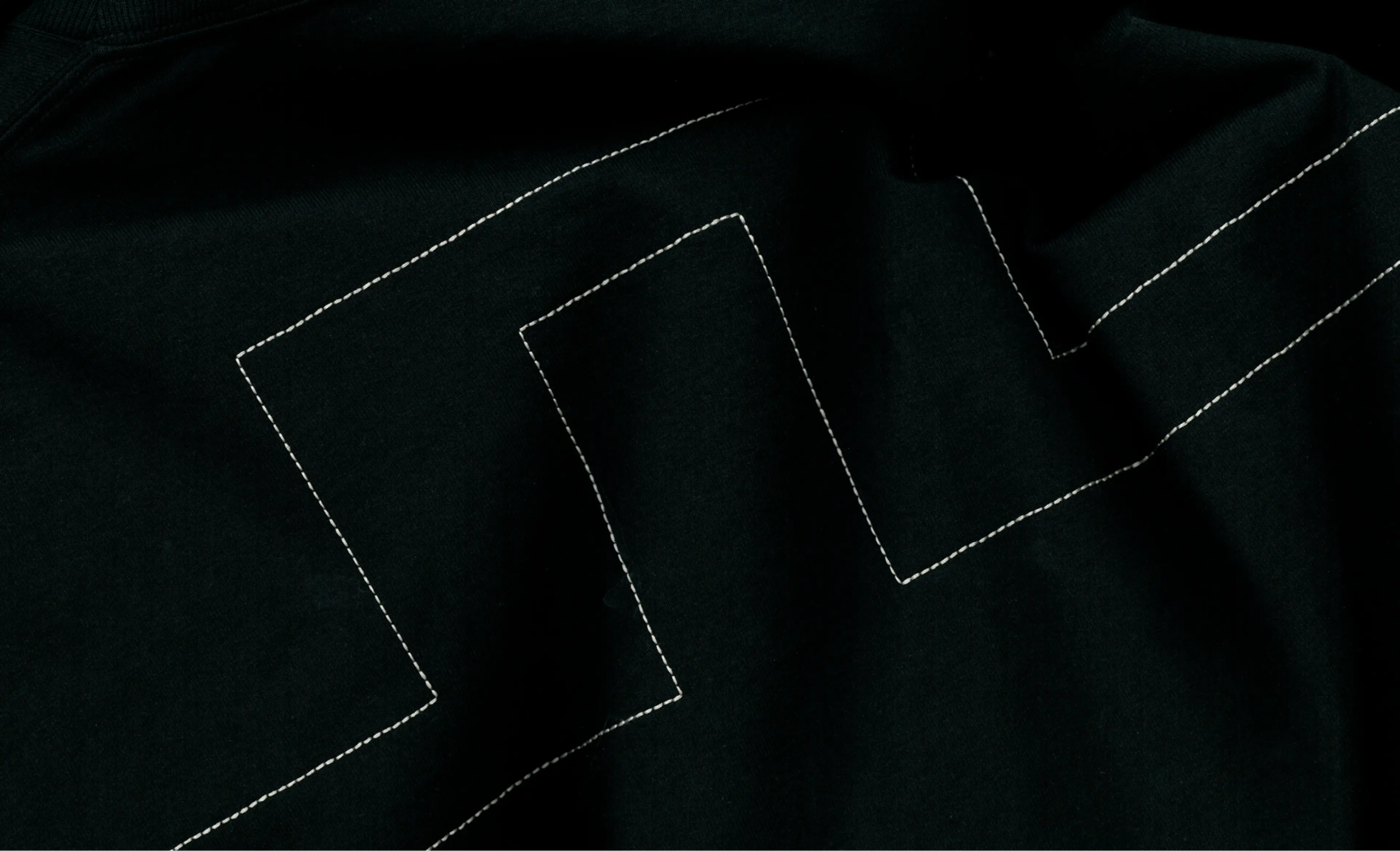
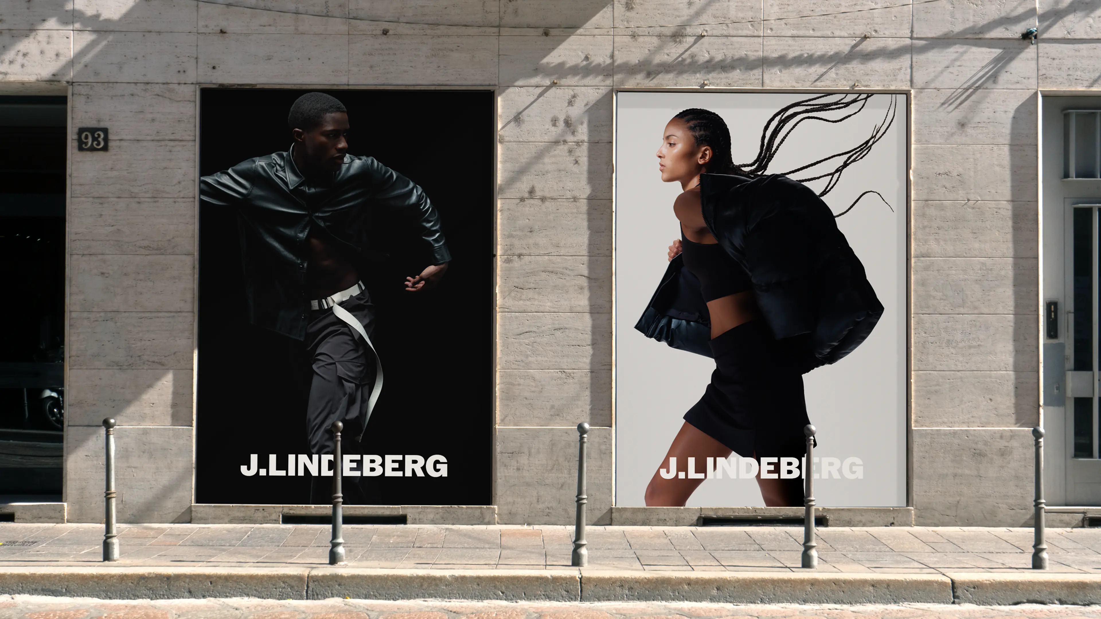
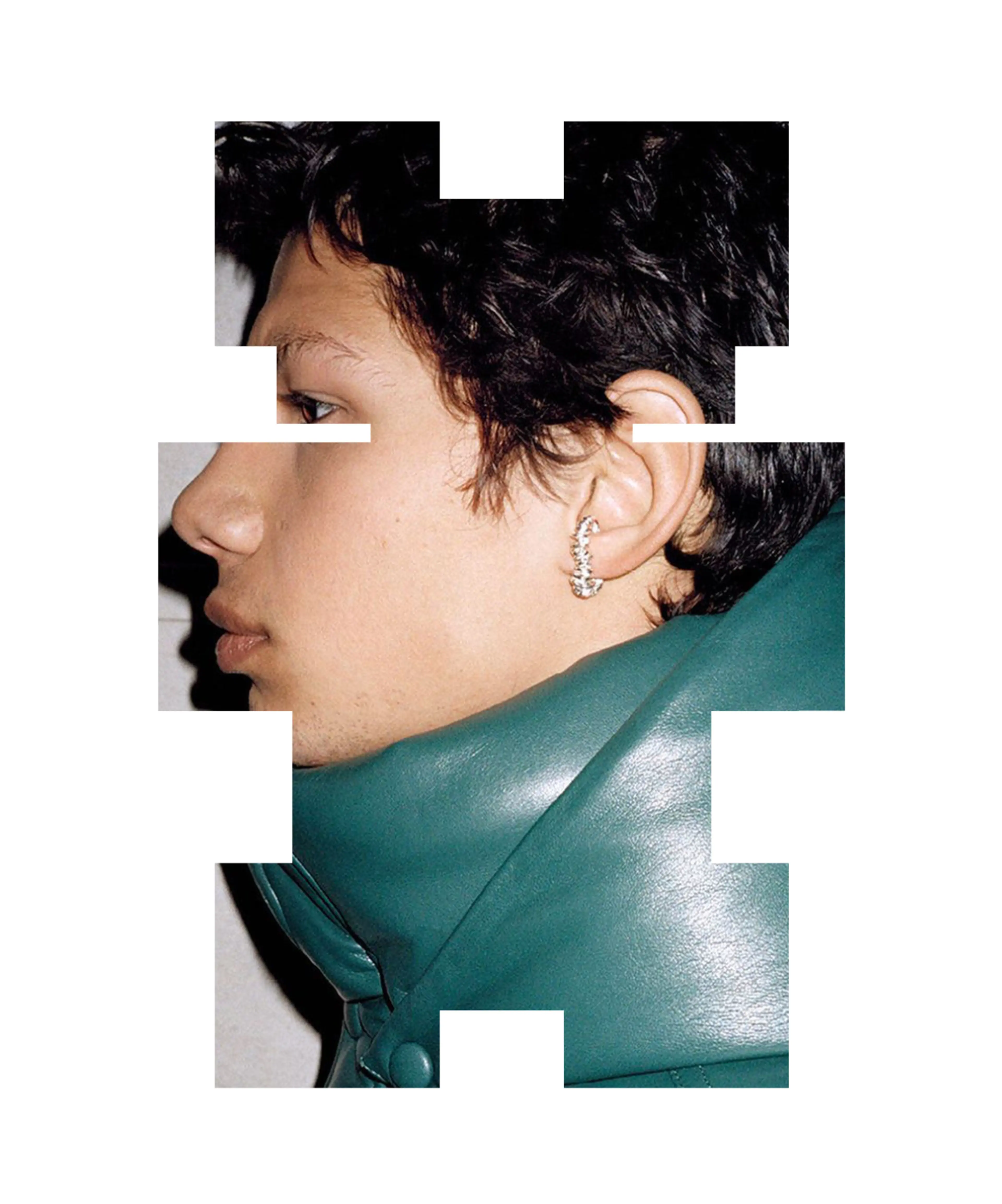
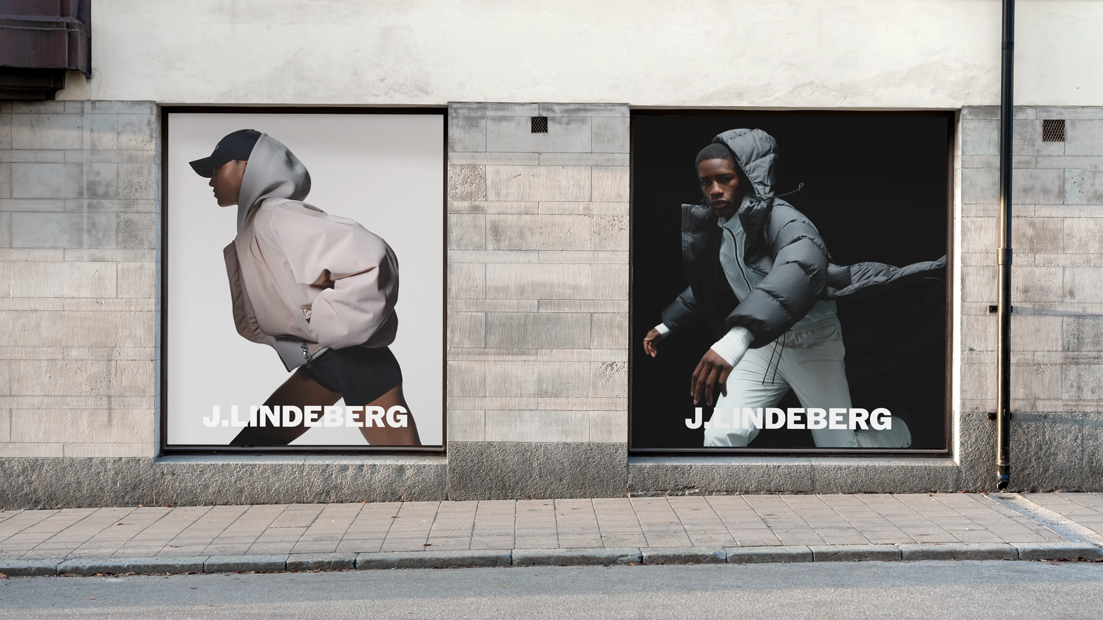
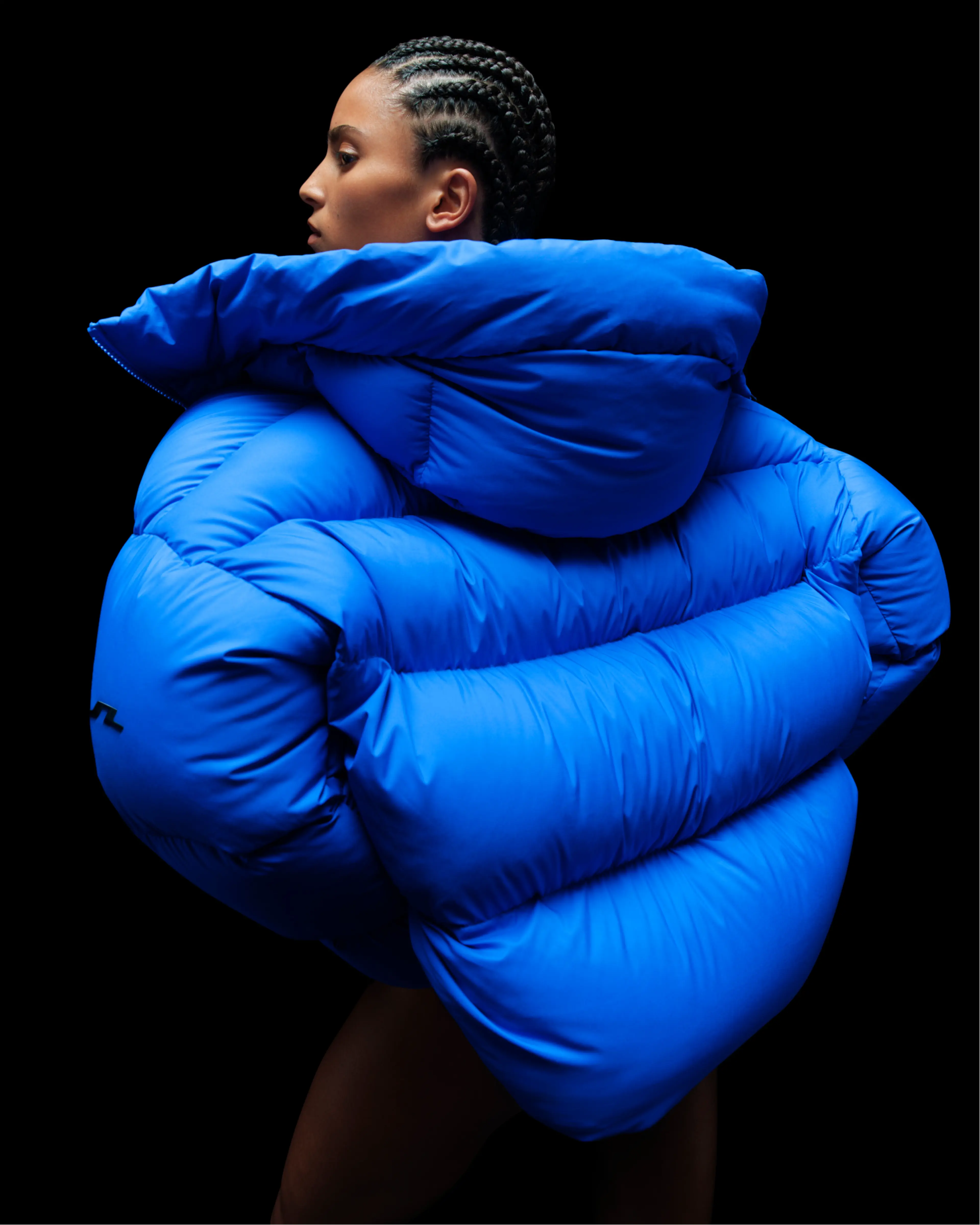
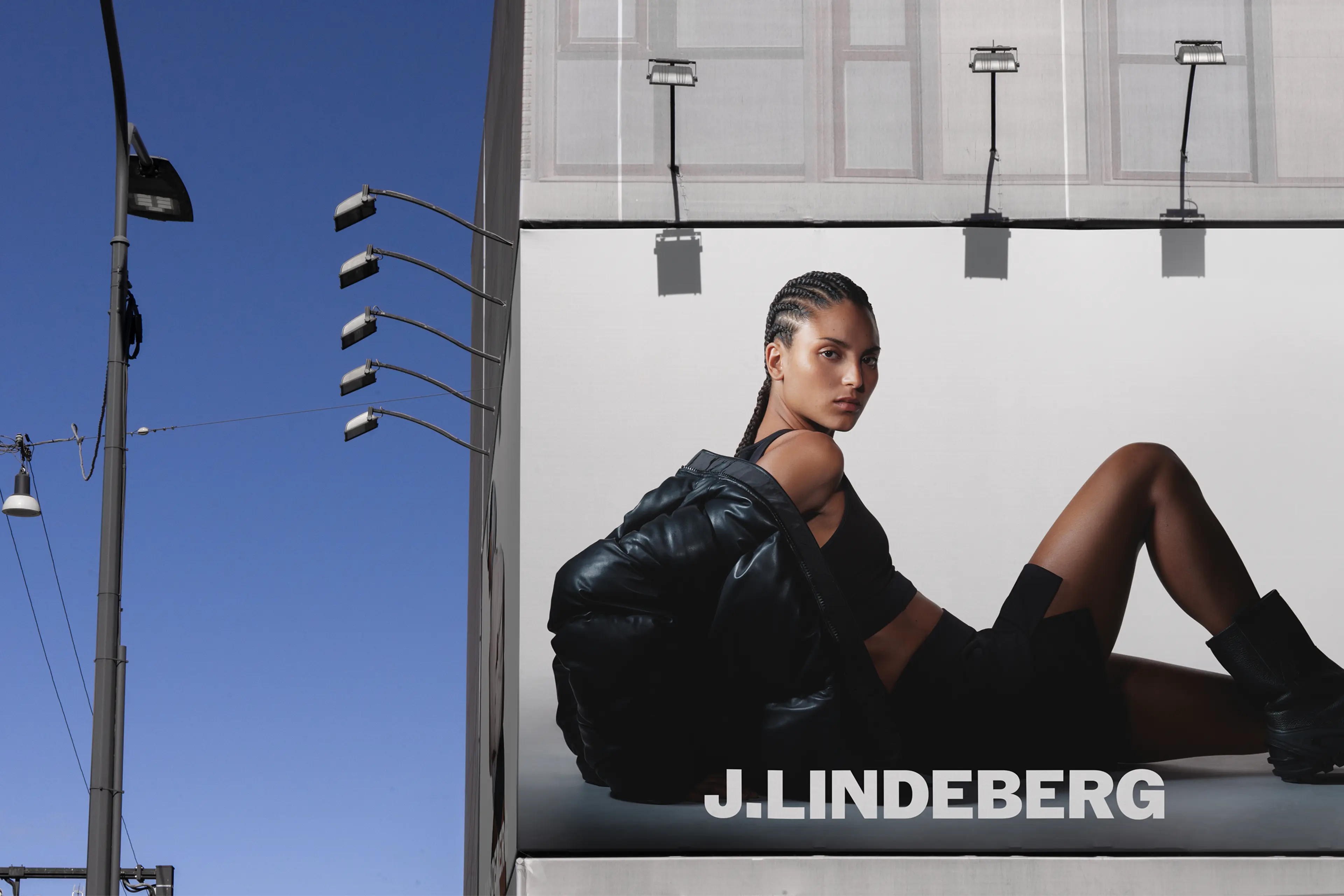
Communication for the FW24 collection, moving beyond literal interpretations, to creates a dynamic visual language—one that is both product-focused and progressive, capturing J.Lindeberg’s iconic blend of sports and fashion.
Credits campaign production:
Photographer: Hedvig Jenning
Director: Teitur Ardal
Music: Adam Olenius
Casting: Caroline Alm
Movement: Sophie Apollonia
Styling: Melanie Buchhave
Makeup: Regina Törnwall
Hair: Martina Senke
Production: Lund Lund Agency
