Sigma, a Japanese manufacturer of high-quality photography equipment, is bigger than branding. It's a company built from the ground up and from the inside out—founded in the early 1960s and still today a family-owned business with a long-term strategic horizon. Sigma turned to Stockholm Design Lab to let their obsession with quality show on the outside, and to create a more coherent brand and customer experience. Through a solid strategic and conceptual journey, we redefined the brand strategy and identity to build for a long and definite continuation of their success. As a holistic brand collaboration, the work includes brand strategy, visual identity, custom typography, photography, illustration, product branding, packaging, website, uniforms, architecture and spatial experience, product launch campaigns, art collaborations, product demo films, stationery and other collaterals. It celebrates Sigma’s spirit of independence, craftsmanship, and innovation. Launched globally early 2025, Sigma’s identity is a testament to how branding is not about surface but about depth.
Visit the global website experience at sigma-global.com
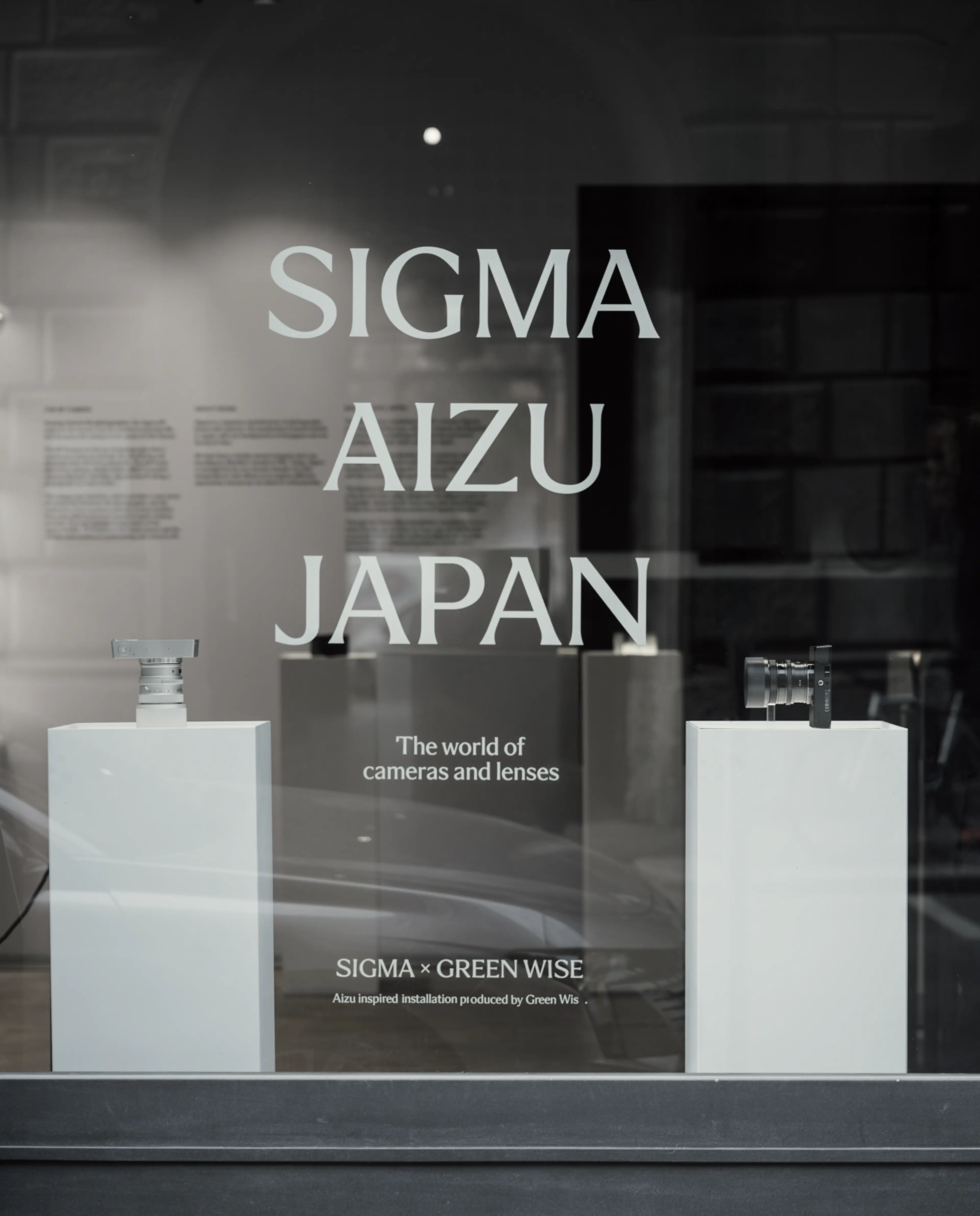
Campaign photography and film in collaboration with photographer Emil Larsson. Product demo films in collaboration with Parapix. Art projects by Sølve Sundsbø and Julia Hetta to be published in art books in collaboration with Greger Ulf Nilson. Aizu footage taken from Sigma, Aizu, Japan 2025 film shot by Yu Yamanaka.
SDL’s scope includes brand strategy, visual identity, custom typography, photography, illustration, product branding, packaging, website, spatial experience, product launch campaigns, art collaborations, product films, uniforms, stationery and other collaterals.
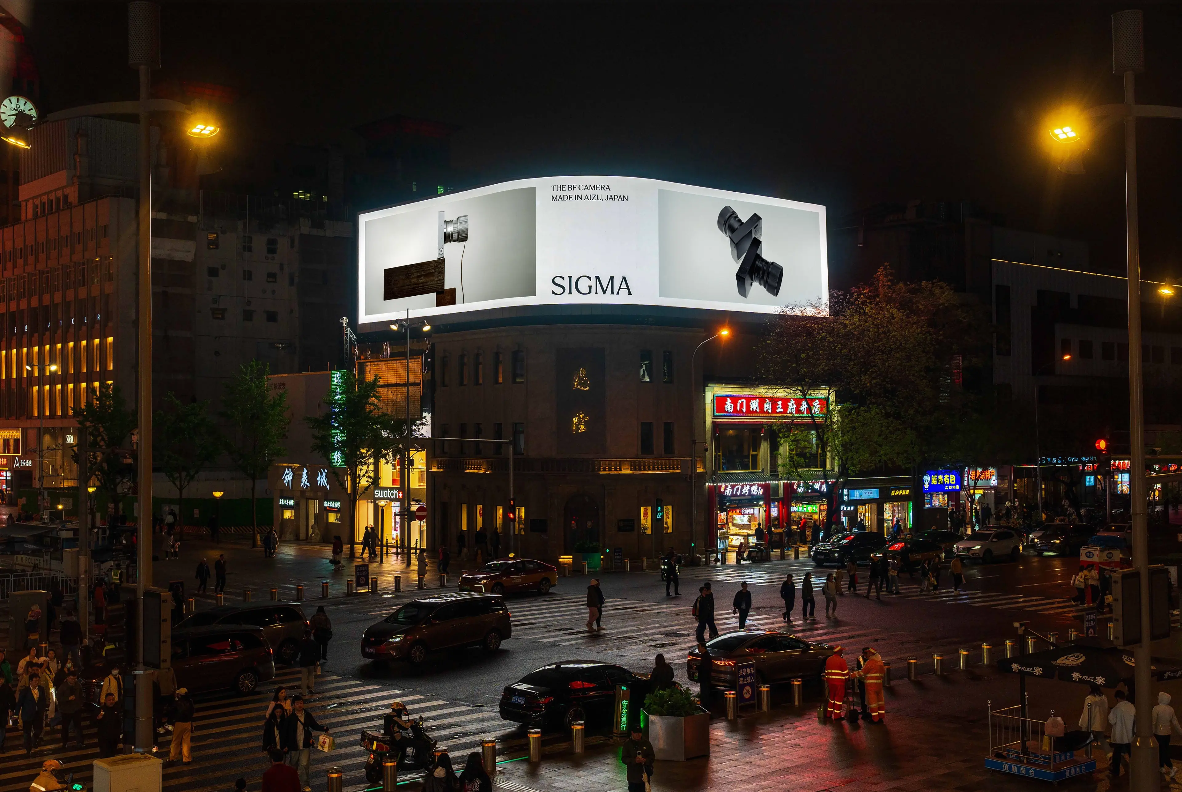
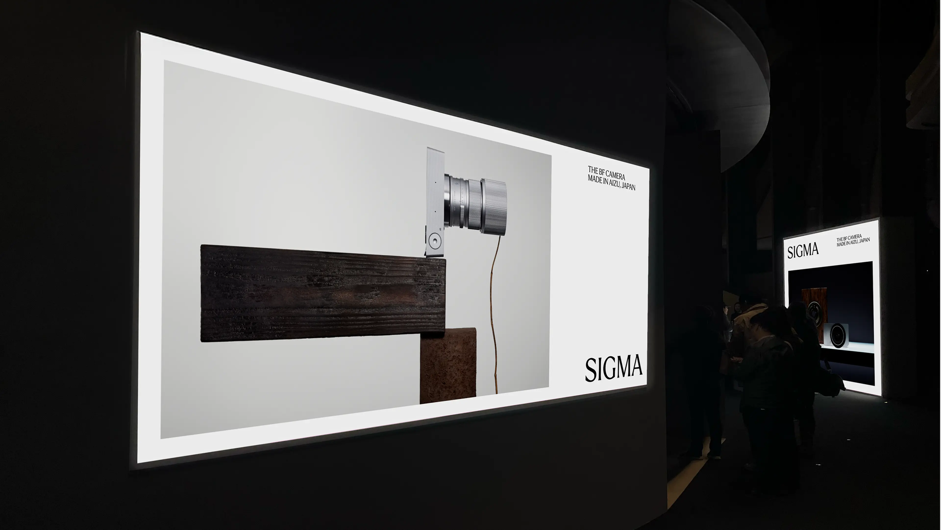
Made in Aizu, Japan
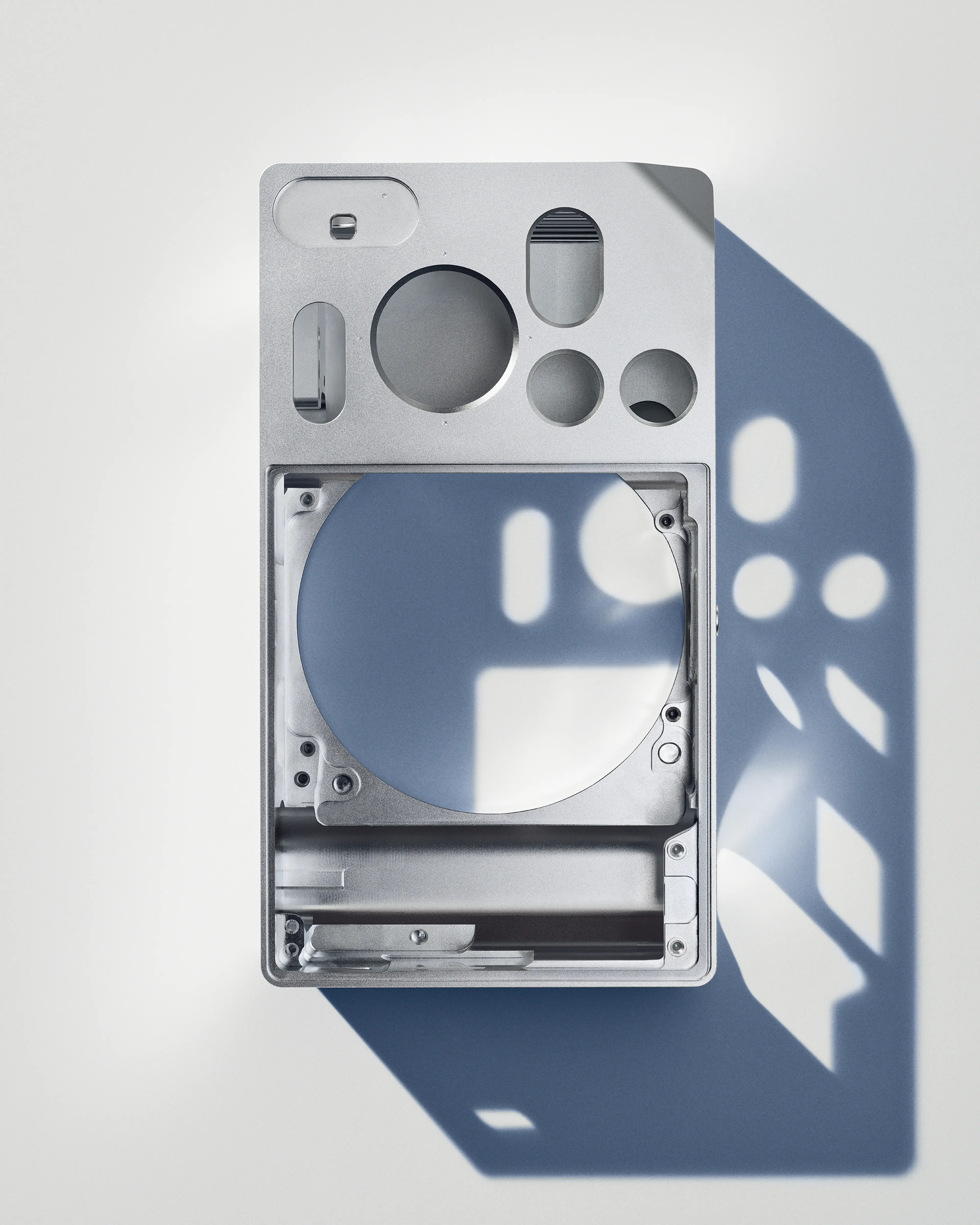
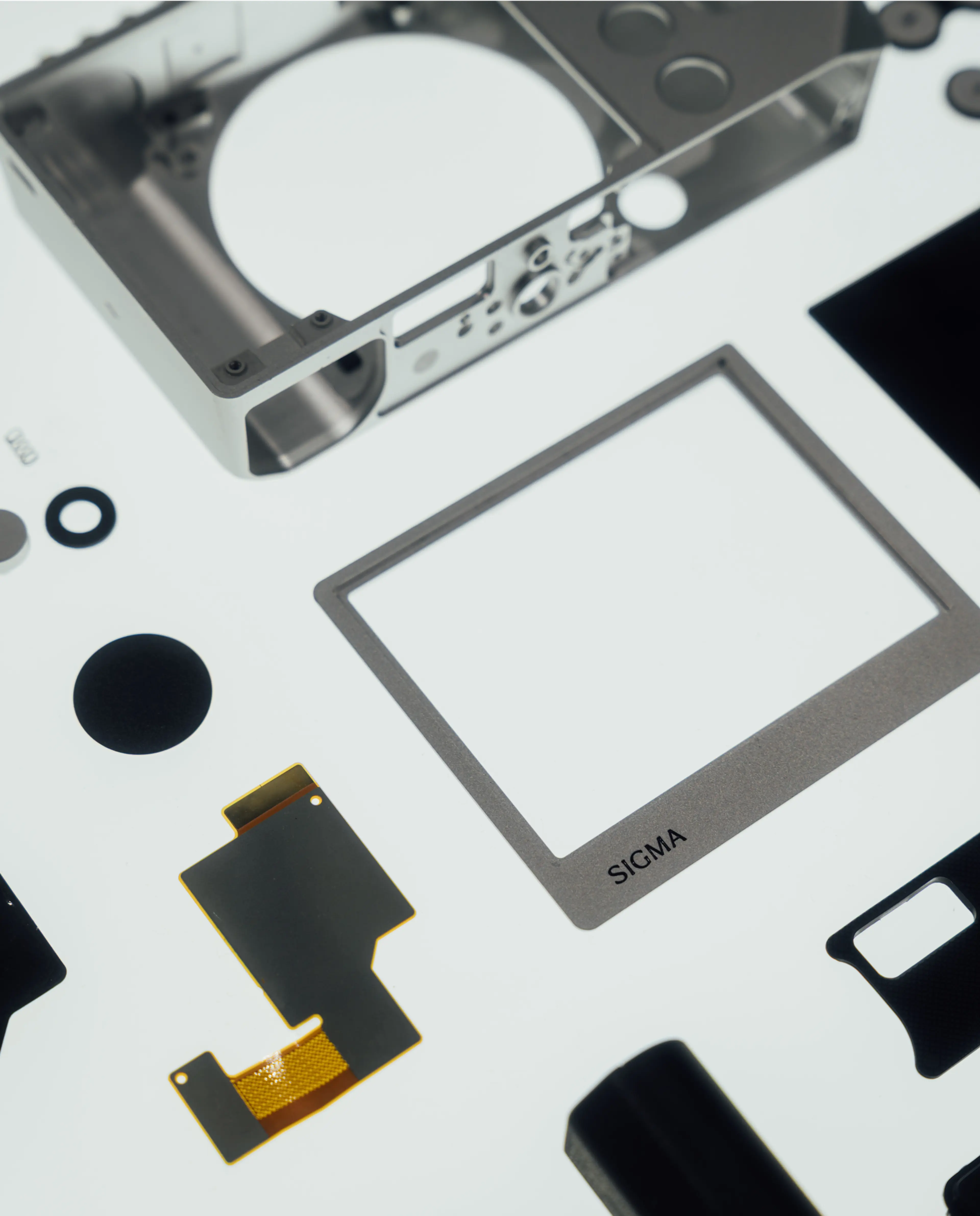
Sigma was founded in 1961 by Michihiro Yamaki and still today remains a family-owned business, lead by his son Kazuto Yamaki. Since 1973, Sigma’s factory is located in Aizu in Fukushima Prefecture, serving as a base of operation when developing some of the best photographic products on the market. Keeping the production local allows a rigorous quality control over every aspect — from design and engineering to lens polishing, molding plastic and metal parts, mounting, and assembly.
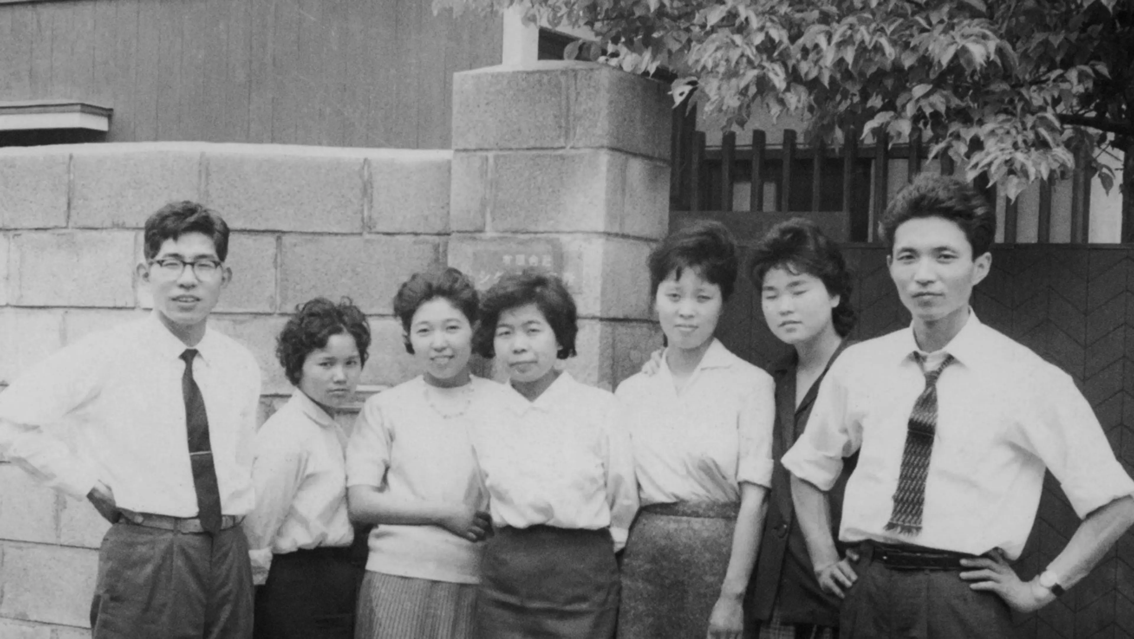
Sigma has always stayed a family-owned company ever since being founded by Michihiro Yamaki in 1961.
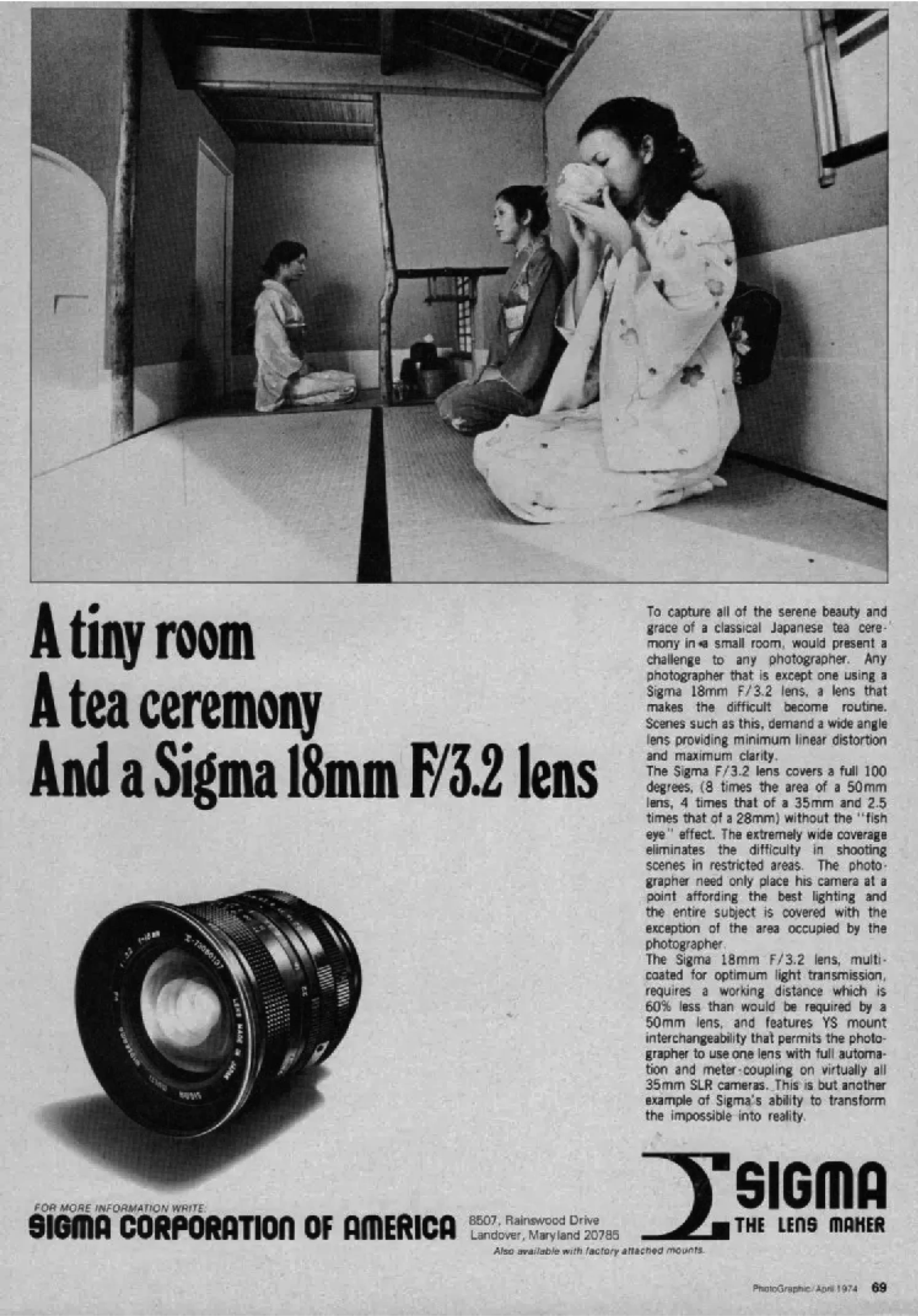
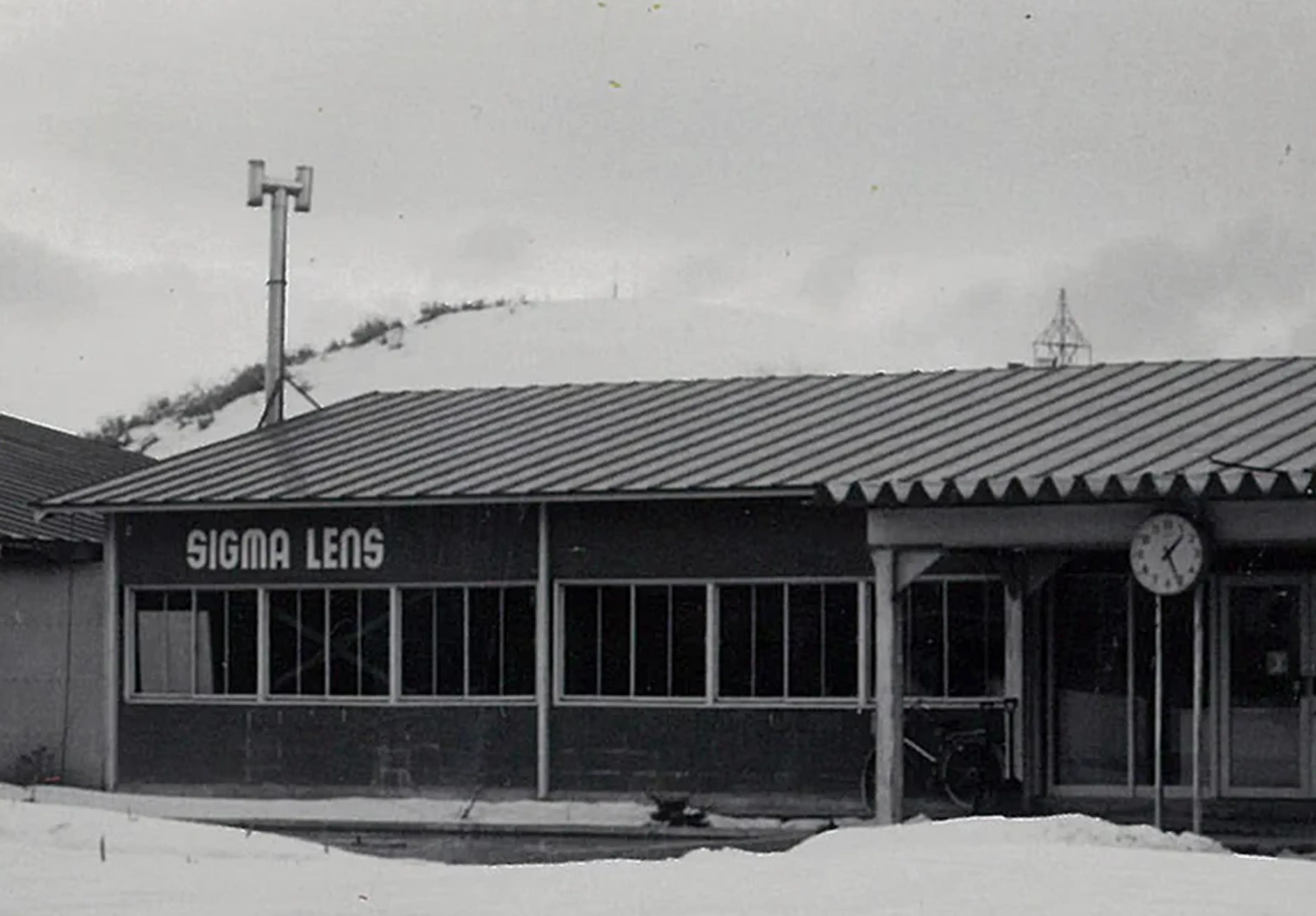
Sigma advertisement 1970.
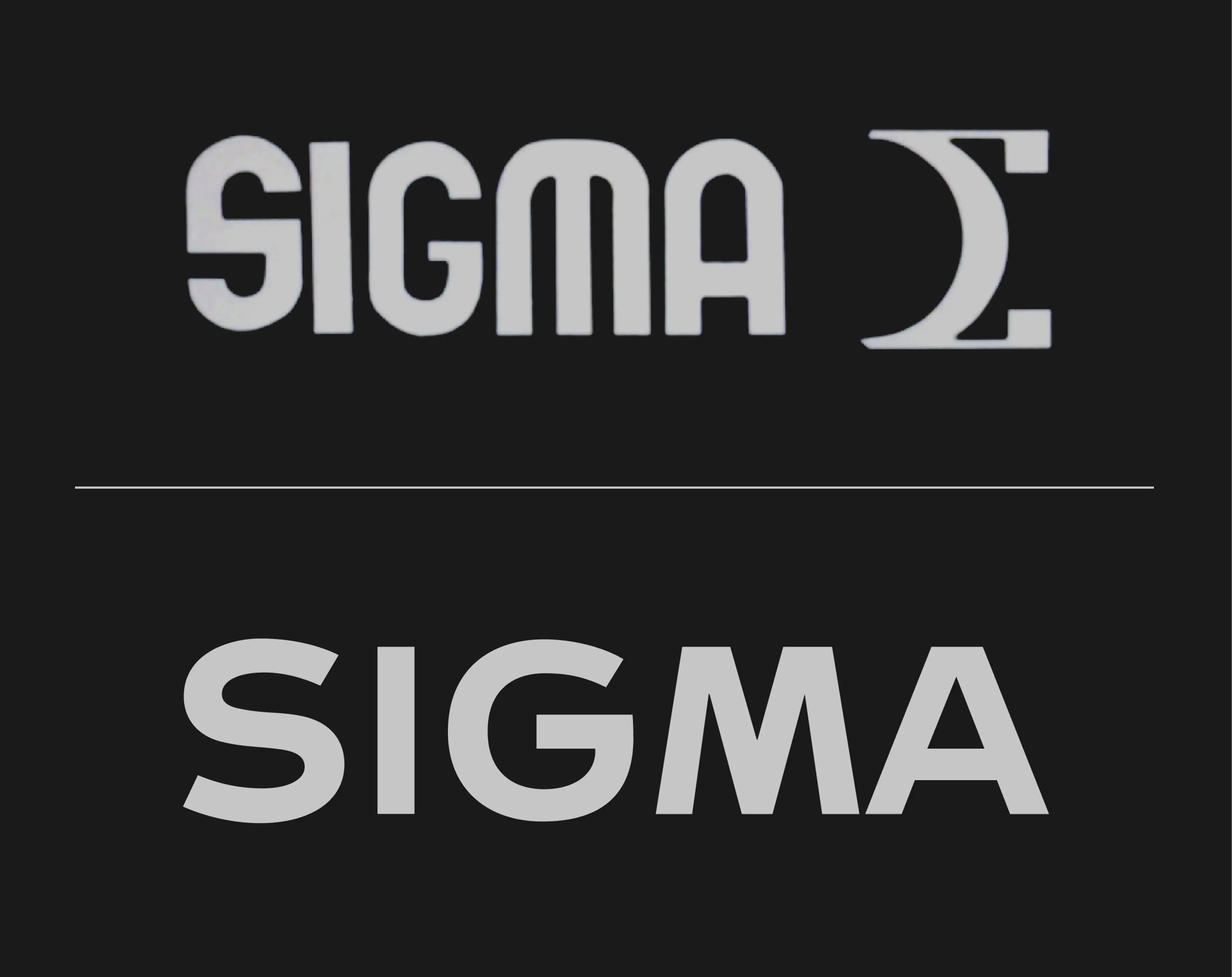
Logotype development over the years. Originally a mechanical-style wordmark was accompanied by a greek alphabet capital sigma. Later, the symbol was taken away and the wordmark was simplified.
The Sigma factory in 1974. The factory is located in Aizu, Fukushima Prefecture, about 300 km north of Tokyo – home to Sigma’s entire production.
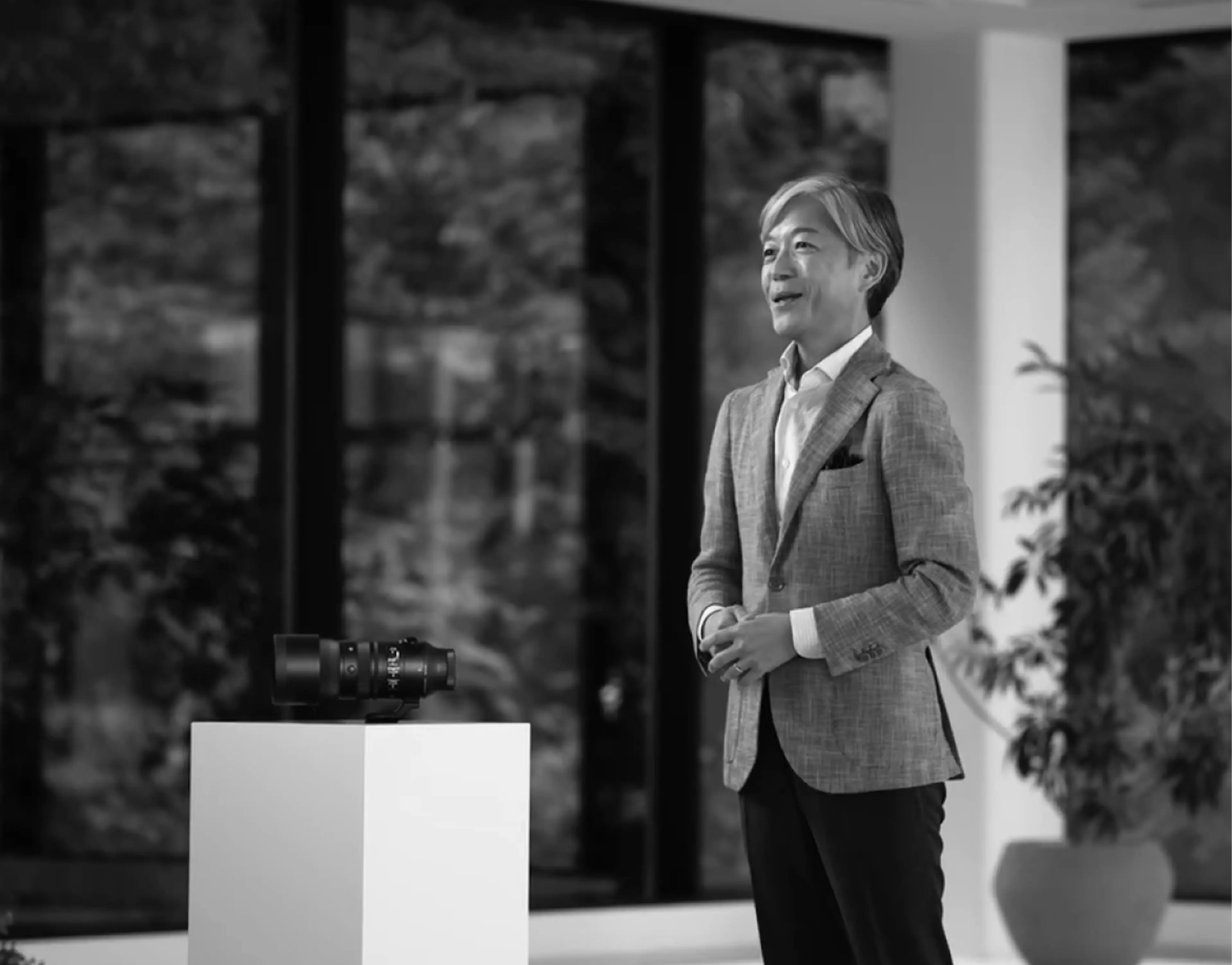
In 2012, Kazuto Yamaki took on the role as CEO of Sigma after his father. It marked the beginning of a new era with innovative products, rigorous quality control and a clear direction towards becoming world-leading in the industry.
A new line of art lenses was introduced targeting professionals and advanced users, setting a new standard for quality and performance. It was also the start of Sigma’s collaboration with Ichiro Iwasaki on product design.
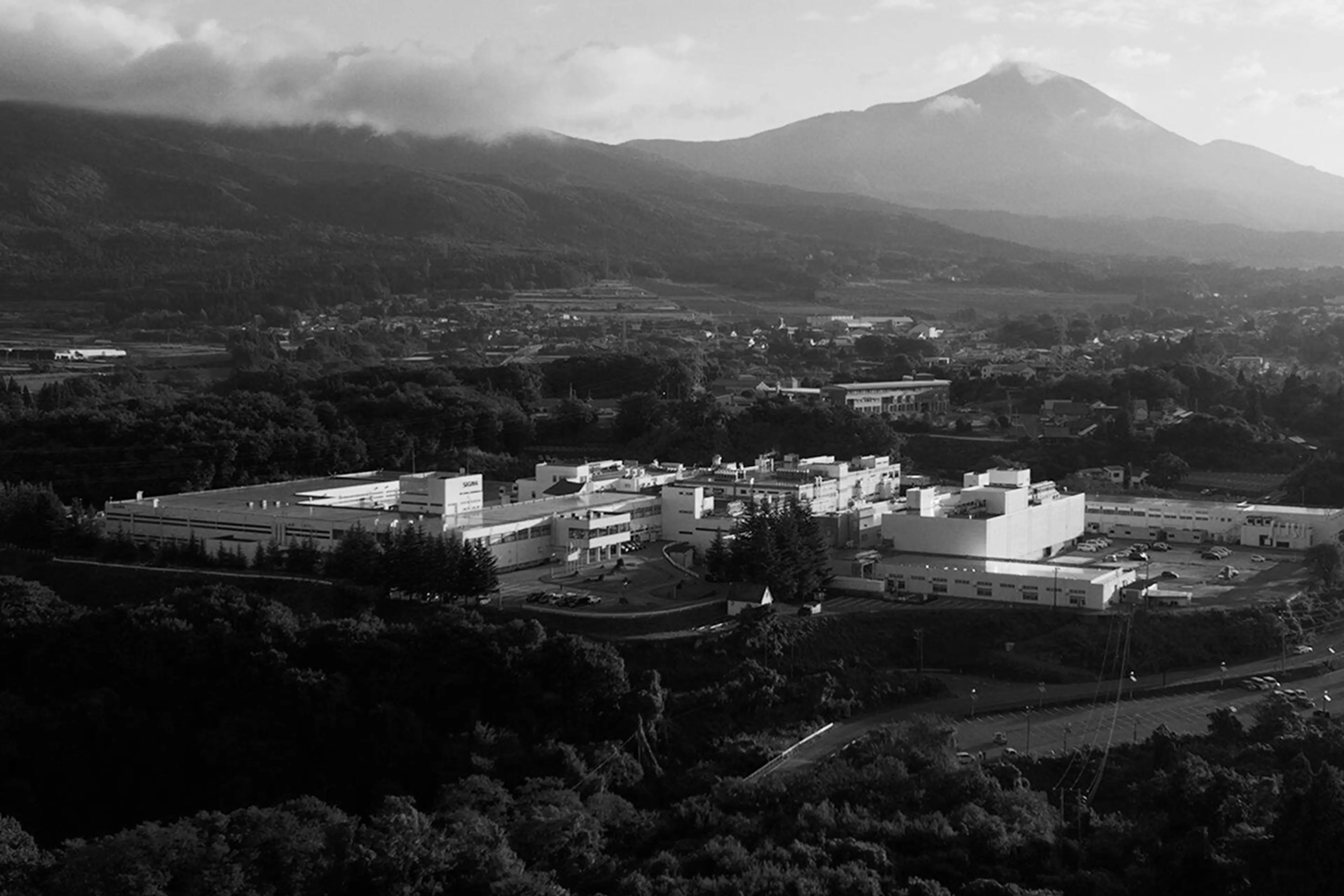
The Aizu factory in 2025. After years of constant improvement, modernization and numerous extensions it is today a unique, vertically integrated production facility – the reason Sigma as the only brand can claim to be truly made in Japan. Photo by Yuichiro Fujishiro.
The new visual identity reflects Sigma’s Japanese heritage, craftsmanship and technical precision.

Sigma Serif is a semi-serif typeface based on the same letterform geometry as the Sigma Sans, giving the serif typeface an engineered character at the foundation. The character of the serifs is inspired by Japanese lettering, translated for the latin alphabet. Sigma Serif is the perfect mix of a sans-serif and a serif, expressing both heritage and technical sharpness.

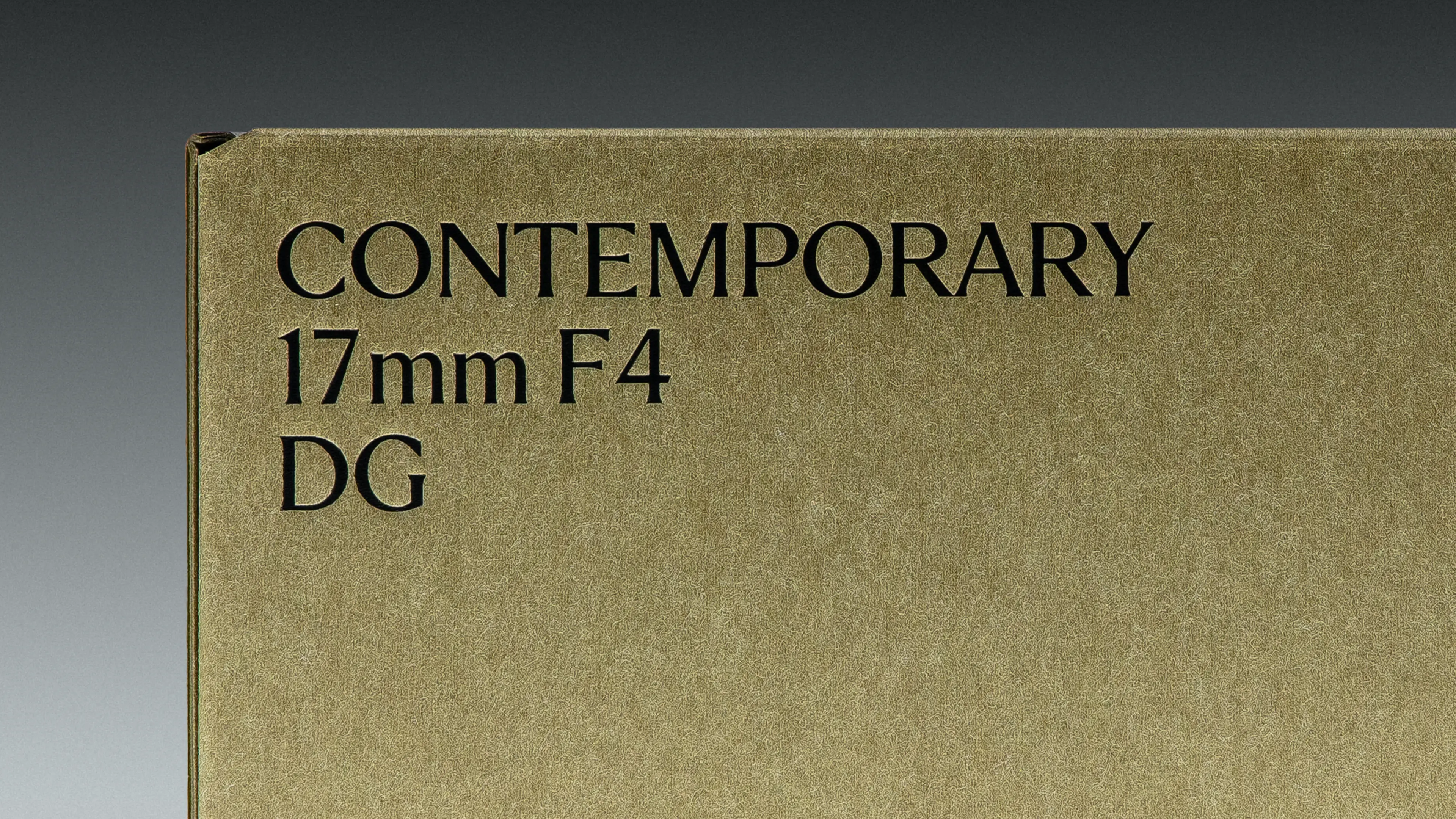
Typefaces


The sigma character has been reintroduced as a brand signifier in an updated geometric symbol, reflecting a footprint of the brand’s history.
Sigma’s new symbol is a mark of quality–subtle and direct. Designed to complement the wordmark, it enables discreet and powerful branding. The circle appears twice in the symbol, a deliberate nod to the company’s foundation: the optical lens. This refined design reinforces Sigma’s commitment to craftsmanship and precision.
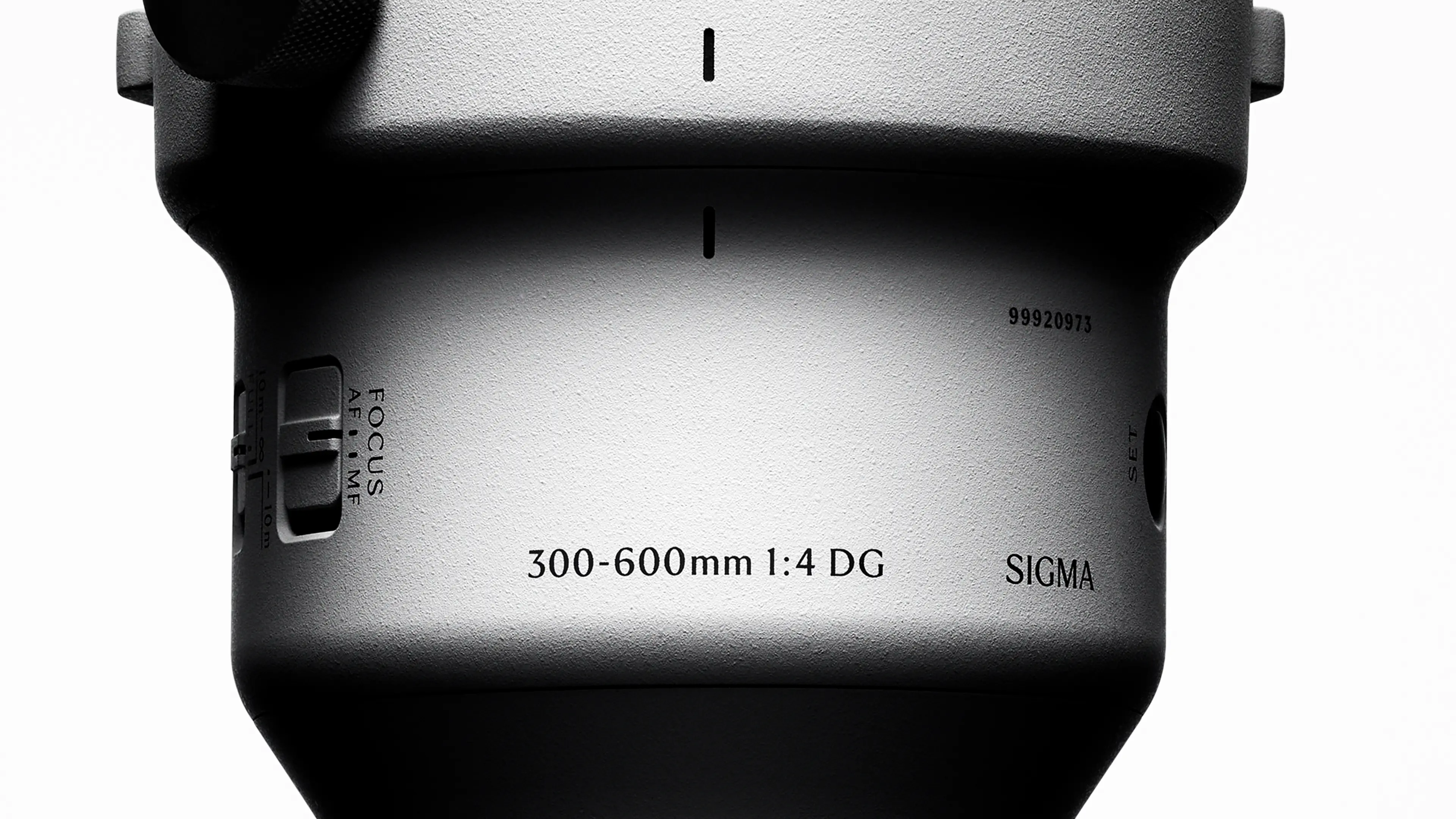
A dynamic photographic language is designed to infuse the brand with a sense of quality and creative excitement.
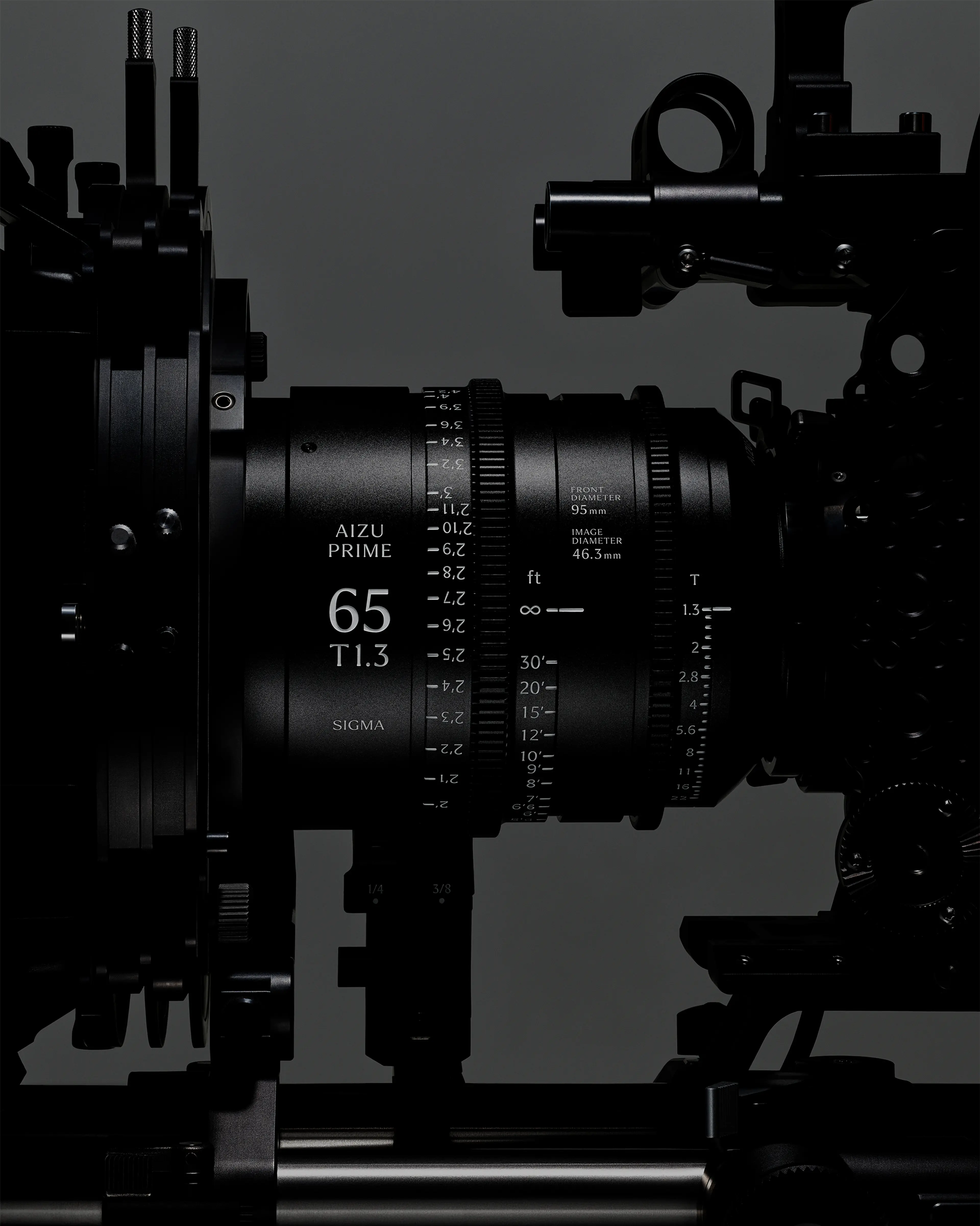
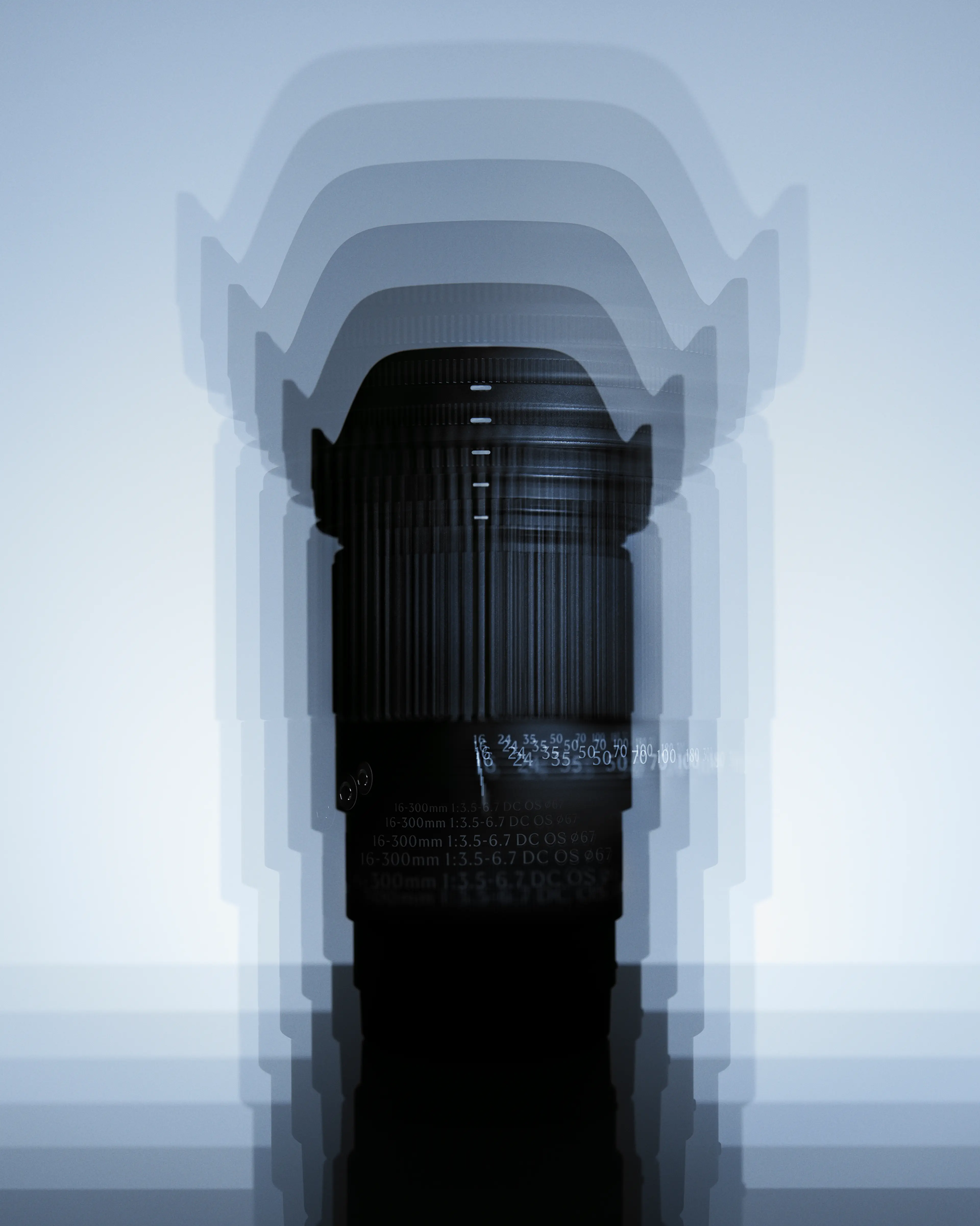
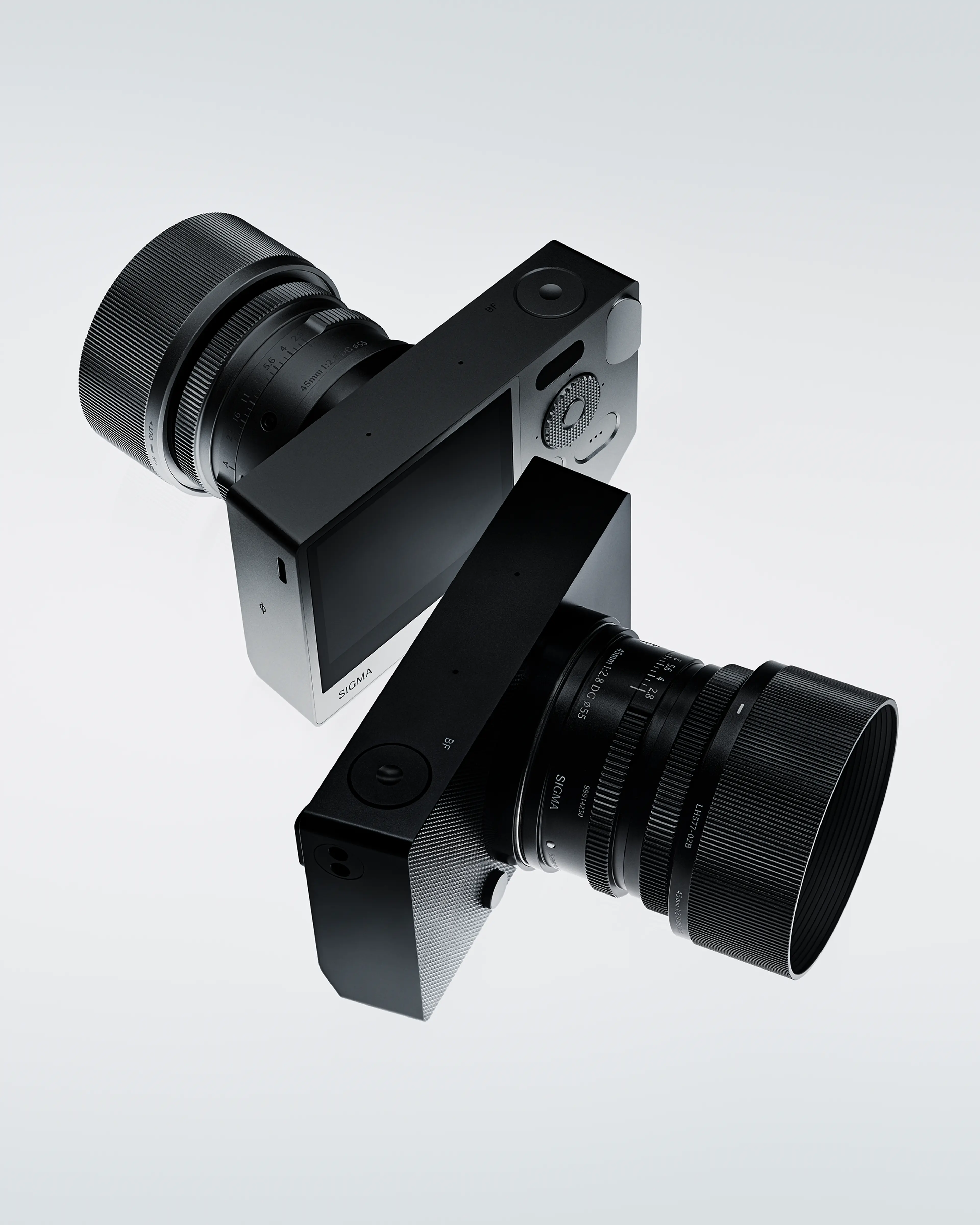
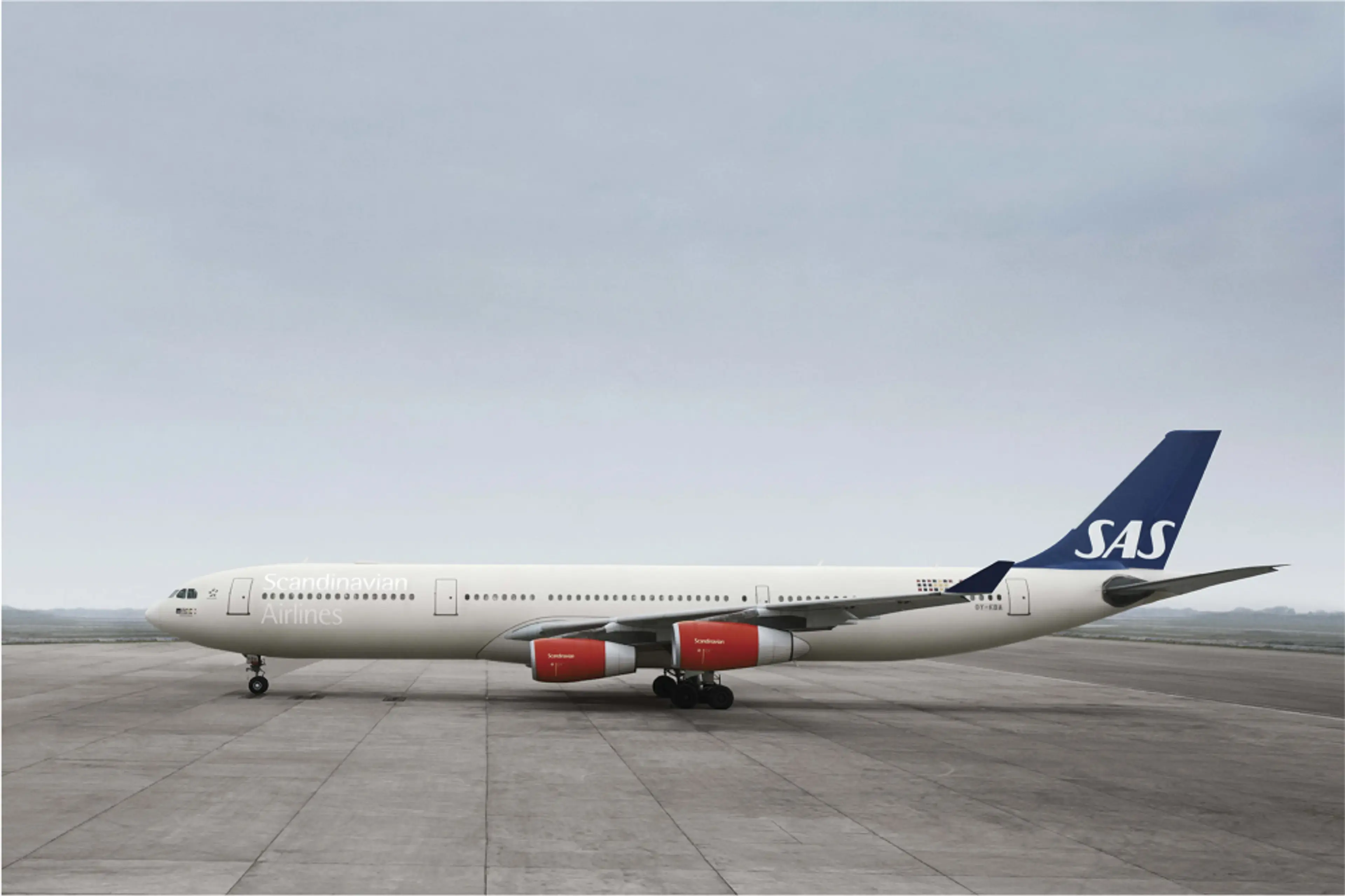
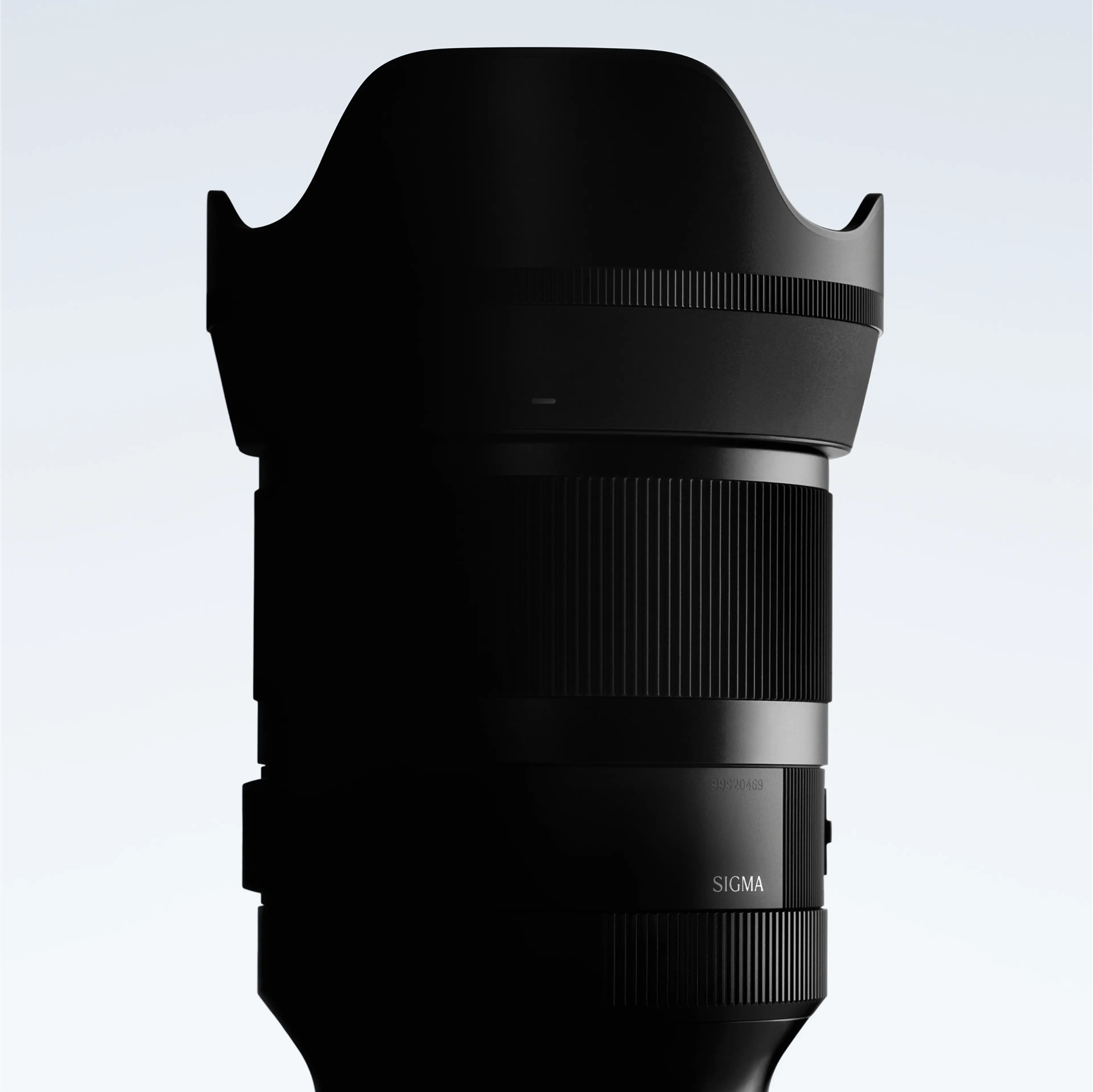
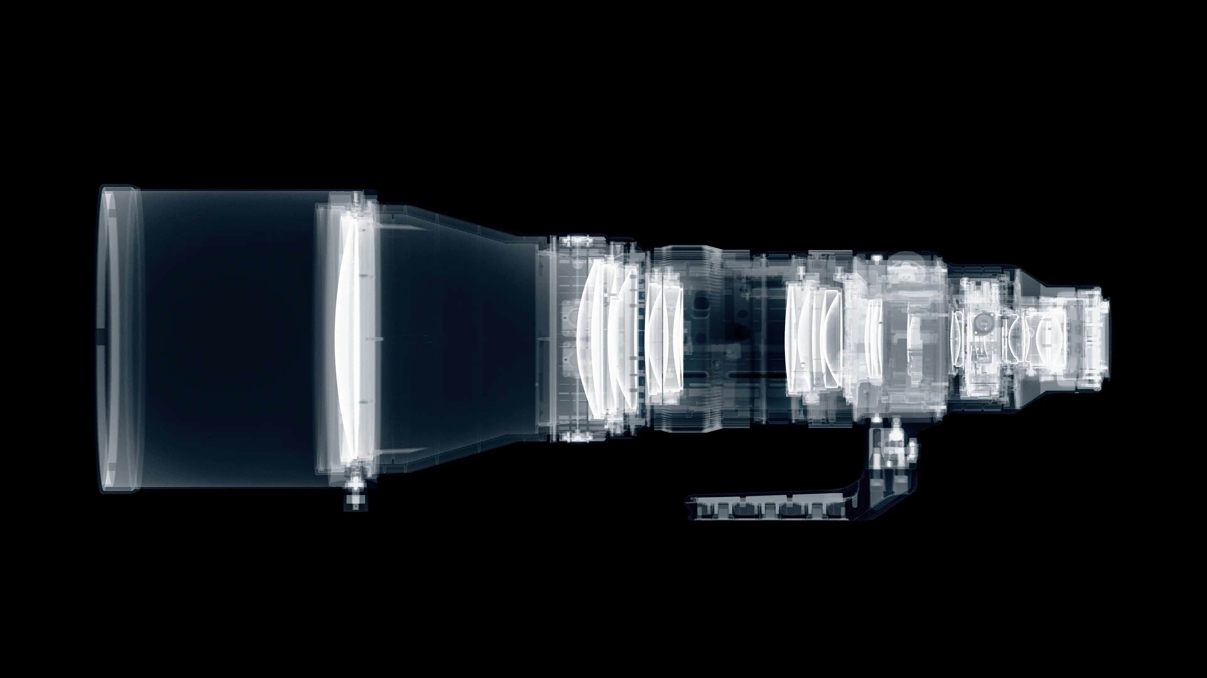
A refined and expressive photographic style has been developed to elevate the brand’s identity, combining sophistication with visual impact. The brand imagery conveys a blend of Japanese elegance and technical excellence. Product design by Ichiro Iwasaki of Iwasaki Design Studio, a trusted Sigma partner since 2012. Photography in collaboration with Emil Larsson. Product demo films produced in collaboration with Parapix.
Illustrated characters guide customers through support and repair services – a light-hearted dimension of the brand, rooted in Japanese culture.


We commissioned Japanese comic book artist nerunodaisuki for Sigma’s characters and branded illustrations. Mascots and comic characters are part of Japanese culture and communication, used in everything from transportation signage to advertisement and public messaging. Sigma’s own characters “Light and Shadow” guide customers through their many support offerings – a lighthearted part of the brand toolbox.

The subdued colours and tactile materials introduce a natural softness, balancing the sharpness and precision of the engineered products.
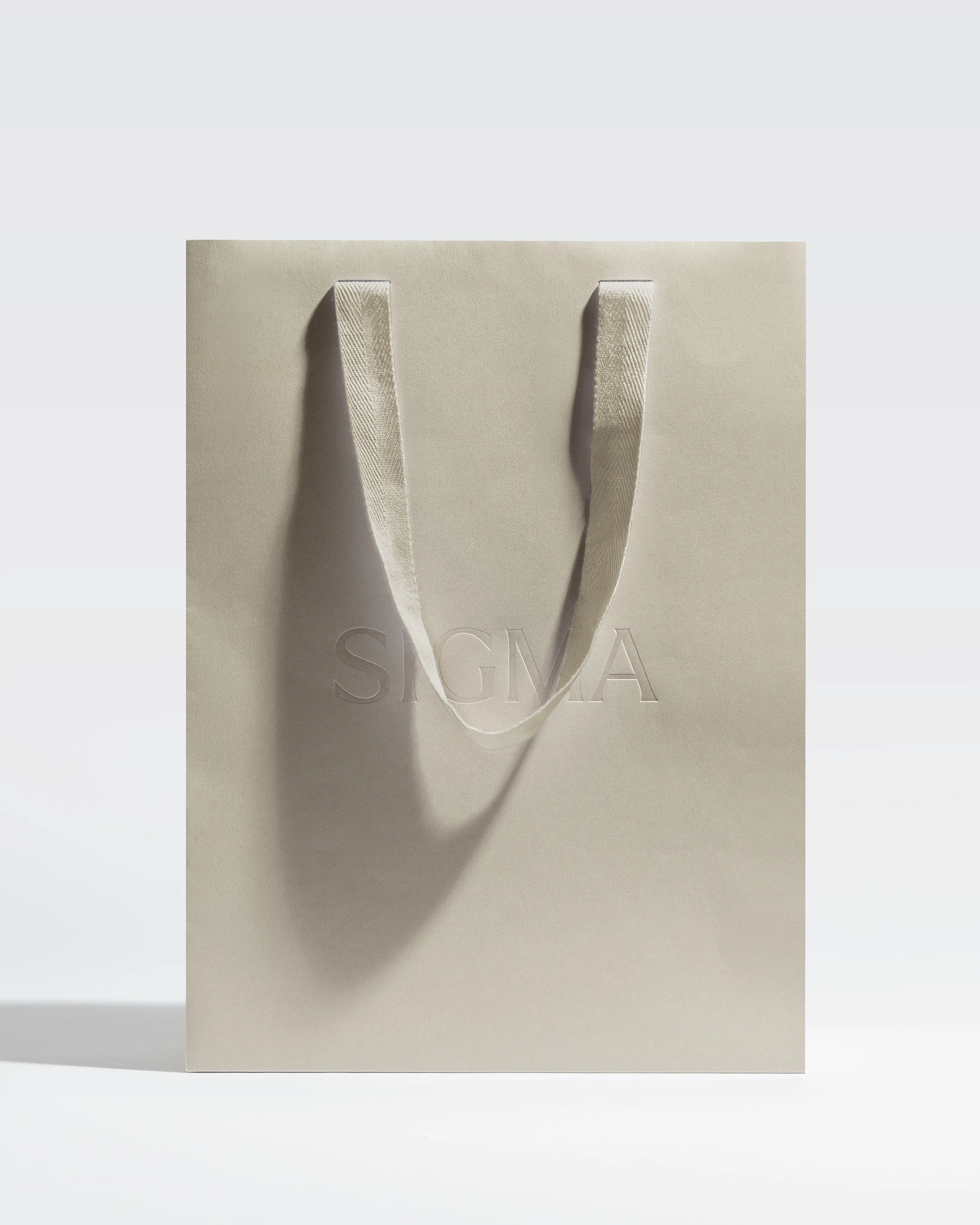
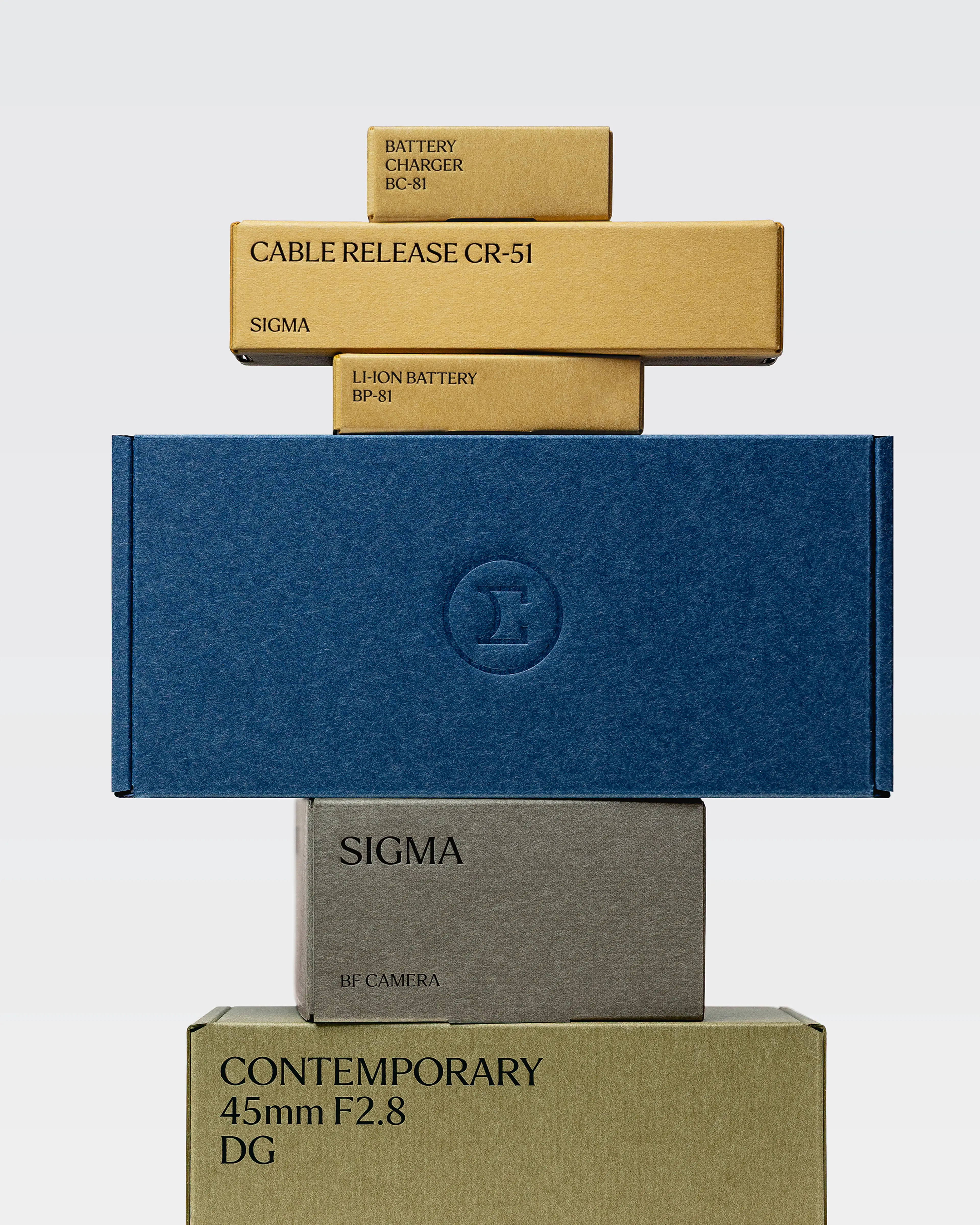
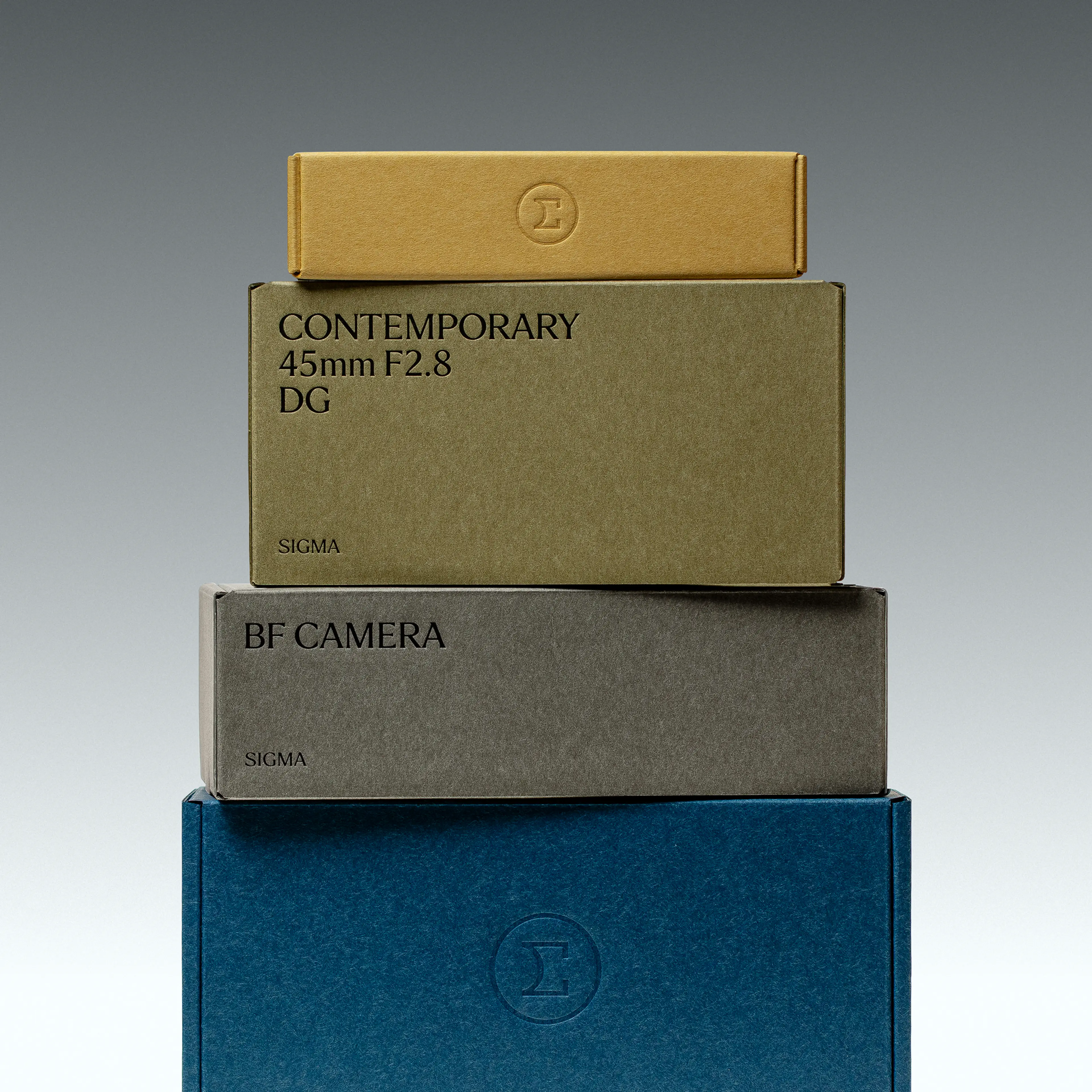
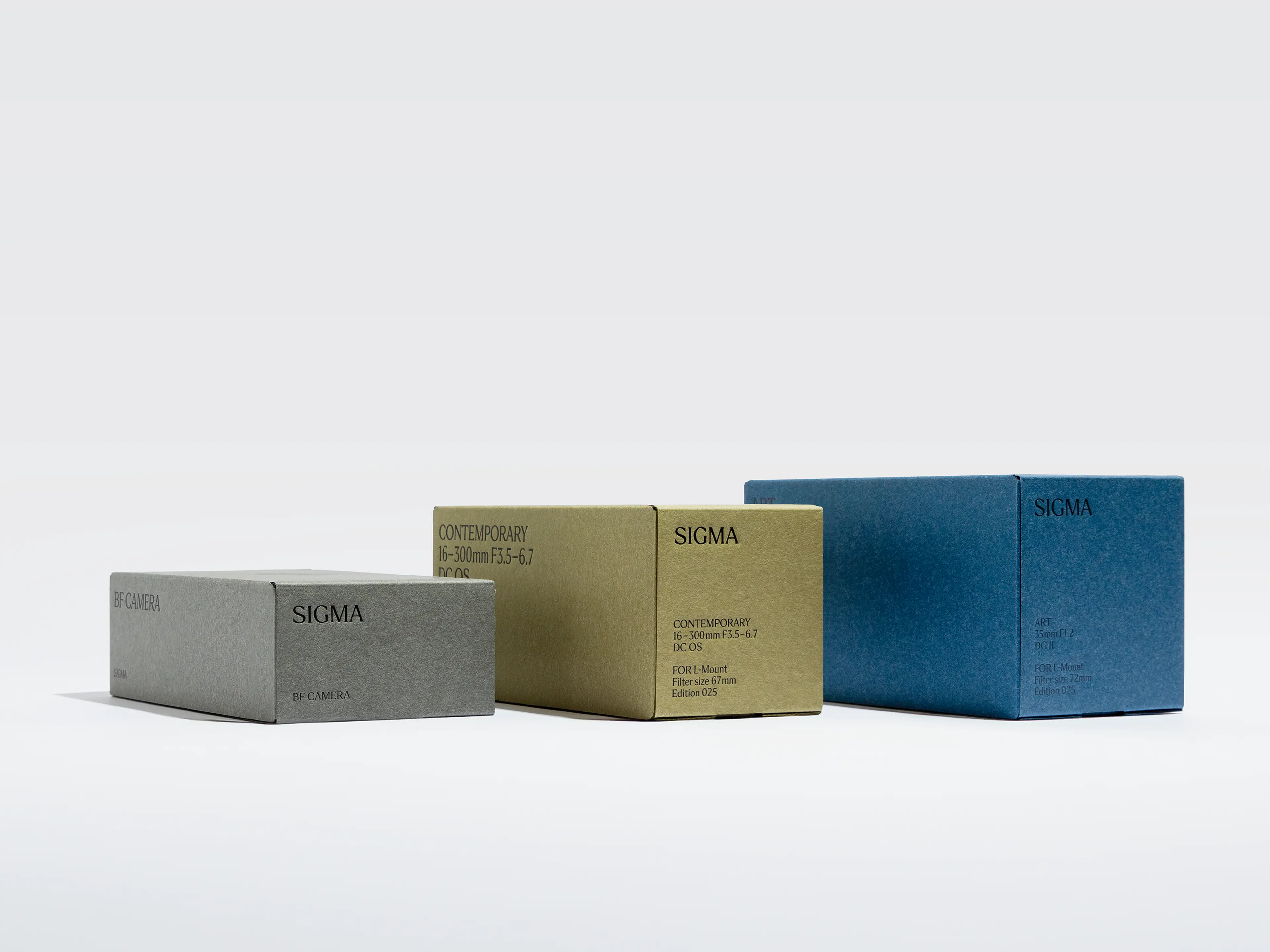
Packaging
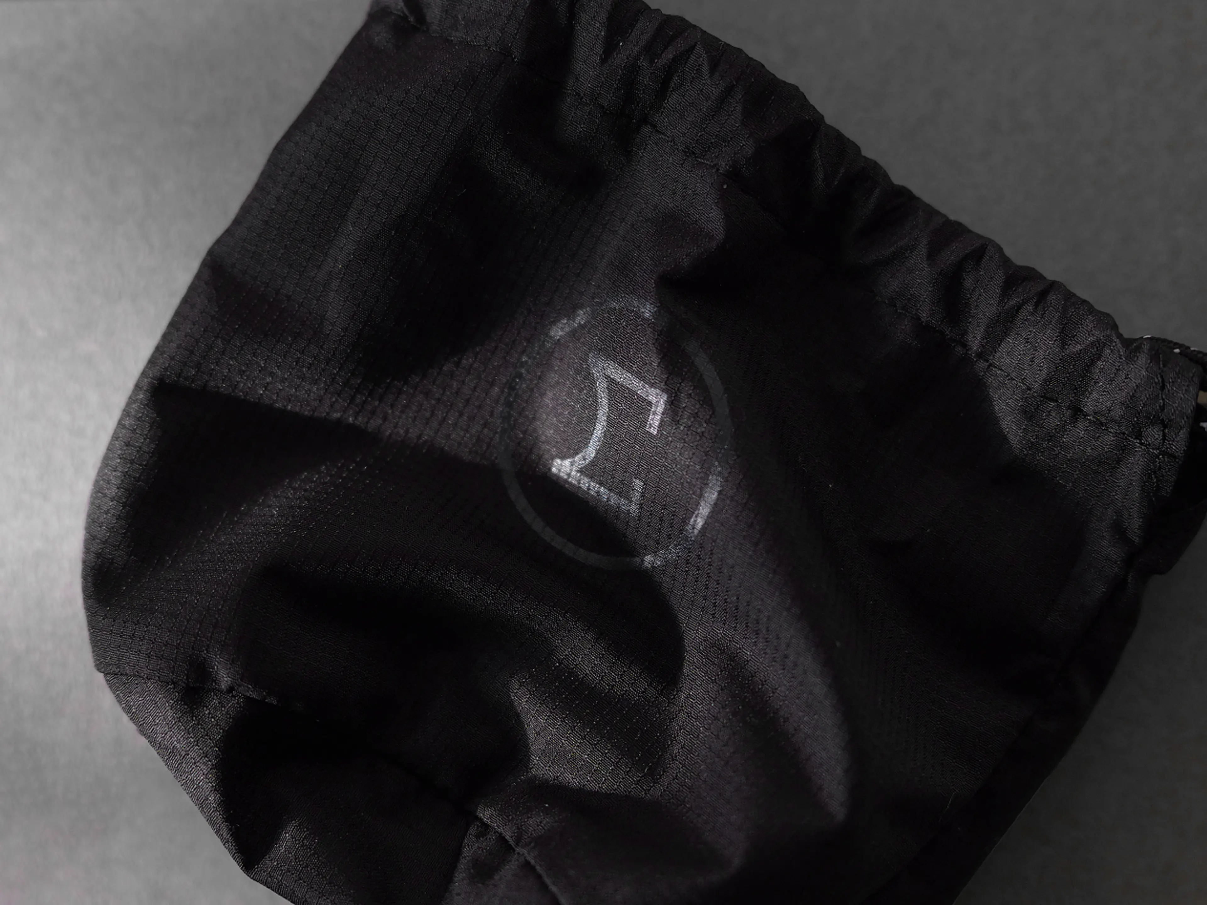
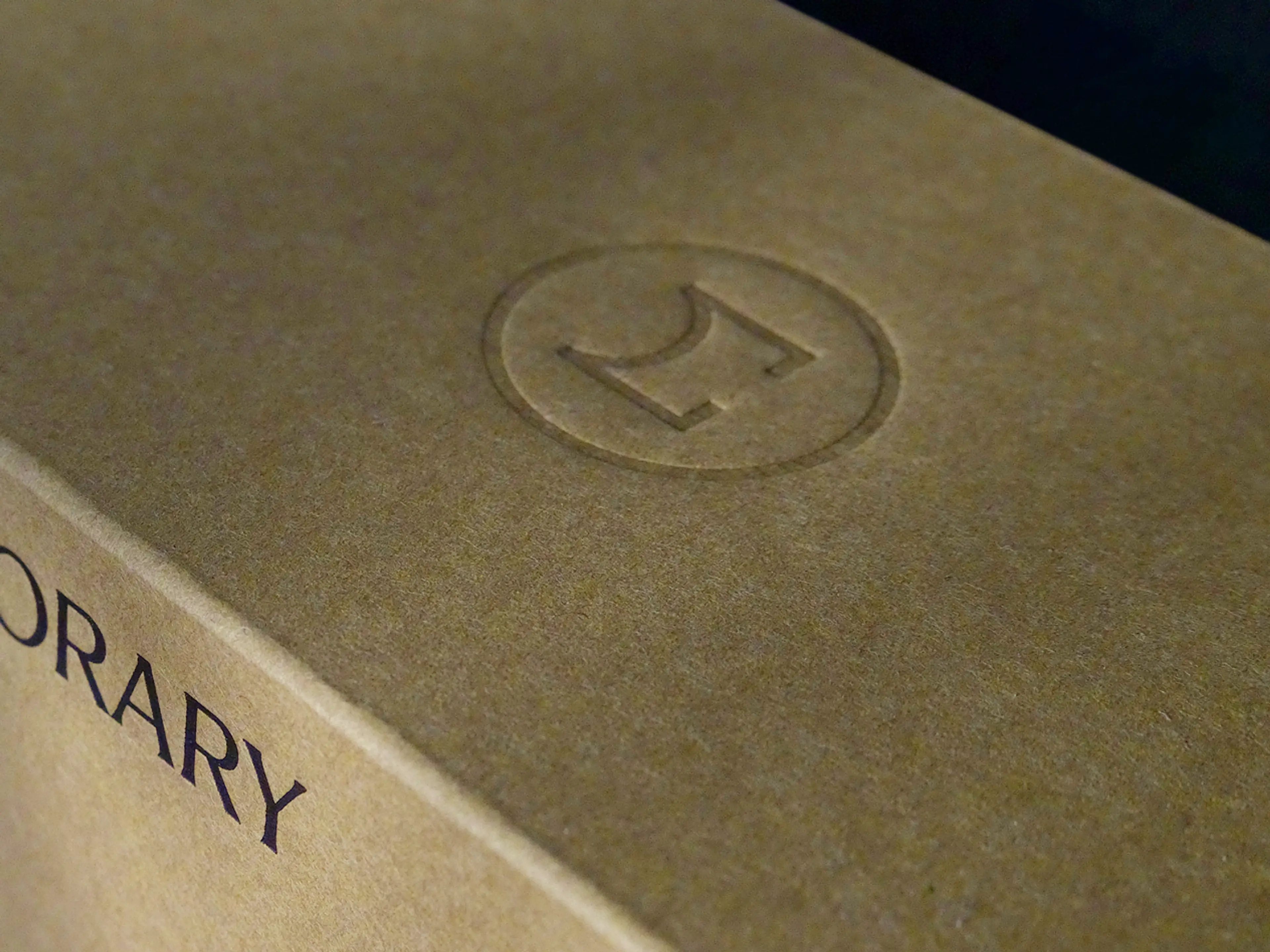
The packaging system combines Japanese craft paper with premium printing and a refined unboxing experience. Sigma’s colour system and typography are applied consistently throughout – from outer packaging to manuals, warranties and branded content. The packaging successfully bridges the gap between a premium aesthetics and the constraints of mass production, maintaining a sense of craftsmanship, precision, and brand coherence at every scale.

Spatial experience
The spatial palette brings together contrasting elements: natural, tactile materials and colours juxtaposed with sleek, technical black and white surfaces. The circle functions as a fifth brand element, subtly reinforcing identity and consistency across all media, especially in physical environments.
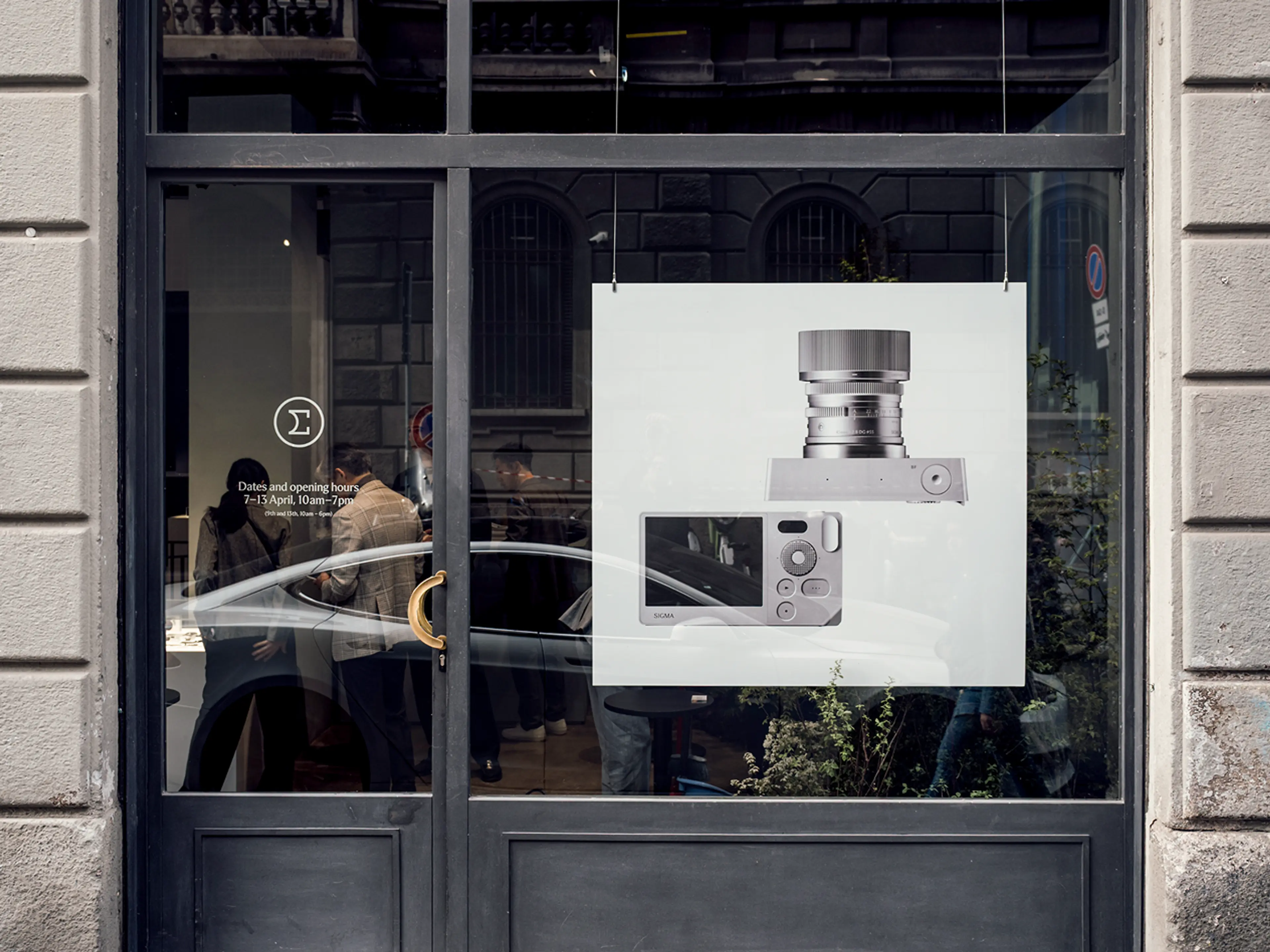
Images from CP+ Photo Imaging Show Yokohama and Salone del Mobile Milan. Design collaborations with Elding Oscarson (CP+) and Iwasaki Design Studio (Salone). Photography from CP+ by Kenryou Gu, and photography from Salone del Mobile Milan by CROPE.