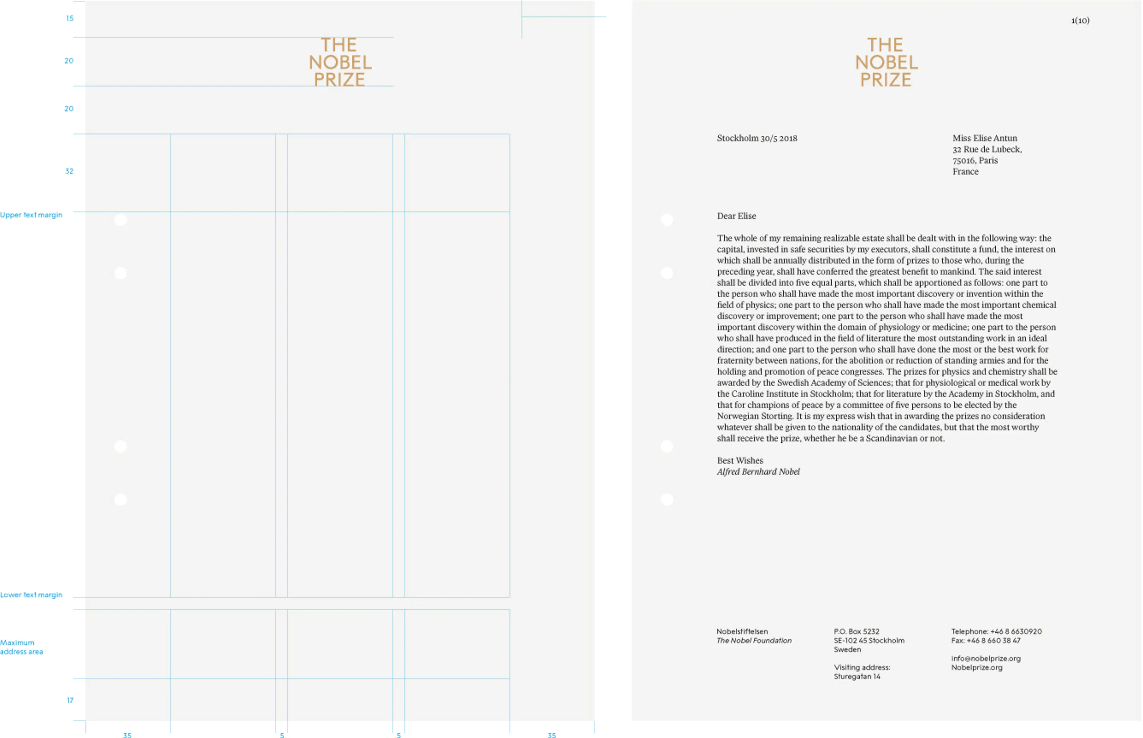
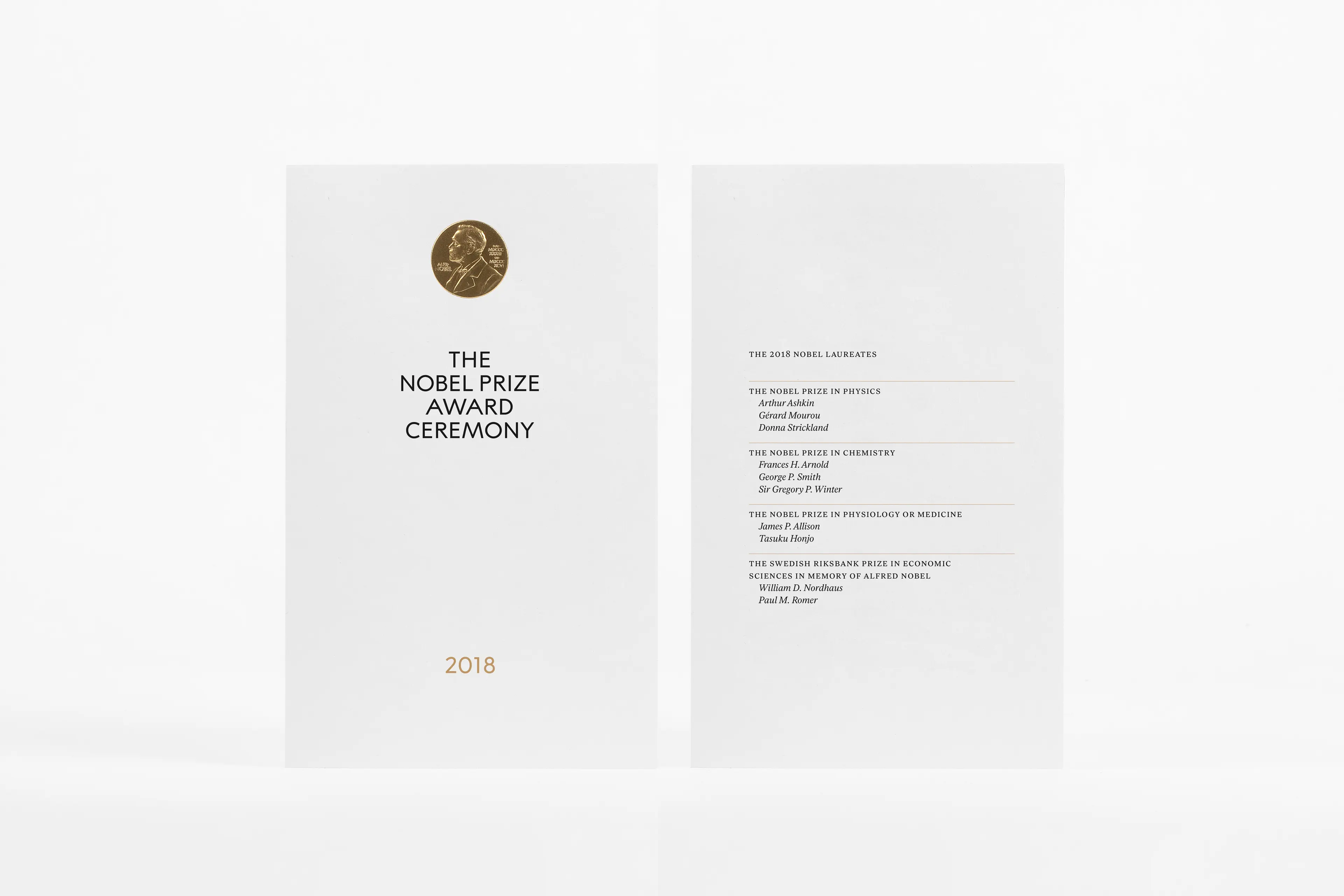
The Nobel Prize is a strong global brand with great integrity and credibility. In order to manifest its heritage, to clarify the sender and to prepare the brand for the future – the Nobel Prize needed a design strategy that is common to all stakeholders. A one-brand approach, paired with a structured nomenclature system and a clear visual identity, the ambition was to create synergies and push the organisations in the same direction, in order to ensure long-term preservation and strengthening of the brand´s unique position. The solution required a strong visual idea and a holistic brand identity as a solid foundation. The requirements on the identity system were for it to be manageable, applicable and flexible enough to work throughout the different organisations, with an emphasis on digital presence, social media and public events.
Heritage and history are key to The Nobel Prize. A part of the credibility and attraction of the brand lies within its ability to stay relevant to the times it operates in and how it manages and continues to develop brand equity. To do so we defined permanent core brand assets and their role in the identity, as well as developed contemporary tools and expressions that complement the needs of today. The natural springboard for the development of the visual identity is the Art Nouveau gold medal that was first handed out in 1902 – the wordmark, typography, colours and the fifth element all spring from this one source. A common identity that will increase the possibilities for recognition, consistency and more effective communication efforts that strengthens the unique position of The Nobel Prize.
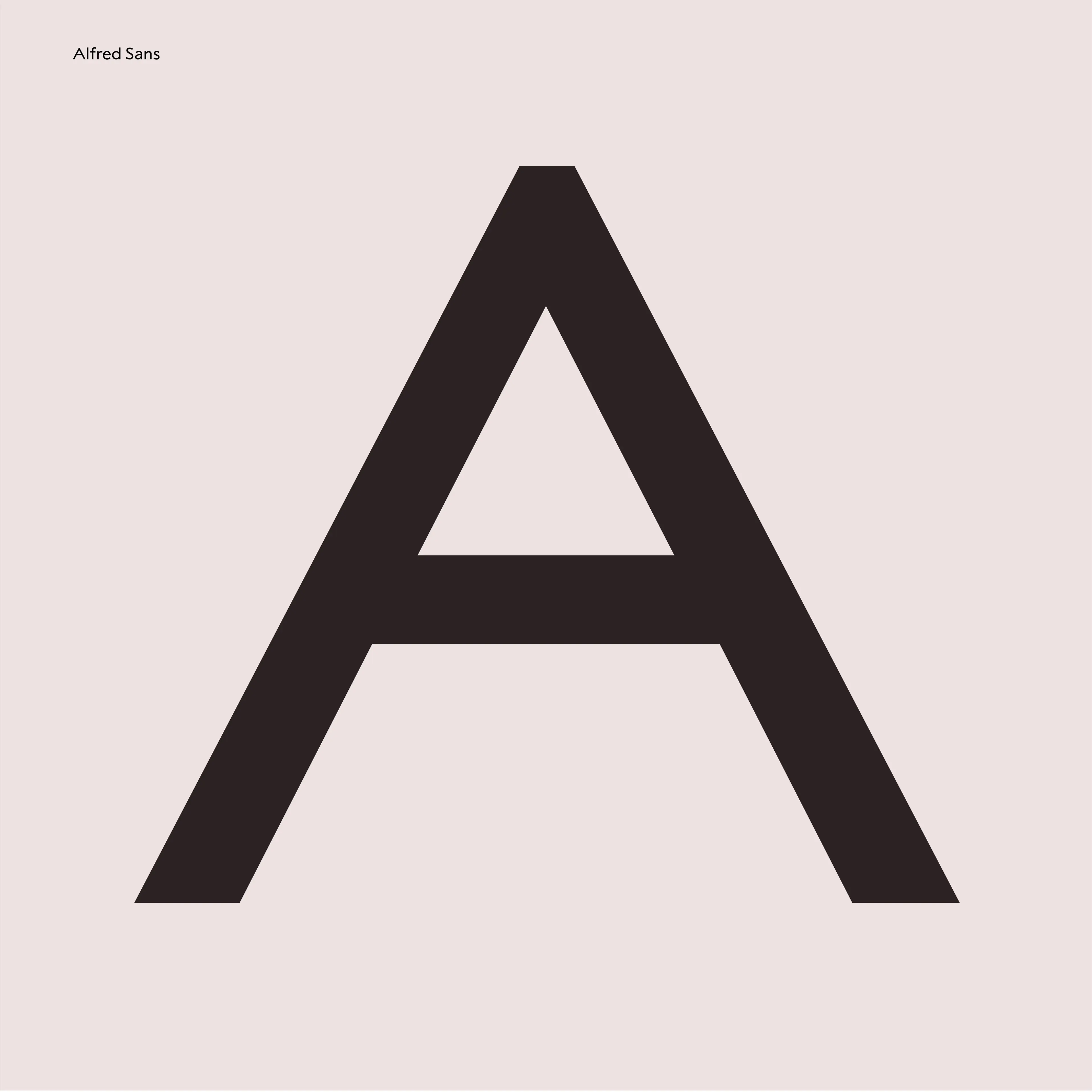
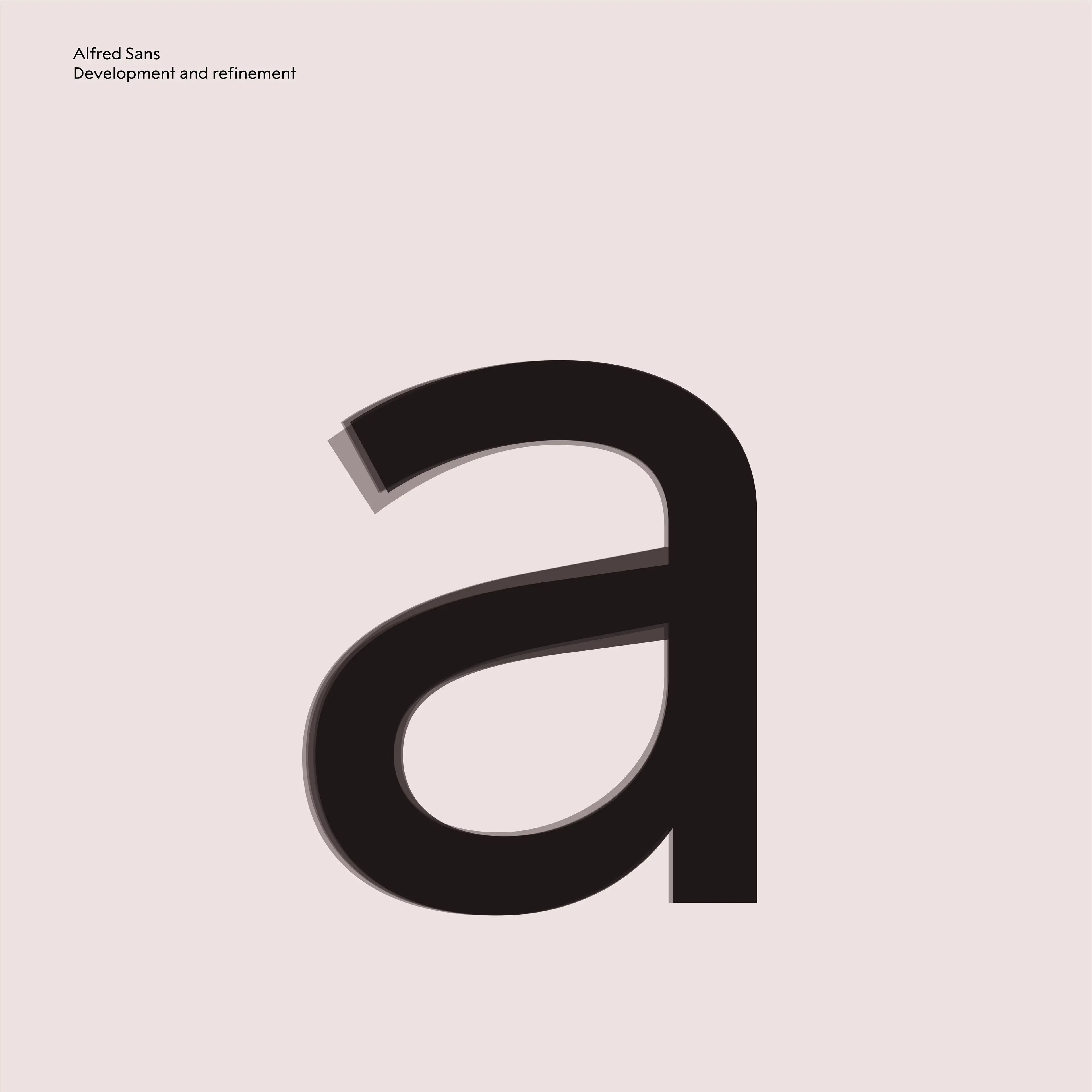
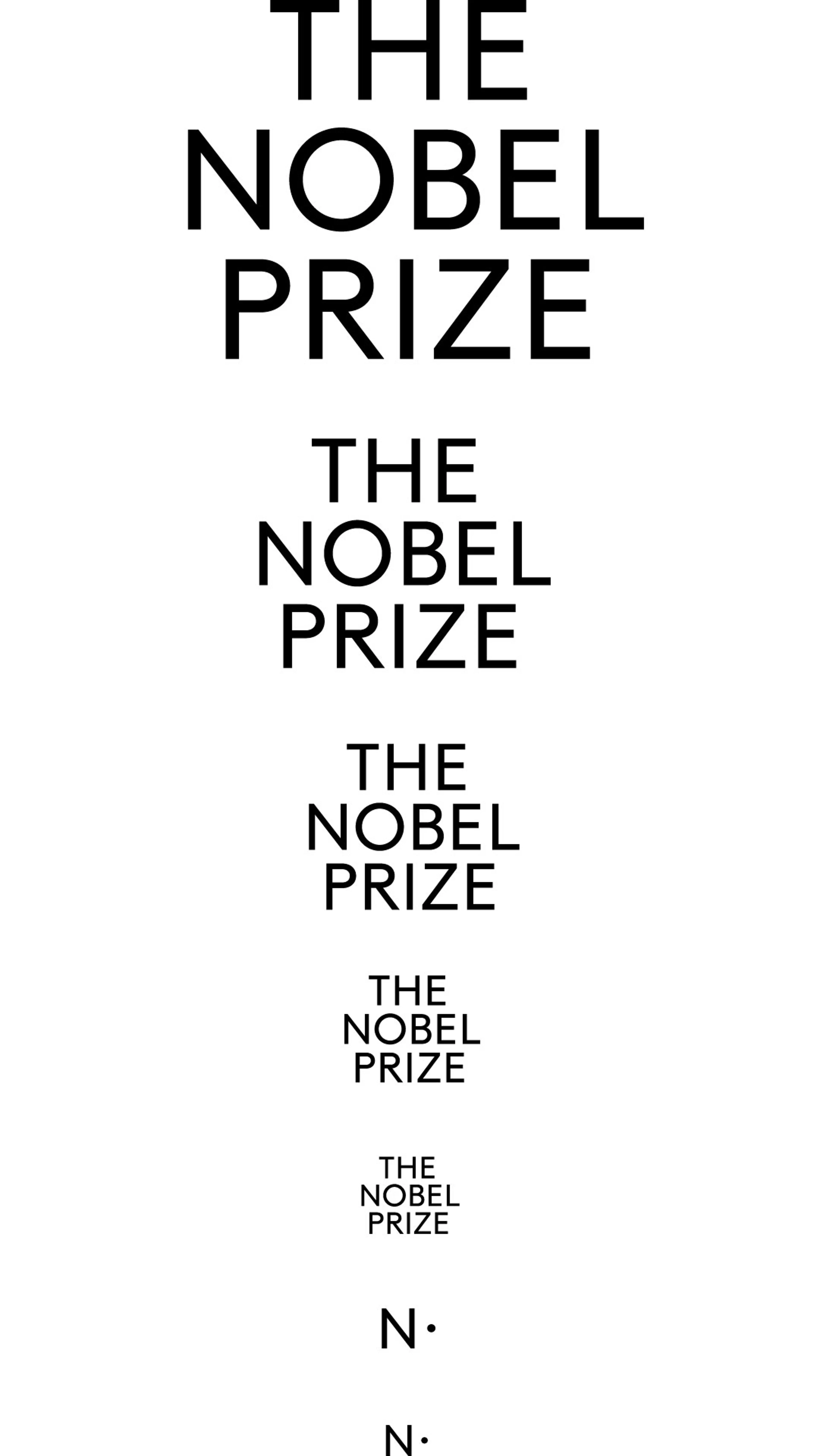
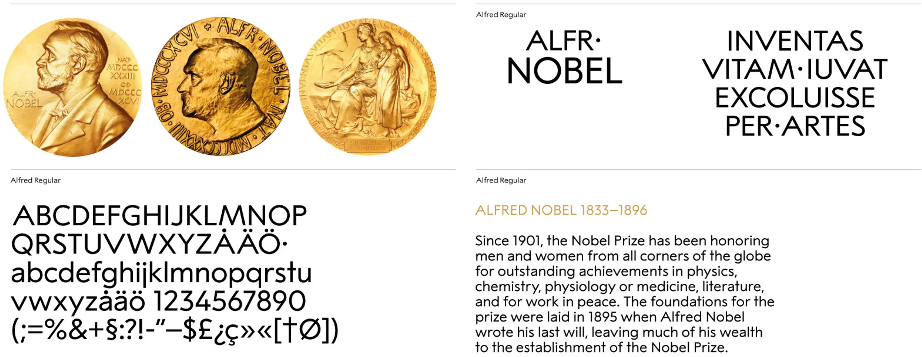
The uniquely drawn typeface, Alfred Regular, originates from the letters engraved in the golden medal. As the primary font and also used in The Nobel Prize wordmark, it will gain recognition in any touchpoint.
The upper case lettering is based on classic geometric shapes, but with varying width and a high waist, giving it a unique and ownable character. The lowercase letters are designed in the tradition of early 20th century sans serif typefaces, like Akzidenz-Grotesk, Berthold Grotesk and Futura.
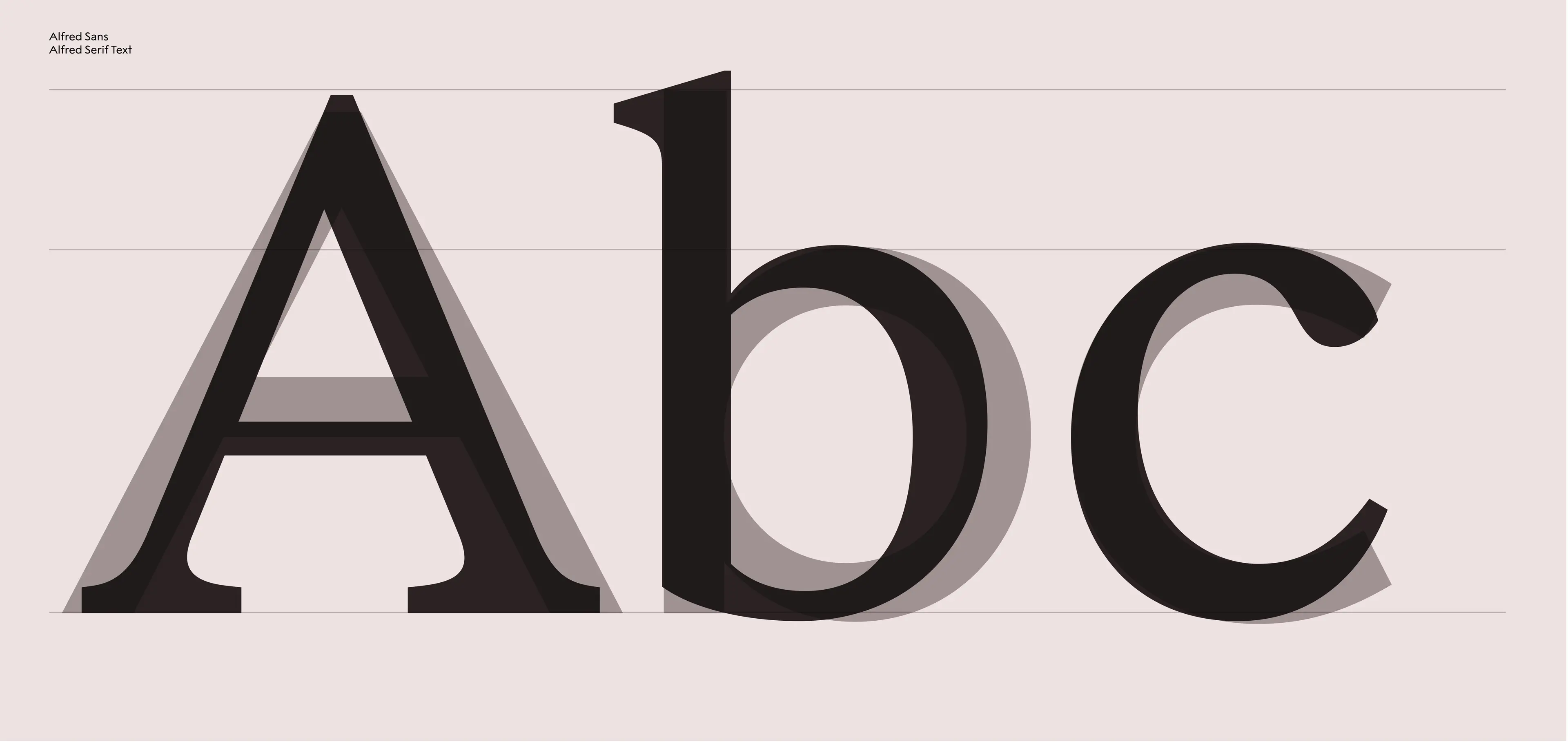
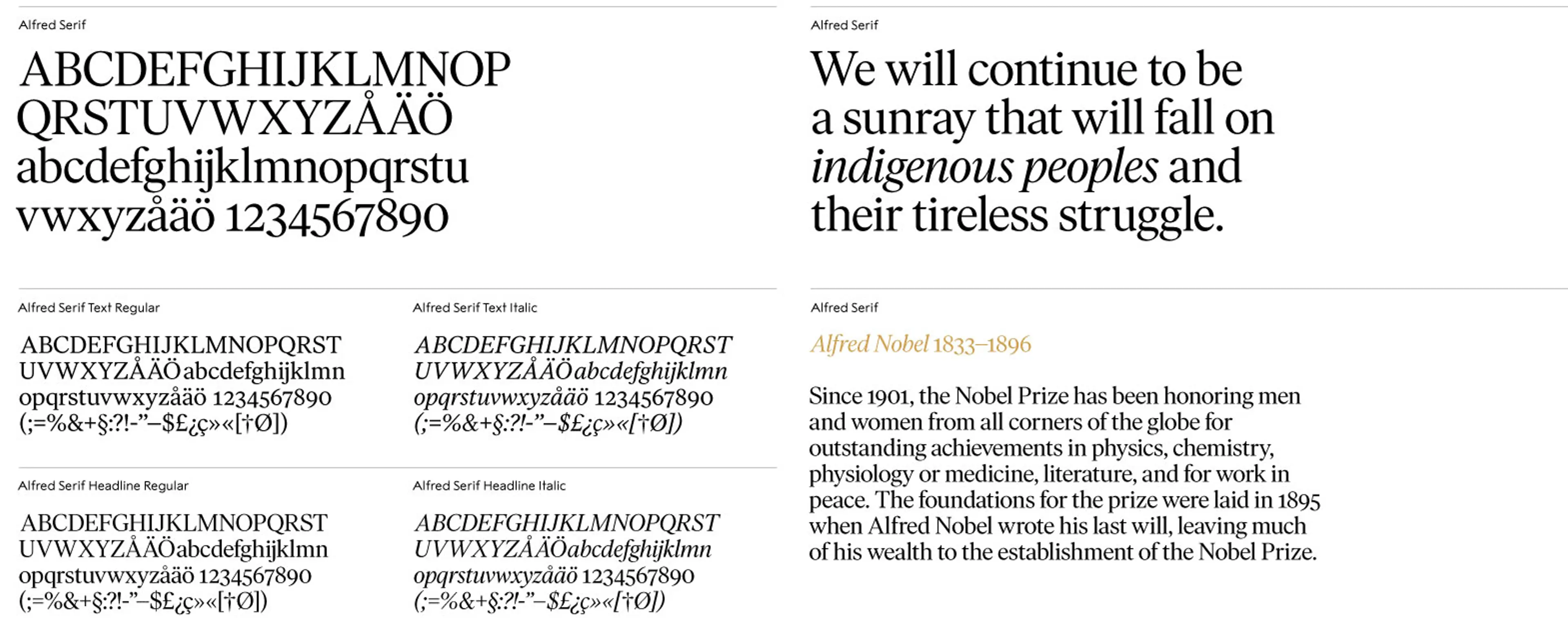
Alfred Sans was developed in parallel with the secondary font, Alfred Serif. Both typefaces are designed to fit together and complement each other, functionally as well as aesthetically with a focus on readability and thus secures long term usage.
“Designers cannot escape the baggage of the past if they continue to use old typefaces. Thankfully, Ivar is here to help move them along — without having to show off either.” Conor Mangat, writing in typographica.org about the typeface Ivar, the commercially available and original version of Alfred Serif by Letters from Sweden.
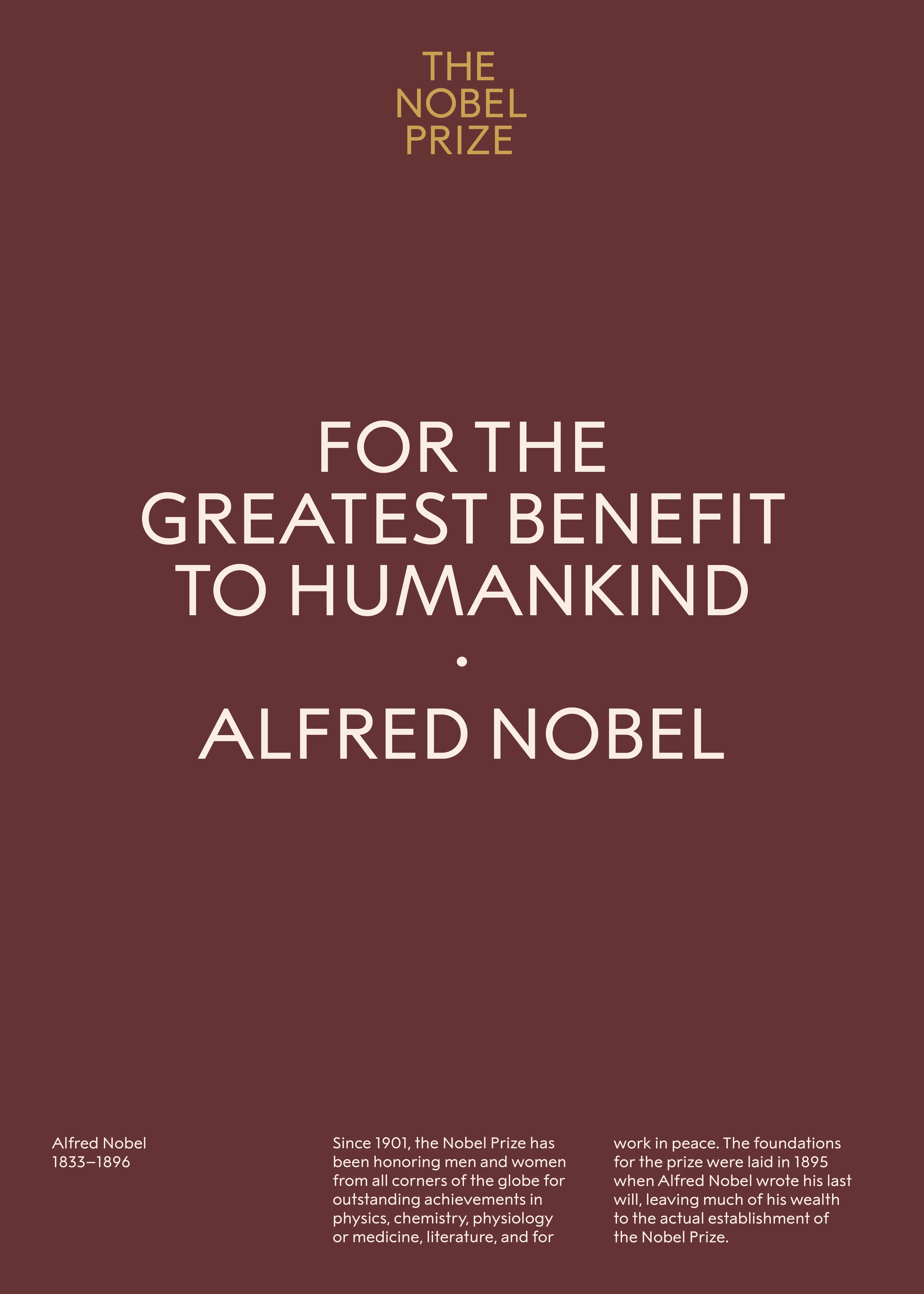
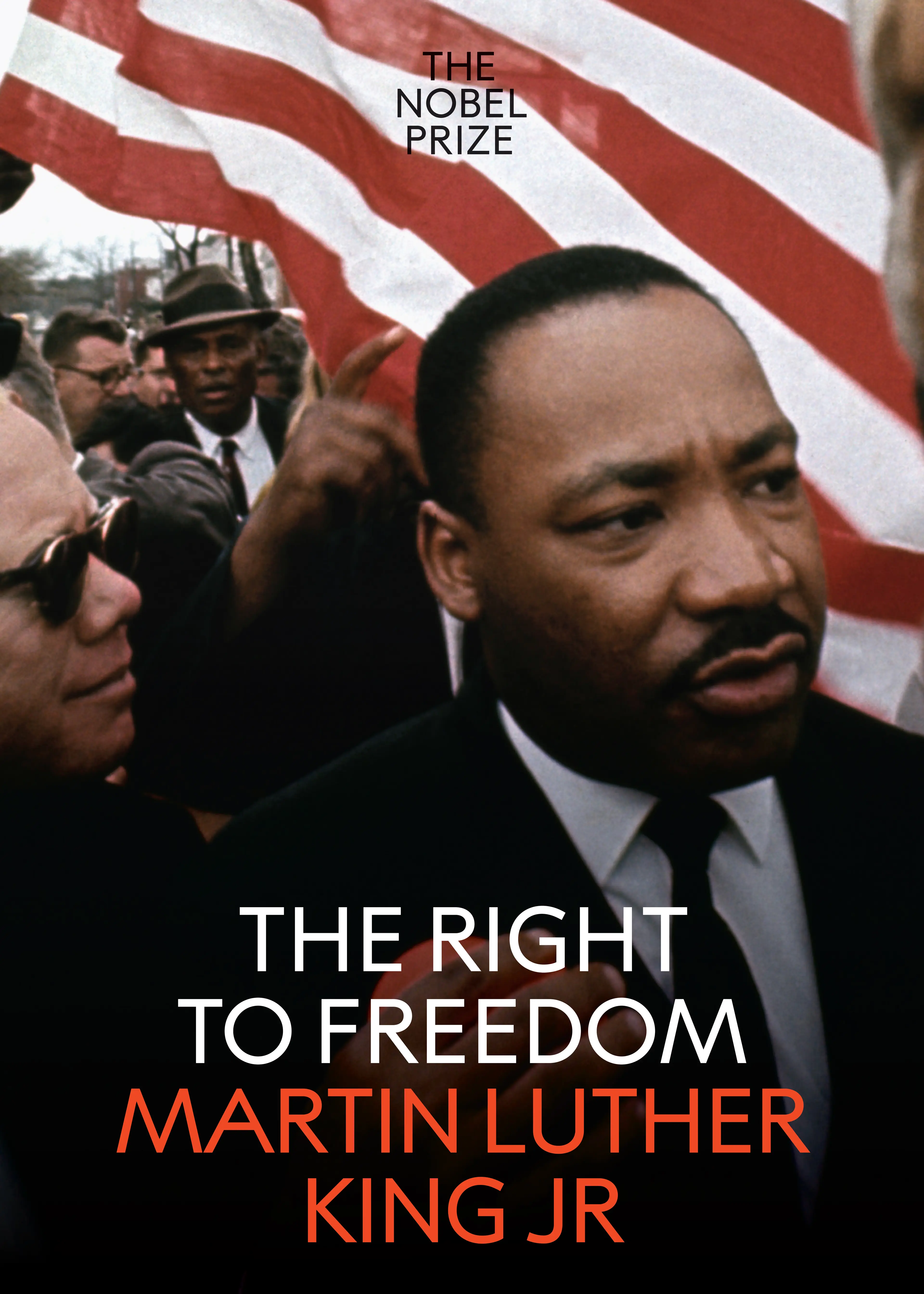
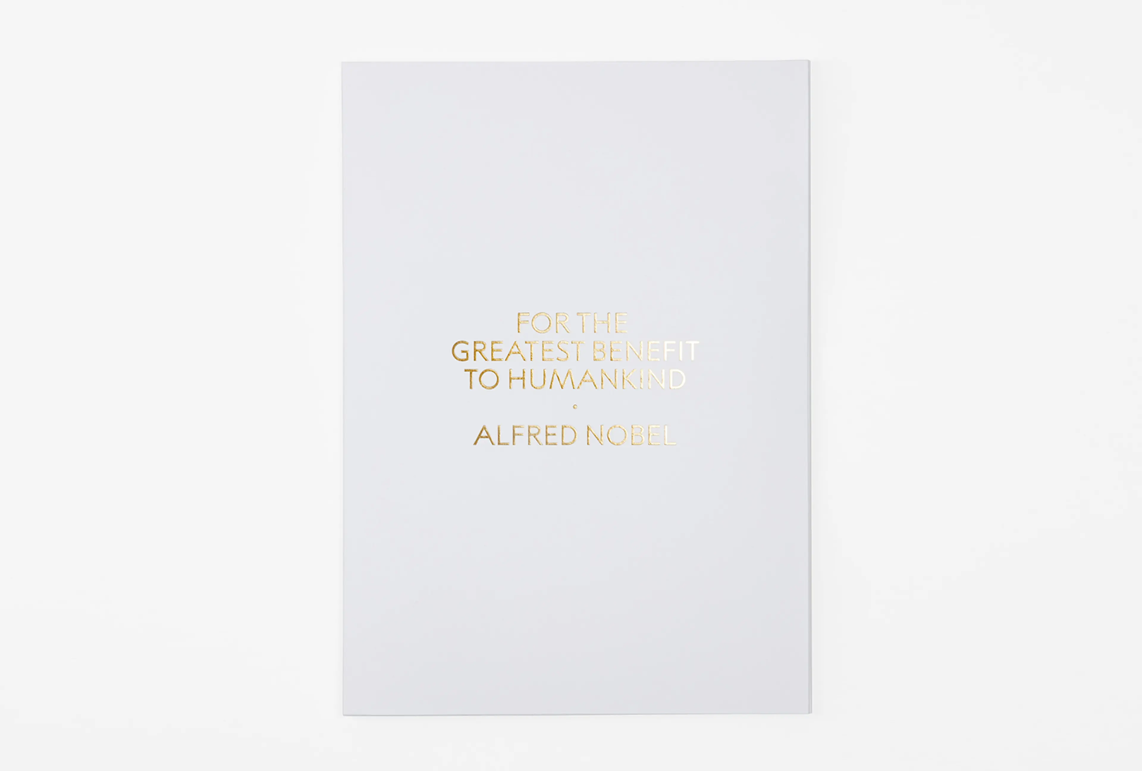
The very foundation of The Nobel Prize is the will of Alfred Nobel, with his clear vision of awarding those who have contributed with the “greatest benefit to humankind”, regardless of nationality. The unique collection of different scientific disciplines is one of The Nobel Prize’s greatest strengths and it is widely regarded as the most prestigious recognition in all disciplines.

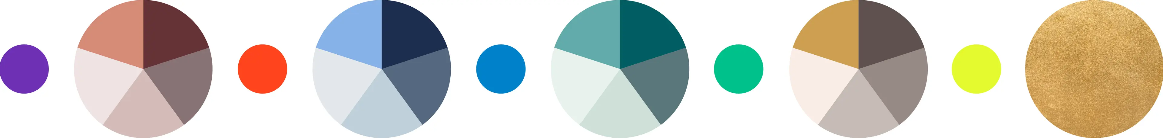
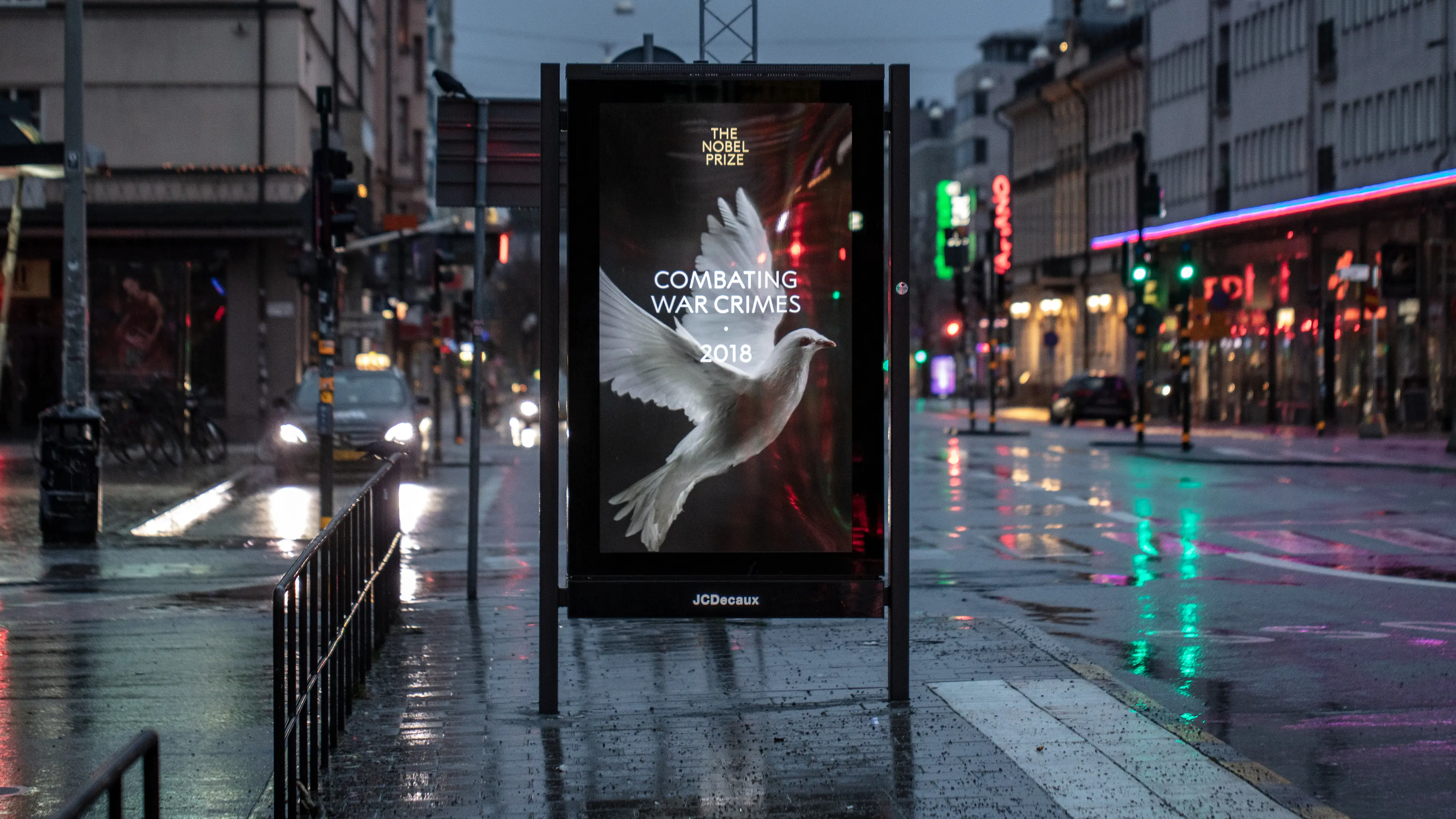
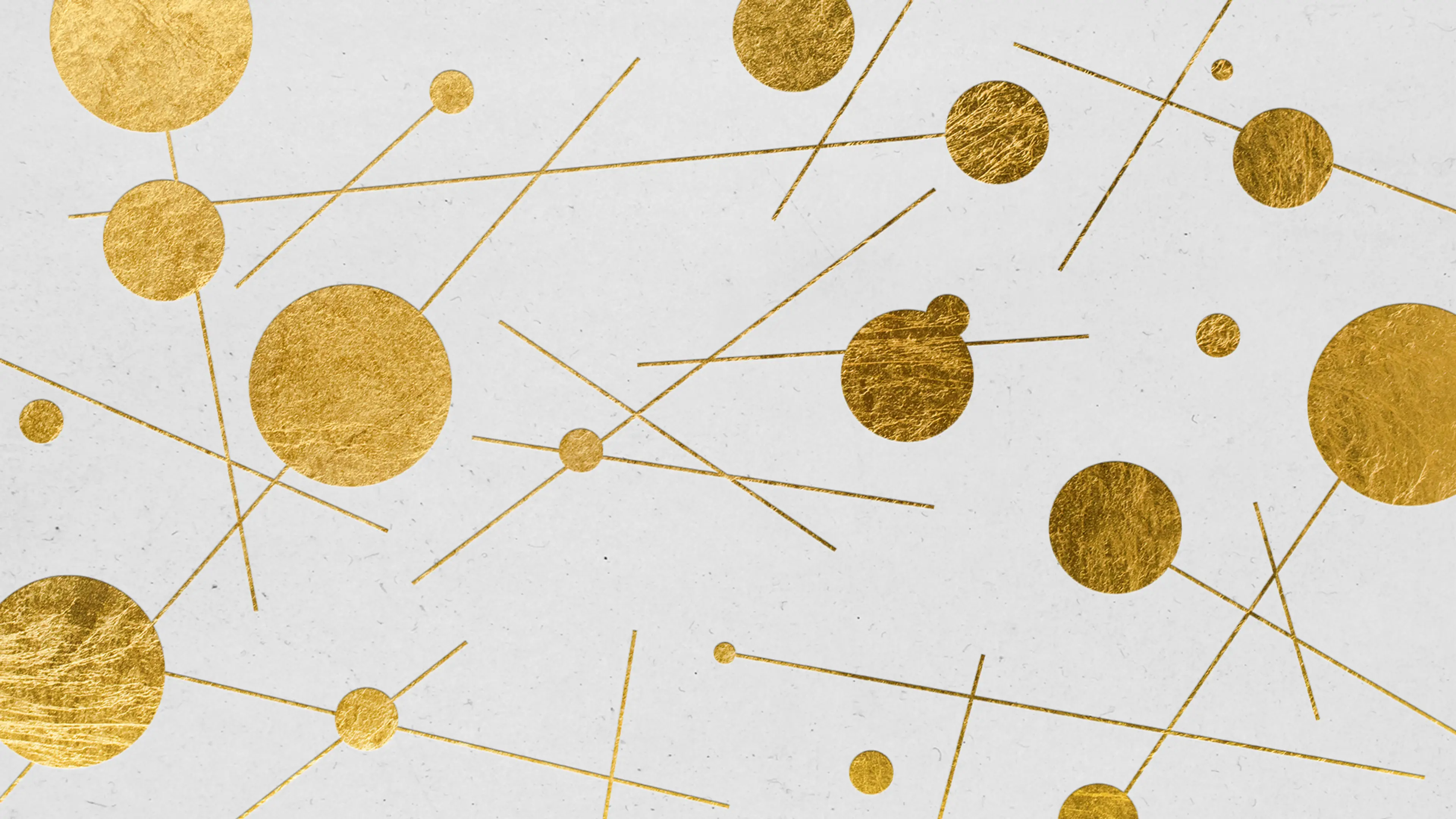
If any brand can rightly claim gold as its natural accent colour, it is probably The Nobel Prize. With a clear connection to the elegant color schemes around the turn of the century, the color system matches well with gold. Complementing this with strong accent colors gives us endless possibilities for exciting combinations – just as the brand, this reflects the historical legacy as well as enables effective presence in a digital context.
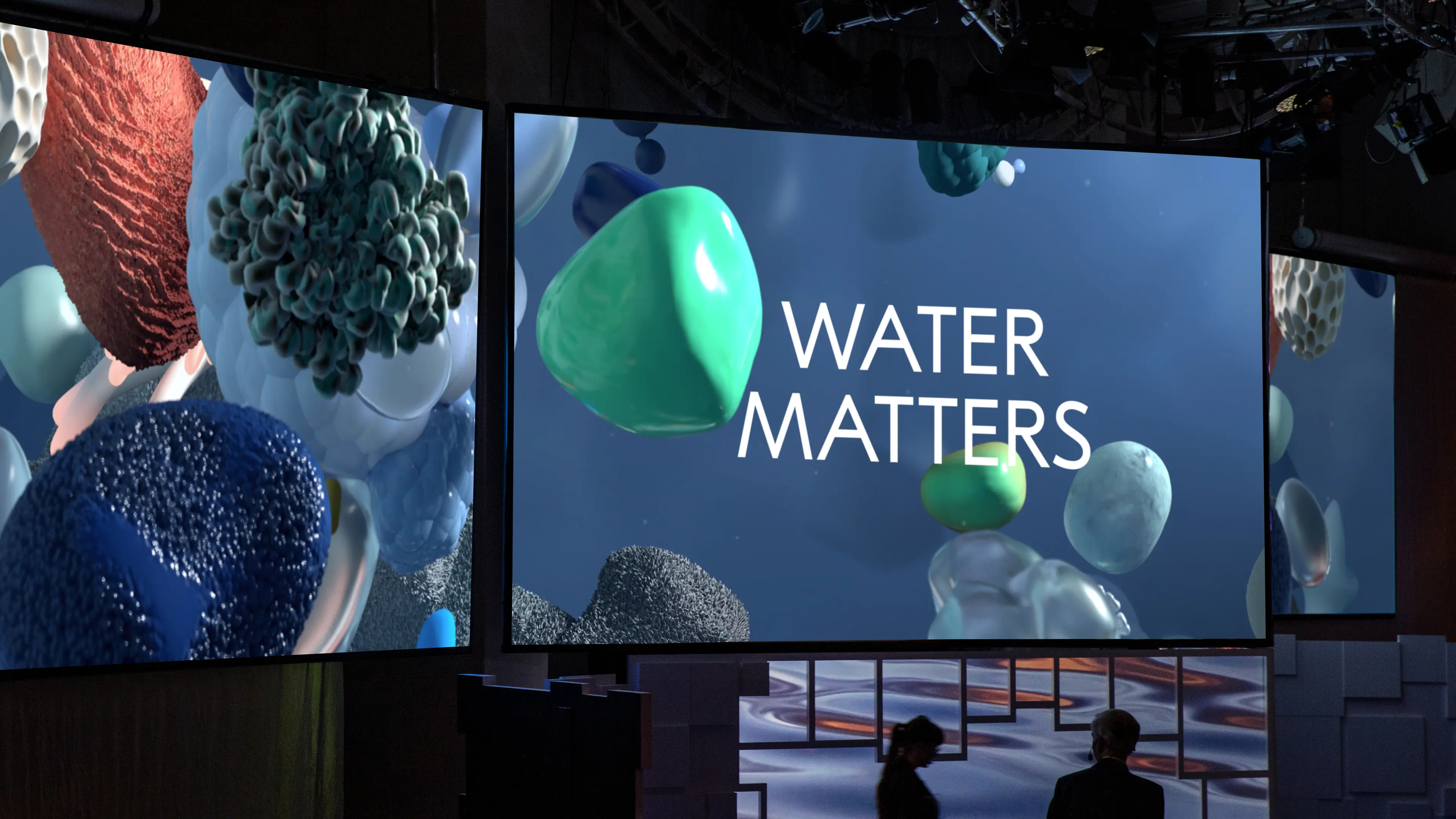
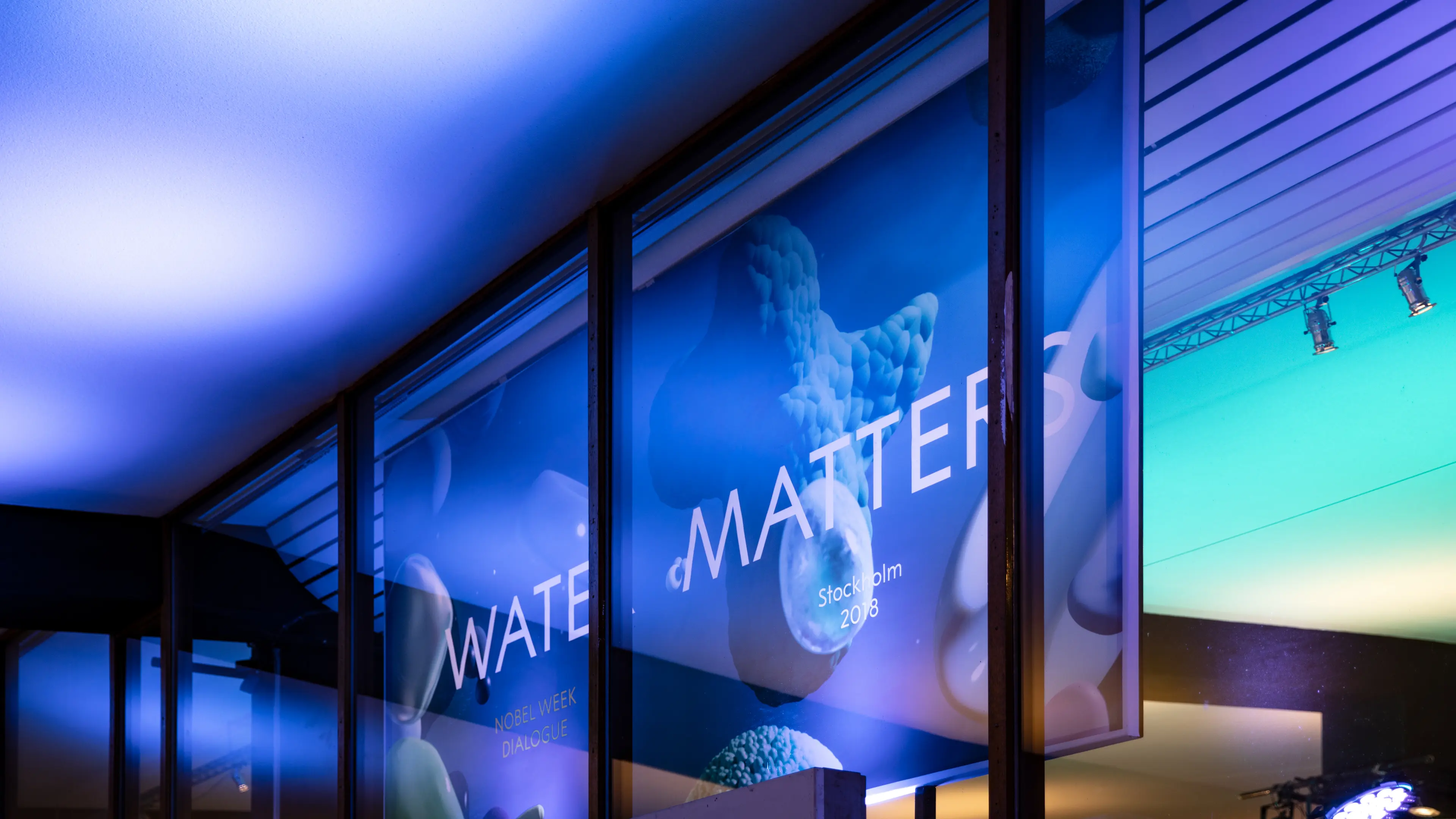
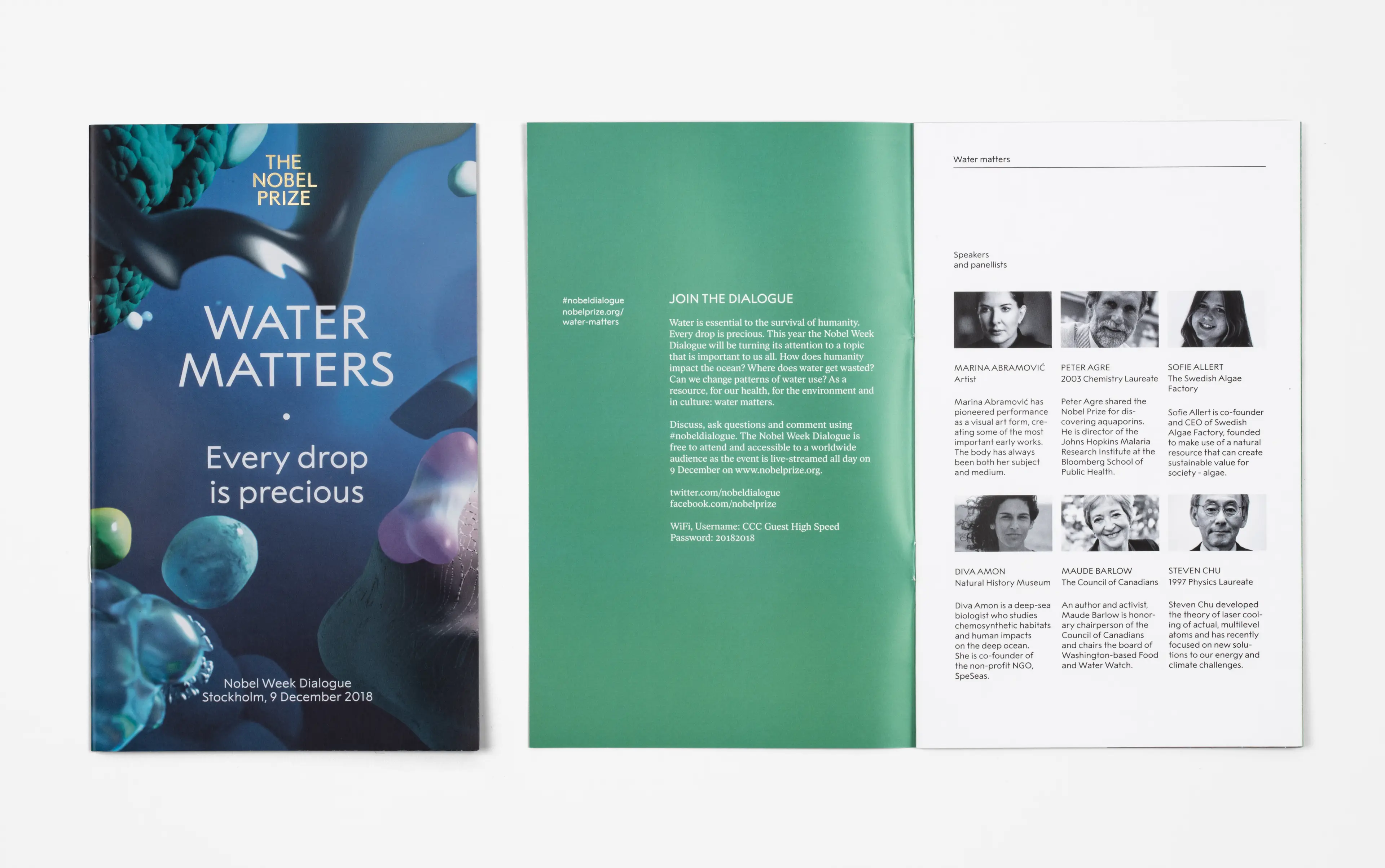
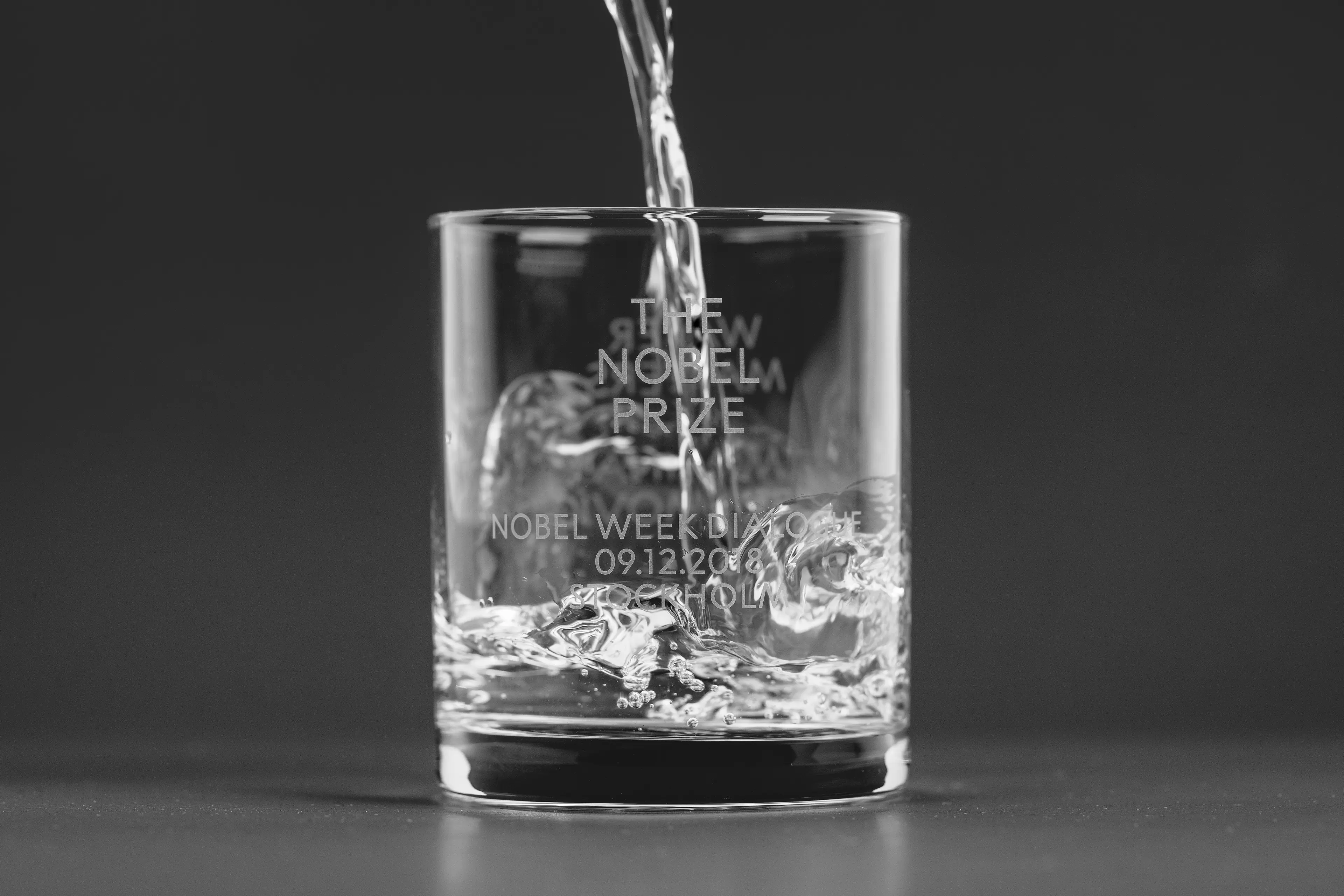
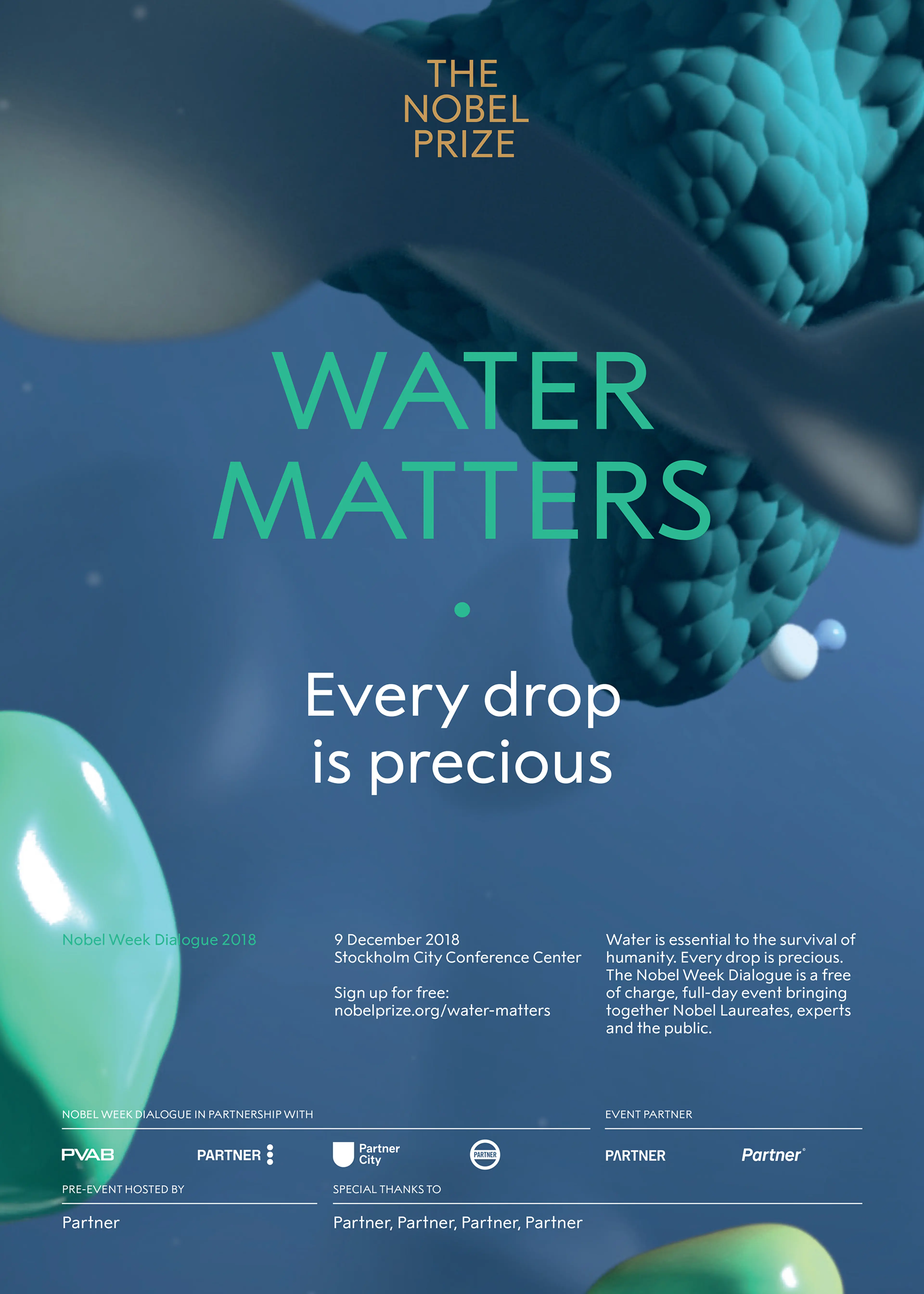
Water is essential to the survival of humanity. Every drop is precious. This year The Nobel Week Dialogue will be turning its attention to a topic that is important to us all. Event communication by SDL in collaboration with Wang & Söderström.
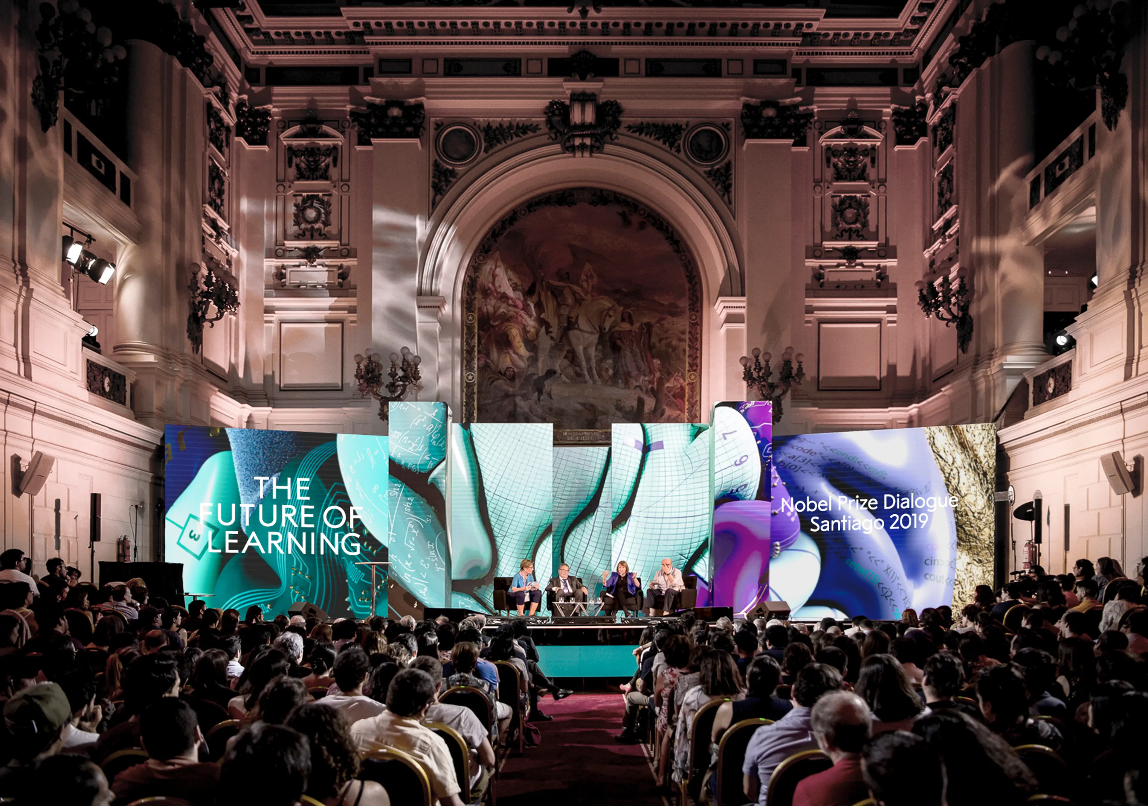
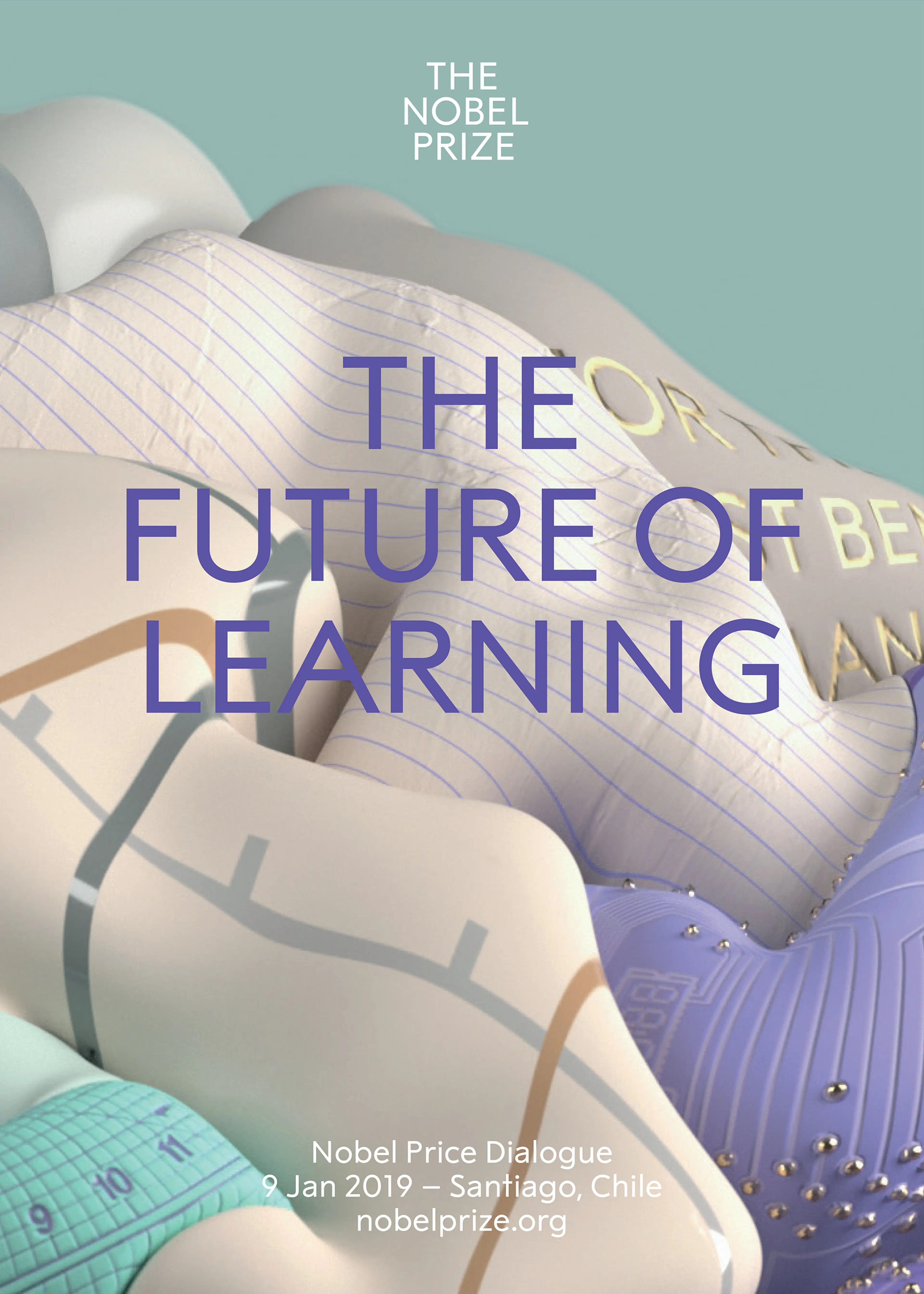
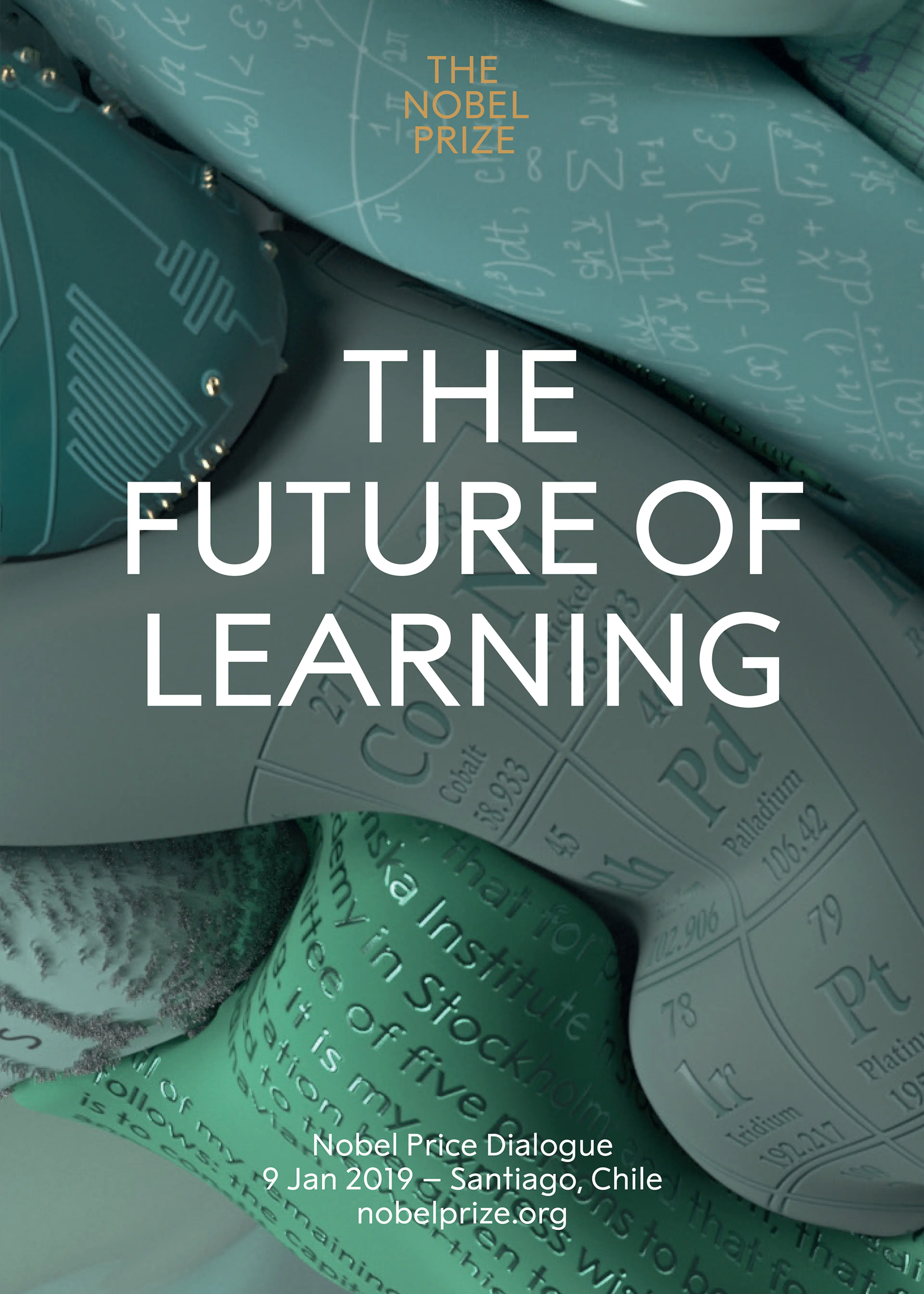
We learn throughout our lives. We learn to adapt to change. We learn to learn. Is it worth the time and money and who is paying? By studying our brains, we try to understand how we learn today. How will we learn in the future?

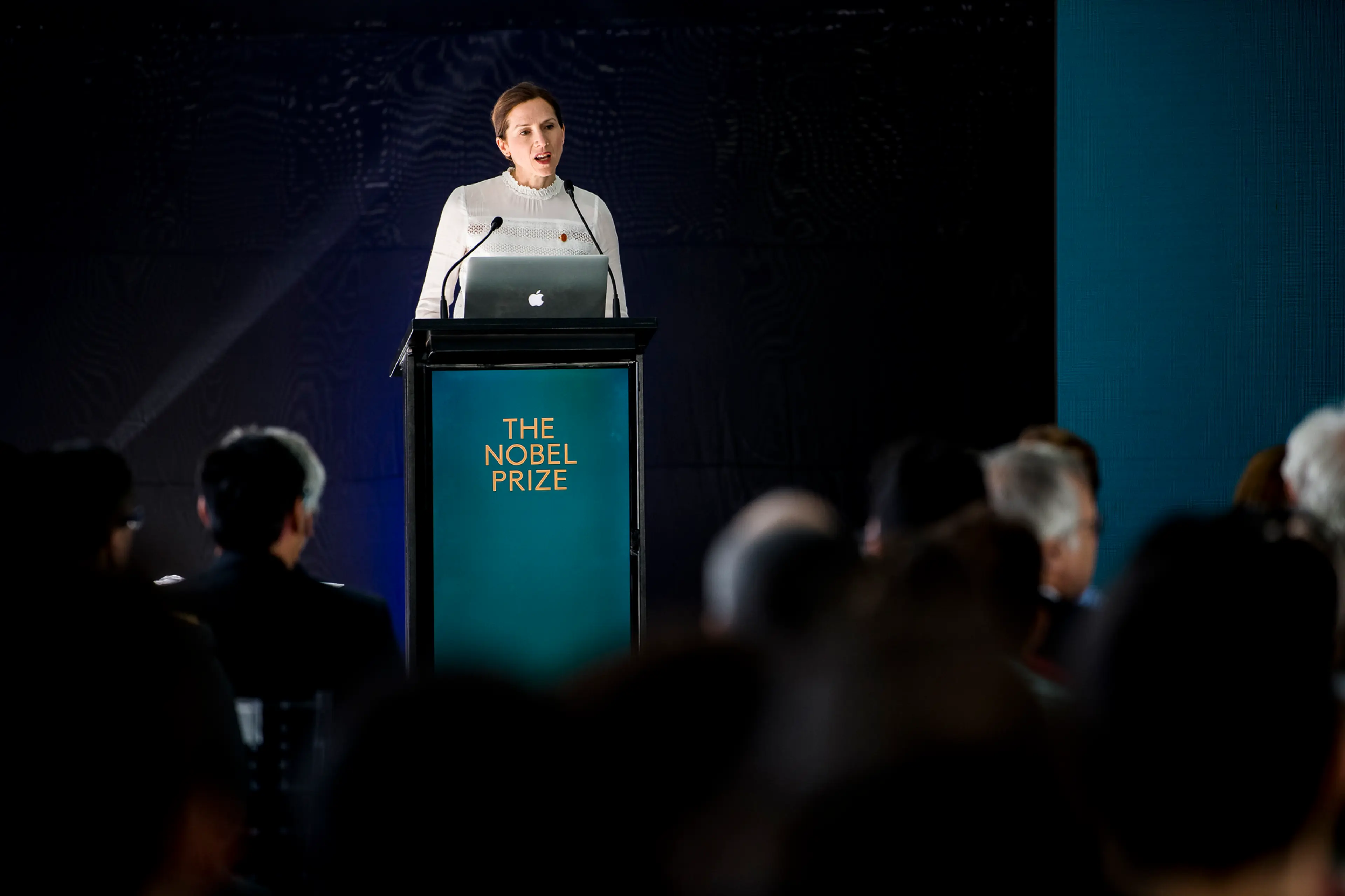
The Nobel Laureates and other world-leading experts met in Chile in January 2019 to discuss the Future of Learning during The Nobel Prize Dialogue. Holistic brand identity and event communication design by SDL, renderings in collaboration with Wang & Söderström.
A highly modular system for inspiring and user friendly digital experiences.
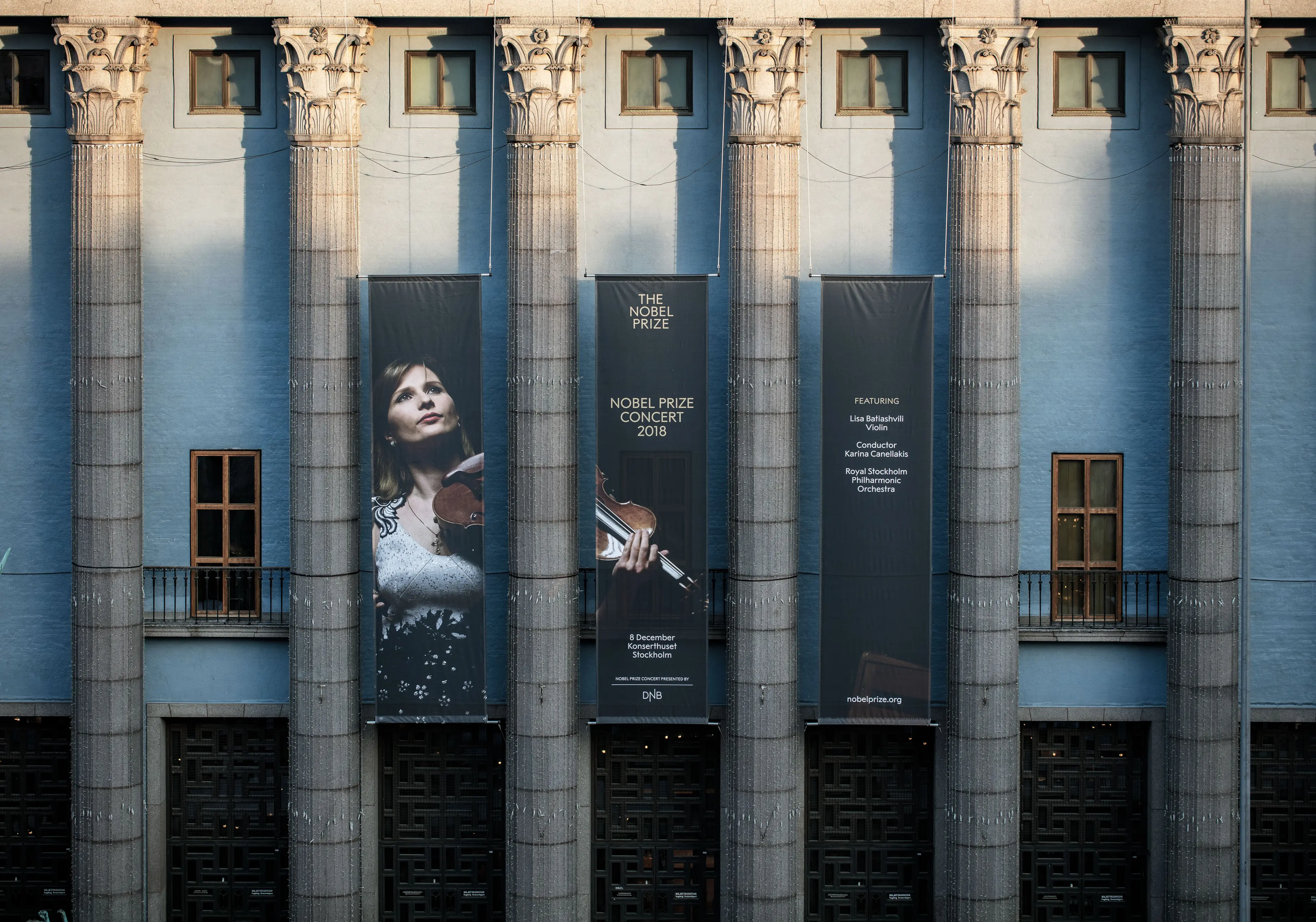
The identity is to be implemented across all channels, platforms and continents. With an even greater ability to reach a wide and diverse global audience with fascinating content to interact with, inspiring people to achieve tremendous things.
The new visual identity is formed to meet the criteria for today’s and tomorrow’s organisations and brands to communicate, but with great respect to the legacy. The words access and excellence evolved to become our guiding principles, steering the tonality and quality of work throughout the project – an inclusive and sharing attitude with the awareness that the sum of all details constitutes the total impression.